Review Badge Widget Settings Reference
Overview
The Review Badge is a compact, versatile widget designed to display your review rating summary in a prominent, eye-catching format. Unlike the full review display widgets (List, Grid, Masonry, Carousel), the Review Badge focuses on showing aggregate data: your average star rating, review count, and trust indicators.
This widget serves as social proof at a glance and is perfect for placing throughout your store where space is limited but trust signals are essential. It's particularly effective when made clickable to scroll users down to your full review section.
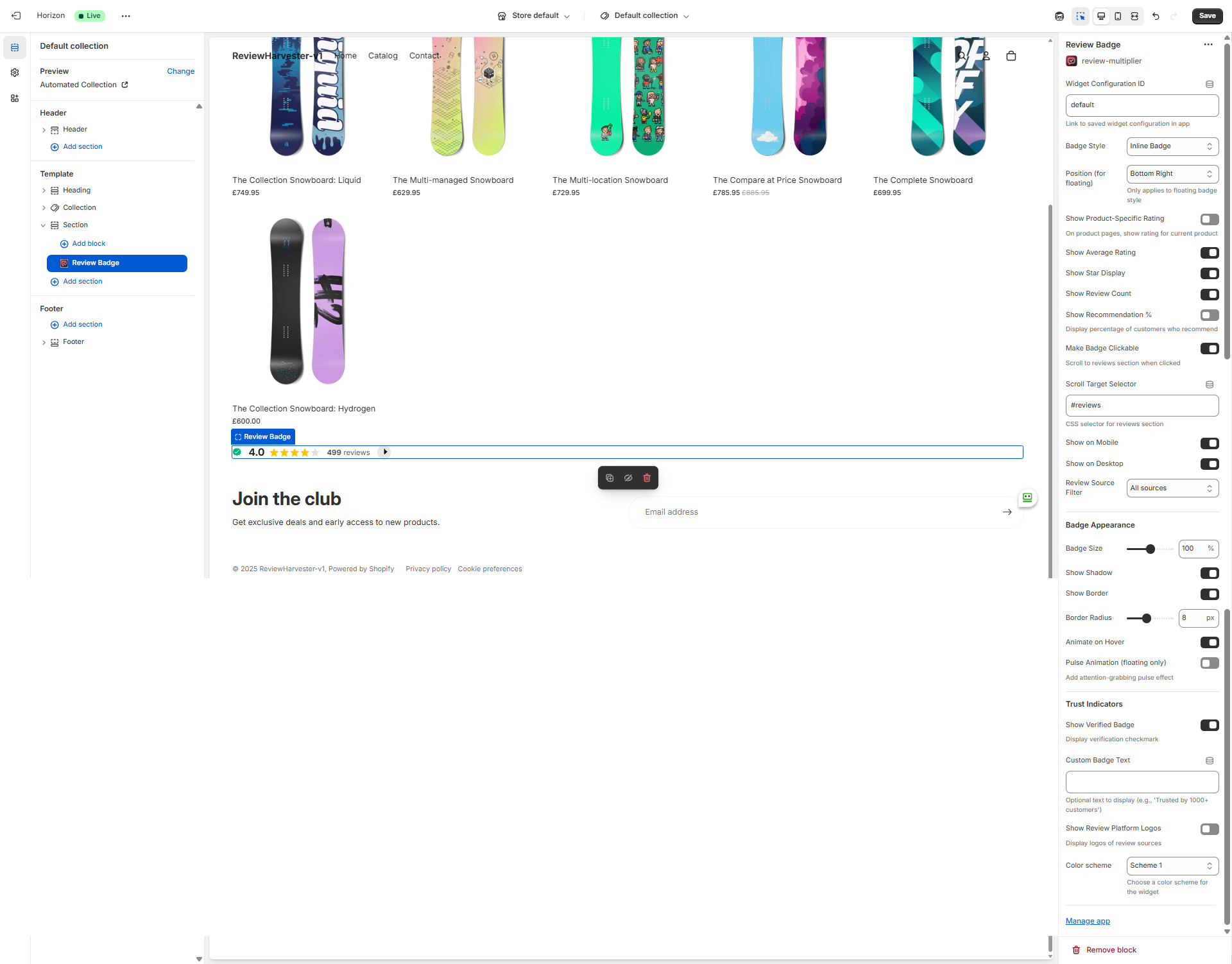
The Review Badge settings panel in the Shopify theme editor, showing all available customization options.
Key Features
The Review Badge offers four distinct badge styles:
- Floating Badge: Fixed position badge that stays visible as users scroll
- Inline Badge: Embedded in your page content flow
- Compact Badge: Minimalist design for tight spaces
- Trust Badge: Enhanced style with trust score and platform logos
With 23 settings, you can control exactly what data displays, how the badge looks, where it appears, and how customers interact with it.
Badge Style
Setting Type: Dropdown select Options: Floating Badge, Inline Badge, Compact Badge, Trust Badge Default Value: Inline Badge
This is the most important visual setting, determining the fundamental layout and behavior of your badge.
Badge Style Options
Floating Badge:
- Fixed position on the screen (stays visible when scrolling)
- Perfect for persistent social proof throughout the browsing experience
- Position controlled by the "Position" setting
- Can include optional pulse animation for attention
- Best for: Product pages, collection pages, anywhere you want constant review visibility
- Use case: "Bottom-right corner floating badge showing 4.8 stars"
Inline Badge (Default):
- Embeds directly into your page content
- Flows with the rest of your page elements
- No fixed positioning
- Best for: Product description areas, near add-to-cart buttons, in page sections
- Use case: "Inline badge below product title showing rating and review count"
Compact Badge:
- Minimalist design with essential info only
- Smaller footprint than other styles
- Great for tight spaces
- Best for: Header, footer, navigation areas, product cards
- Use case: "Compact badge in header showing quick 4.8★ rating"
Trust Badge:
- Enhanced style emphasizing trustworthiness
- Can display platform logos (Google, Facebook, etc.)
- Shows "Trust Score" label
- Best for: Landing pages, checkout areas, high-value product pages
- Use case: "Trust badge on high-ticket product page with Google logo"
Choosing the Right Style
Consider three factors:
1. Placement Context:
- Product page hero section: Inline or Trust Badge
- Persistent throughout site: Floating Badge
- Header/navigation: Compact Badge
- Checkout/cart page: Trust Badge
2. Space Available:
- Limited space: Compact Badge
- Dedicated section: Inline or Trust Badge
- No space concerns: Floating Badge (doesn't take up layout space)
3. Customer Journey Stage:
- Browsing/discovery: Floating or Compact
- Evaluating product: Inline or Trust Badge
- Ready to purchase: Trust Badge
Position (for Floating Badge)
Setting Type: Dropdown select Options: Bottom Left, Bottom Right, Top Left, Top Right, Center Left, Center Right Default Value: Bottom Right
This setting only applies when Badge Style is set to "Floating Badge." It determines where on the screen the floating badge appears and remains fixed during scrolling.
Position Options Explained
Bottom Right (Default - Most Common):
- Standard placement for floating elements
- Doesn't obscure important content
- Familiar to users (similar to chat widgets)
- Right-aligned suits left-to-right reading patterns
Bottom Left:
- Alternative to bottom-right
- Use when other elements occupy bottom-right
- Less common but equally effective
Top Right:
- High visibility placement
- Users see it immediately without scrolling
- Can conflict with navigation elements
- Consider z-index and overlap issues
Top Left:
- Uncommon but attention-grabbing
- May conflict with logo and navigation
- Use sparingly
Center Right/Left:
- Vertically centered on screen edge
- Always visible regardless of scroll position
- Most persistent visibility
- Can feel intrusive if overused
Best Practices for Floating Position
- Test on mobile: Ensure the floating badge doesn't obscure critical mobile UI elements (add-to-cart buttons, navigation)
- Check other widgets: If you have chat widgets, cookie banners, or other floating elements, position your badge to avoid overlap
- Consider desktop vs mobile: The "Show on Mobile/Desktop" settings let you show floating badges on desktop only if they're too intrusive on mobile
- Bottom positions are safest: Top positions can conflict with sticky headers and navigation
Show Product-Specific Rating
Setting Type: Checkbox (toggle) Default Value: Off (unchecked)
When enabled on a product page, this setting displays the rating data for only that specific product. When disabled, the badge shows your store-wide rating across all products.
Product-Specific vs. Store-Wide
Product-Specific (ON):
- Shows accurate rating for the exact product being viewed
- More relevant to purchase decision
- But: May show lower ratings on less-reviewed products
- But: Can be empty if product has no reviews yet
- Best for: Stores with well-reviewed products, when accuracy matters most
Store-Wide (OFF - Default):
- Shows your overall store rating across all reviews
- Provides social proof even for new products
- Maintains consistent high ratings throughout your store
- But: Less specific to the item being purchased
- Best for: New products, stores with strong overall ratings, maximum social proof
Strategic Approach
Recommended Strategy: Use store-wide badges on product pages initially. Once a product accumulates 10+ reviews, consider switching to product-specific for that product (using a separate widget configuration ID).
Context Matters: This setting only affects the widget when placed on product page templates. On other pages (home, collection, custom pages), it has no effect and always shows store-wide data.
Display Data Settings
Show Average Rating
Setting Type: Checkbox (toggle) Default Value: On (checked)
Controls whether the numerical average rating (e.g., "4.8") is displayed in the badge.
When ON: Displays the average (like "4.8" or "4.6") When OFF: Hides the numerical rating (only stars show, if enabled)
Recommendation: Keep this ON. The numerical rating is one of the most important trust signals and conversion drivers. Studies show numerical ratings alongside stars perform better than stars alone.
Show Star Display
Setting Type: Checkbox (toggle) Default Value: On (checked)
Controls whether the visual star rating (five stars with partial fills) is displayed.
When ON: Shows the familiar 5-star visual rating When OFF: Hides stars (only numerical rating shows, if enabled)
Recommendation: Keep this ON. The star visual is universally recognized and processes faster than numbers for most users. The combination of stars + number is most effective.
Show Review Count
Setting Type: Checkbox (toggle) Default Value: On (checked)
Controls whether the total number of reviews is displayed (e.g., "152 reviews").
When ON: Shows review count with label When OFF: Hides the review count
Why This Matters: Review count provides social proof volume. "4.8 stars from 500 reviews" is more persuasive than "4.8 stars" without context. However, if you have very few reviews (under 10), you may want to hide the count temporarily.
Recommendation:
- 20+ reviews: Keep ON to show volume
- 10-20 reviews: Keep ON (shows you're gaining traction)
- Under 10 reviews: Consider turning OFF until you build more volume
Show Recommendation Percentage
Setting Type: Checkbox (toggle) Default Value: Off (unchecked)
Displays the percentage of customers who recommend your product/store (e.g., "96% recommend").
When ON: Shows recommendation percentage with label When OFF: Hides this metric
What is "Recommendation %"?: This is calculated from reviews where customers explicitly indicated they would recommend the product (typically from a yes/no question in your review collection form).
When to Enable:
- You actively collect recommendation data in your review forms
- Your recommendation percentage is high (90%+)
- You have sufficient sample size (50+ reviews)
- You want to emphasize trustworthiness beyond just star ratings
When to Keep Disabled:
- You don't collect recommendation data
- Your percentage is lower than your star rating would suggest
- Badge space is limited
- You prefer visual simplicity
Interactivity & Visibility
Make Badge Clickable
Setting Type: Checkbox (toggle) Default Value: On (checked)
When enabled, clicking the badge smoothly scrolls the page to your full review section (requires a Review List, Grid, Masonry, or Carousel widget on the same page).
Why This Matters: This transforms your badge from passive social proof into an active navigation element that helps customers find and read full reviews.
Requirements:
- You must have another review widget on the page (List, Grid, Masonry, or Carousel)
- The target section must have an ID or selector (configured in "Scroll Target Selector")
When to Enable (Recommended):
- Product pages with reviews section below the fold
- Landing pages with dedicated reviews sections
- Any page where badge is visible but full reviews require scrolling
When to Disable:
- Stand-alone badges where no full reviews exist on the page
- When you don't want to encourage review exploration
- Trust badges in checkout where you don't want to navigate away
Scroll Target Selector
Setting Type: Text input
Default Value: #reviews
This CSS selector specifies where the page should scroll when the badge is clicked (only applicable when "Make Badge Clickable" is ON).
How It Works: Enter any valid CSS selector targeting the section you want to scroll to:
- ID selector:
#reviews,#customer-reviews,#testimonials - Class selector:
.review-section,.testimonials-block - Element:
section(scrolls to first section element)
Setup Instructions:
- Add a Review List, Grid, Masonry, or Carousel widget to your page
- Note the ID or class of that section (check with browser dev tools if needed)
- Enter that selector here (with # for IDs, . for classes)
- Test by clicking the badge
Common Selectors:
#reviews(most common)#customer-reviews.review-list-block[data-widget-type="list"]
Show on Mobile / Show on Desktop
Setting Type: Checkbox (toggle) Default Values: Both On (checked)
These two settings independently control badge visibility on mobile and desktop devices.
Use Cases
Desktop Only (Mobile OFF, Desktop ON):
- Floating badges that interfere with mobile UI
- When you have separate mobile-optimized review displays
- To reduce visual clutter on small screens
Mobile Only (Mobile ON, Desktop OFF):
- When desktop has review data elsewhere
- Mobile-specific trust signals
- Unusual but sometimes useful
Both Enabled (Default - Recommended):
- Maximum visibility across all devices
- Consistent experience
Neither Enabled: Badge never shows (effectively disables the widget)
Best Practice for Floating Badges: Consider Desktop-only for floating badges if they obscure critical mobile elements like add-to-cart buttons.
Review Type Filter
Setting Type: Dropdown select Options: Both (product and store reviews), Product reviews only, Store reviews only Default Value: Smart default based on page context
Controls which type of reviews are included in the badge's calculated rating—whether they're linked to specific products or are general store/brand reviews.
Understanding Review Types
Product Reviews: Reviews linked to specific products in your Shopify catalog. Best for showing product-specific ratings on product pages.
Store Reviews: General reviews about your brand, service, or overall shopping experience. Includes imported reviews from Google, Facebook, and Trustpilot. Best for overall reputation badges on homepage and landing pages.
Smart Defaults
The badge automatically selects an appropriate default based on where it's placed:
- Product pages: Defaults to "Product reviews only" — shows rating specific to the product being viewed
- Homepage, collection pages, and other pages: Defaults to "Store reviews only" — shows general store rating
You can override these defaults by selecting a different option.
Option Details
Both (product and store reviews): Includes all reviews for maximum volume and comprehensive rating.
Product reviews only: Only includes product-linked reviews. Best for product pages to show accurate product-specific ratings.
Store reviews only: Only includes store-level and imported platform reviews. Best for general brand trust badges.
Badge Appearance
Badge Size
Setting Type: Range slider Range: 80-120% Step: 10% Default Value: 100%
Controls the overall scale of the badge relative to its default size.
80%: Smaller, more subtle badge (use in tight spaces) 100% (Default): Standard size, well-balanced 120%: Larger, more prominent badge (use when badge is primary element)
Choosing the Right Size:
- In header/navigation: 80-90% (subtle)
- Product page inline: 100% (balanced)
- Hero section focal point: 110-120% (prominent)
- Floating badge: 90-100% (visible but not obtrusive)
Show Shadow
Setting Type: Checkbox (toggle) Default Value: On (checked)
Adds a subtle drop shadow around the badge for depth and separation from the background.
When ON: Badge has soft shadow (feels lifted, more prominent) When OFF: Flat badge (cleaner, more minimal)
Best for Shadow ON: Floating badges, overlapping content, need for visual separation Best for Shadow OFF: Minimal design, high-contrast backgrounds, inline badges in clean layouts
Show Border
Setting Type: Checkbox (toggle) Default Value: On (checked)
Adds a border outline around the badge.
When ON: Badge has defined edge (clearer boundaries) When OFF: No border (seamless, softer appearance)
Design Consideration: Borders help badges stand out against similar-colored backgrounds. If your badge background color is close to your page background, keep the border ON for definition.
Border Radius
Setting Type: Range slider Range: 0-20 pixels Step: 2 pixels Default Value: 8px
Controls how rounded the badge corners are.
0px: Square corners (modern, sharp, geometric) 8px (Default): Gently rounded (friendly, approachable, standard) 20px: Highly rounded (soft, pill-shaped for certain dimensions)
Match Your Theme: Align border radius with your theme's button and card styling for visual consistency.
Animate on Hover
Setting Type: Checkbox (toggle) Default Value: On (checked)
Adds a subtle hover animation when customers move their cursor over the badge (desktop only).
When ON: Badge scales slightly and/or changes shadow on hover (provides interactive feedback) When OFF: Badge is static (no hover effects)
Recommendation: Keep ON when badge is clickable to signal interactivity. Turn OFF if badge is informational only.
Pulse Animation (Floating Only)
Setting Type: Checkbox (toggle) Default Value: Off (unchecked)
Adds an attention-grabbing pulse animation to floating badges only.
When ON: Badge pulses periodically (expands and contracts slightly) When OFF: Badge is static
Use Sparingly: Pulse animations draw attention but can be distracting if overused. Consider enabling when:
- Newly launching review collection and want to drive engagement
- Running a promotion around customer reviews
- High-value product pages where reviews are critical to conversion
Caution: Multiple pulsing elements on one page can feel chaotic. Use one pulse animation maximum per page.
Trust Indicators
Show Verified Badge
Setting Type: Checkbox (toggle) Default Value: On (checked)
Displays a verification checkmark icon within the badge.
When ON: Shows checkmark icon indicating verified/authentic reviews When OFF: No verification icon
Why This Matters: The verification checkmark is a universal trust signal. Even without reading details, customers recognize the checkmark as an indicator of legitimacy.
Recommendation: Keep ON unless your badge is so minimal that every element must be justified.
Custom Badge Text
Setting Type: Text input Default Value: (empty)
Allows you to add custom text to your badge for additional messaging.
Examples of Effective Custom Text:
- "Trusted by 1,000+ customers"
- "Rated Excellent"
- "5-Star Service"
- "Award-Winning"
- "As seen on [Platform]"
Best Practices:
- Keep it short (under 5 words)
- Make it specific and quantifiable when possible
- Ensure it's true and supportable
- Consider how it appears at different badge sizes
When to Use:
- You have specific trust milestones to highlight
- Complementing Trust Badge style
- Awards or recognition to mention
- Volume-based social proof ("1M+ happy customers")
When to Leave Blank (Default):
- Visual simplicity preferred
- Rating and count speak for themselves
- Limited badge space
Show Review Platform Logos
Setting Type: Checkbox (toggle) Default Value: Off (unchecked)
Displays small logos of the review platforms you collect from (Google, Facebook, Trustpilot, etc.).
When ON: Shows platform logos within badge When OFF: No platform logos
Why This Matters: Platform logos leverage the trust and recognition of established brands. A Google logo next to your rating borrows Google's credibility.
When to Enable:
- Using Trust Badge style (designed for this)
- You collect from recognized platforms (Google, Facebook, Trustpilot)
- You want to emphasize multi-platform validation
- Landing pages or high-consideration purchases
When to Keep Disabled:
- Minimalist design preference
- Badge space is limited
- Your native reviews are the focus
- Visual clutter concerns
Important: Logos only appear for platforms you actually collect reviews from. The badge automatically detects your connected sources.
Color Scheme
Setting Type: Dropdown select Options: Scheme 1, Scheme 2, Scheme 3 Default Value: Scheme 1
Applies one of three predefined color schemes to the badge, affecting background colors, text colors, borders, and icons.
The schemes inherit and adapt to your Shopify theme's color settings, ensuring the badge integrates harmoniously with your store design.
Choosing a Scheme: Preview each scheme in the theme editor to see how it complements your page design. The schemes are designed to offer light, medium, and dark variations.
Best Practices
Optimal Configurations by Placement
Product Page Hero/Title Area (Inline Badge):
- Badge Style: Inline
- Show Product-Specific: ON (if product has reviews)
- Show Average Rating: ON
- Show Star Display: ON
- Show Review Count: ON
- Make Clickable: ON (scroll to reviews section below)
- Badge Size: 100-110%
Persistent Floating Badge (Throughout Site):
- Badge Style: Floating
- Position: Bottom Right
- Show Product-Specific: OFF (store-wide rating)
- Make Clickable: ON
- Show on Desktop: ON
- Show on Mobile: OFF (or ON if not intrusive)
- Pulse Animation: OFF (subtle is better)
Header/Navigation (Compact Badge):
- Badge Style: Compact
- Show on Mobile: ON
- Show on Desktop: ON
- Badge Size: 80-90%
- Show Shadow: OFF
- Show Border: OFF (depends on header design)
- Make Clickable: ON (scroll to reviews if available)
High-Value Product or Landing Page (Trust Badge):
- Badge Style: Trust
- Show Platform Logos: ON
- Show Verified Badge: ON
- Custom Text: "Trusted by [X] customers"
- Badge Size: 110%
- Show Shadow: ON
Performance Considerations
The Review Badge is lightweight and performance-friendly. It loads aggregate data (average rating, count) rather than full review content, making it one of the fastest widgets in your arsenal.
Best Practice: Use Review Badges liberally throughout your site as micro-conversion elements, while using heavier widgets (List, Grid, Masonry) selectively on pages where customers need detailed review content.
Conversion Optimization
Badge Placement Strategy:
- Above the fold: Place badge near product title/price for immediate social proof
- Near CTA: Position inline badge just above or beside "Add to Cart" button
- Persistent floating: Use floating badge on product and collection pages for constant visibility
- Navigation/header: Compact badge in header builds trust site-wide
A/B Testing Ideas:
- Floating vs. Inline placement
- Product-specific vs. store-wide ratings
- With vs. without recommendation percentage
- Pulse animation on/off
- Different badge styles (Trust vs. Inline)
Troubleshooting
For comprehensive troubleshooting of widgets not displaying, see our detailed Troubleshooting Widgets Not Displaying guide.
Click to expand troubleshooting steps
Badge Not Appearing
Check:
- Widget Configuration ID is correct (matches a config in your app)
- "Show on Mobile" or "Show on Desktop" are enabled for your current device
- You have published, approved reviews in your system
- Review Type Filter isn't set to a type with no reviews
Badge Shows But No Data (Skeleton/Loading State Persists)
Check:
- Your Review Multiplier app is active and connected
- Shop domain is correct
- Network/firewall isn't blocking API requests
- Browser console for JavaScript errors
Clicking Badge Doesn't Scroll
Check:
- "Make Badge Clickable" is enabled
- "Scroll Target Selector" matches an element on your page
- You have a Review List/Grid/Masonry widget on the page with matching selector
- JavaScript isn't being blocked
Badge Overlaps Other Elements (Floating Style)
Try:
- Change "Position" to a different corner
- Adjust Badge Size to 80-90%
- Disable "Show on Mobile" if it overlaps mobile UI
- Consider Inline style instead
Rating Shows as 0.0 or Empty
This means:
- No reviews meet your current filters
- Check "Product-Specific" setting on products with no reviews
- Check "Review Type Filter" isn't excluding all your reviews
- Verify you have approved, published reviews in the app
Summary
The Review Badge is your most versatile trust-building widget, perfect for displaying aggregate rating data anywhere on your store. With four distinct badge styles (Floating, Inline, Compact, Trust) and 23 customization settings, you can create precisely the right balance of visibility, information, and design for each placement context.
Key strengths include lightweight performance, clickable scroll-to-reviews functionality, device-specific visibility controls, and flexible trust indicators including verification badges and platform logos.
The default configuration (Inline style, store-wide rating, all display elements enabled) works well for most scenarios, but the extensive customization options let you optimize for specific placements, customer journey stages, and conversion goals.
Use Review Badges liberally throughout your store as micro-conversion elements, reserving the heavier review display widgets (List, Grid, Masonry, Carousel) for detailed review exploration pages.
For additional help with the Review Multiplier app, visit the full documentation site or contact support through the app admin.