Review Grid Widget: Complete Settings Reference
Overview
The Review Grid Widget is a clean, structured layout that displays customer reviews in a uniform, organized grid format. This is the most traditional and expected review display pattern, offering excellent readability, easy scanning, and intuitive navigation. The grid layout presents reviews in equal-width columns with consistent spacing, creating a professional, trustworthy appearance that works well across all device types.
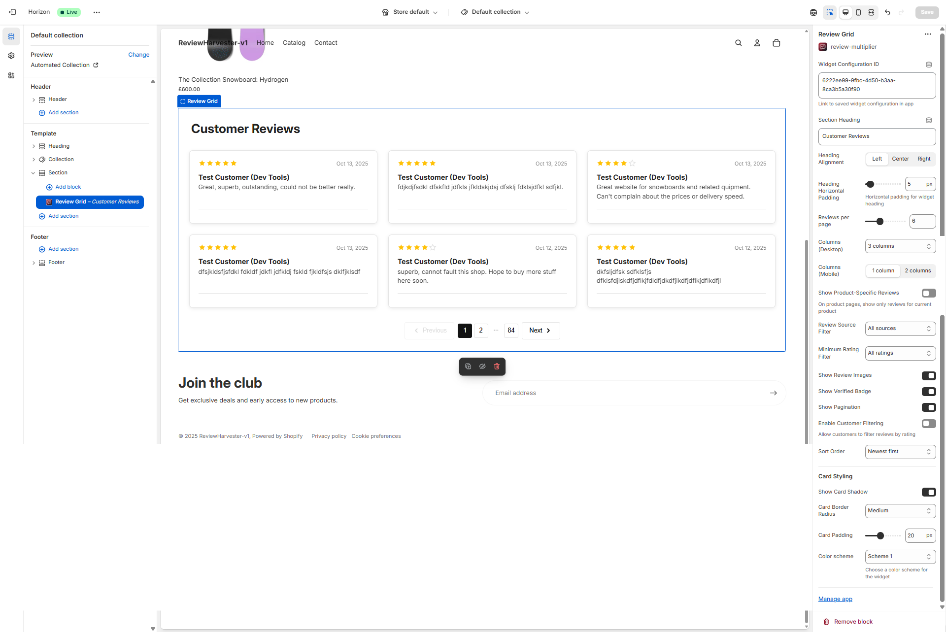
The Review Grid Widget displayed in the Shopify theme editor with the complete settings panel visible on the right.
What Makes the Grid Layout Special?
The grid format is the workhorse of review displays, offering unique advantages:
- Predictable Structure: Uniform columns create organized, easy-to-scan layout
- Maximum Readability: Equal-width cards optimize reading experience
- Familiar Pattern: Customers expect and understand grid layouts instinctively
- Comparison Friendly: Side-by-side cards facilitate easy review comparison
- Responsive Excellence: Grids adapt beautifully across all screen sizes
- Professional Appearance: Clean, structured feel builds trust and credibility
When to Use the Review Grid Widget
The grid layout is best suited for:
- Product pages: Customers actively researching need comprehensive, scannable reviews
- Collection pages: Display diverse reviews from multiple products
- Dedicated review pages: Full review archives with filtering and pagination
- Research-focused contexts: When customers are comparing and evaluating
- High review counts: Grids scale excellently with many reviews
- Professional presentations: Corporate, B2B, or premium brands
Consider alternatives if:
- You want dynamic, eye-catching presentation → Use Review Carousel instead
- You have varying review lengths and want organic flow → Use Review Masonry instead
- You need compact, vertical scrolling → Use Review List instead
- You want featured, curated testimonials → Carousel works better
Quick Start Configuration
Get your grid up and running with this checklist:
- Widget Configuration ID - Paste from Review Multiplier app (required)
- Section Heading - Add clear heading (e.g., "Customer Reviews")
- Columns - Set 3 for desktop, 1 for mobile (standard configuration)
- Reviews per page - Start with 6 for quick loading
- Pagination - Enable to allow browsing through reviews
- Rating filter - Choose "All ratings" for transparency or "4+ stars" for positivity
- Card styling - Adjust to match your theme's design
Now let's explore each setting in detail.
Essential Settings
Widget Configuration ID
Type: Text input Required: Yes Default: "default"
This is the critical link between the theme block and your widget configuration in the Review Multiplier app. It tells the widget which reviews to load, which filters to apply, and which settings to use.
Finding Your Widget Configuration ID
- Open Review Multiplier app from Shopify admin
- Navigate to Widgets section
- Create a new widget or select an existing one
- On the widget details or installation page, locate the Widget Configuration ID
- Copy the entire ID (typically formatted like
clxtk7m8q0001...) - Paste it exactly into this field in the theme editor
Critical notes:
- Without this ID, the widget displays using default settings
- The ID is case-sensitive and must be copied exactly
- No extra spaces before or after the ID
- Each widget configuration has a unique ID
Troubleshooting
Click to expand troubleshooting steps
If reviews aren't displaying:
- Verify the complete ID was copied (check for truncation)
- Ensure the widget status is "Active" in the Review Multiplier app
- Confirm you have reviews available that match your filters
- Try refreshing the theme editor and storefront
Content & Display Settings
Section Heading
Type: Text input Default: "Customer Reviews"
The heading text that appears above your review grid, providing context and drawing attention to the section.
Effective heading examples:
- "What Our Customers Are Saying"
- "Customer Reviews & Testimonials"
- "Real Feedback from Real Customers"
- "Verified Customer Reviews"
- "See What Others Are Saying"
- "Trusted by Thousands"
Best practices:
- Keep concise (under 50 characters for mobile)
- Use action-oriented language when appropriate
- Match your brand's voice and tone
- Consider the page context (product vs homepage headings differ)
- Leave blank if your theme section already includes a heading
- Use emojis sparingly (⭐ Customer Reviews) only if brand-appropriate
Heading Alignment
Type: Dropdown select Options: Left, Center, Right Default: Left
Controls the horizontal text alignment of your section heading.
Left Alignment (Default)
Visual: Text aligns to the left edge of the section
Best for:
- Traditional, editorial layouts
- Content-heavy pages
- Professional/corporate brands
- Left-to-right reading languages
- When matching other left-aligned headings on your site
Design tip: Left alignment creates a strong visual starting point and feels familiar to most readers.
Center Alignment
Visual: Text centers horizontally in the section
Best for:
- Homepage hero sections
- Symmetrical designs
- Modern, minimalist aesthetics
- Drawing attention to the section
- Creating visual balance
Design tip: Center alignment works well when the grid itself is visually balanced and centered on the page.
Right Alignment
Visual: Text aligns to the right edge of the section
Best for:
- Artistic or unconventional designs
- Right-to-left language support (Arabic, Hebrew)
- Creating visual tension or interest
- Specific design systems that use right alignment
Design tip: Use sparingly—right alignment is uncommon and can feel unfamiliar to users.
Heading Horizontal Padding
Type: Range slider Range: 0-100 pixels Step: 5 pixels Default: 35 pixels
Adds horizontal spacing (left or right padding depending on alignment) to your section heading, creating breathing room between the heading and the edge.
How it works:
- Left-aligned heading: Padding applies to the left side
- Right-aligned heading: Padding applies to the right side
- Center-aligned heading: No padding effect (heading stays centered)
Recommended values:
| Padding | Effect | Best For |
|---|---|---|
| 0-15px | Minimal, near edge | Narrow sections, mobile-optimized |
| 20-40px | Standard, comfortable | Most use cases (recommended) |
| 45-70px | Generous, editorial | Wide sections, premium designs |
| 75-100px | Maximum, dramatic | Full-width sections, artistic layouts |
Design consideration: Match this padding to other headings on your site for visual consistency. If your product titles have 35px padding, use 35px here too.
Reviews per Page
Type: Range slider Range: 3-12 reviews Step: 3 (options: 3, 6, 9, 12) Default: 6 reviews
Controls how many review cards display on each page before pagination begins. This directly impacts page load time, scrolling requirements, and how many clicks customers need to see all reviews.
3 Reviews per Page (Minimal)
Best for:
- Very slow hosting or internet connections
- Image-heavy reviews (many customer photos)
- Mobile-heavy traffic (70%+ mobile users)
- Preview/teaser implementations
- Pages where reviews are supplementary content
Pros: Fastest loading, minimal scrolling Cons: Frequent pagination clicks needed, feels sparse
6 Reviews per Page (Standard)
Best for:
- Most use cases (recommended default)
- Balanced performance and content
- Product pages with moderate traffic
- Standard e-commerce implementations
- Mix of desktop and mobile traffic
Pros: Good balance of speed and content, comfortable amount to read Cons: Still requires pagination for large review sets
9 Reviews per Page
Best for:
- Desktop-heavy traffic
- Faster hosting with good CDN
- Collection or category pages
- When you want more comprehensive first view
- Stores with 50+ total reviews
Pros: More content visible, fewer pagination clicks Cons: Longer page load, more scrolling required
12 Reviews per Page (Maximum)
Best for:
- Dedicated review archive pages
- Desktop-primary audiences
- Fast hosting with optimization
- When reviews are primary page content
- Stores with hundreds of reviews
Pros: Maximum content per page, comprehensive view Cons: Slowest loading, longest scrolling, may overwhelm users
How to Choose
Consider your total review count:
- Under 20 reviews: 6 per page (shows most on page 1)
- 20-50 reviews: 6-9 per page (balance)
- 50+ reviews: 9-12 per page (efficient browsing)
Consider your traffic source:
- 70%+ mobile: 6 per page (mobile loads slower)
- Desktop-heavy: 9-12 per page (can handle more)
Consider page context:
- Product pages: 6 per page (focused research)
- Homepage: 3-6 per page (quick preview)
- Dedicated review page: 9-12 per page (comprehensive)
Performance rule: Each review loads text, metadata, and potentially images. Test your actual load time with different values.
Column Configuration
Columns (Desktop)
Type: Dropdown select Options: 2, 3, or 4 columns Default: 3 columns
Controls how many vertical columns of reviews display side-by-side on desktop screens (typically 990px width and wider).
2 Columns - Wide Layout
Visual: Two wide columns of reviews side-by-side
Card width: Each card is approximately 45-48% of container width
Best for:
- Long, detailed reviews (50+ words average)
- Reviews with customer photos
- Minimalist, spacious designs
- Premium/luxury brands
- When readability is top priority
- Narrow container widths
Pros:
- Maximum readability
- Comfortable card width for long content
- Customer photos display large and clear
- Feels spacious and premium
Cons:
- Shows fewer reviews at once
- Requires more scrolling
- Uses horizontal space less efficiently
Recommendation: Use 2 columns if your average review is 40+ words or includes images frequently.
3 Columns - Balanced Layout (Default)
Visual: Three evenly-spaced columns of reviews
Card width: Each card is approximately 30-32% of container width
Best for:
- Most use cases (recommended default)
- Standard review lengths (20-40 words)
- Professional e-commerce layouts
- Desktop screens 1200px and wider
- Balanced presentation of content and density
Pros:
- Optimal balance of readability and efficiency
- Shows good variety of reviews at once
- Standard expectation for review grids
- Works with most review lengths
Cons:
- May feel cramped with very long reviews
- Middle ground (not optimizing for extremes)
Recommendation: Start with 3 columns. It's the sweet spot for most stores.
4 Columns - Dense Layout
Visual: Four columns of reviews in a tight grid
Card width: Each card is approximately 22-24% of container width
Best for:
- Brief reviews (10-30 words)
- High review counts (showing many at once)
- Ultra-wide screens (1400px+)
- Modern, busy designs
- "Social proof" emphasis over detail
- When space efficiency is priority
Pros:
- Maximum content density
- Shows many reviews simultaneously
- Efficient use of screen real estate
- Good for brief testimonials
Cons:
- Cards feel narrow
- Long reviews become hard to read
- Only works on wide screens
- May feel cluttered
Recommendation: Only use 4 columns if most reviews are under 30 words and your desktop screens are typically 1400px+ wide.
Columns (Mobile)
Type: Dropdown select Options: 1 or 2 columns Default: 1 column
Controls column layout on mobile devices (screens under 750px width). This is arguably your most important responsive setting since 60-80% of e-commerce traffic is mobile.
1 Column - Full Width (Strongly Recommended)
Visual: Single column, each review card spans full width
Why this is default:
- Mobile screens are narrow (320-430px typically)
- Single column provides maximum readability
- No squinting or zooming required
- Standard mobile pattern users expect
- Optimal for reviews averaging 20+ words
- Best accessibility for all users
- Natural vertical scrolling behavior
Best for:
- 95% of stores (highly recommended)
- Any reviews longer than 20 words
- Users age 30+ (prefer larger text)
- Accessibility compliance
- Professional implementations
Readability comparison:
- 1 column: Text is ~300-400px wide (comfortable reading)
- 2 columns: Text is ~140-200px wide (straining)
2 Columns - Compact Layout
Visual: Two narrow columns side-by-side on phone screen
Why you might consider it:
- Reviews are extremely brief (10-15 words max)
- Showing star ratings/scores more than text content
- Brand targets young, mobile-first users (18-25)
- Modern, minimalist aesthetic
- You've specifically tested and confirmed better engagement
When to use:
- Reviews are consistently 1-2 sentences maximum
- Content is "social proof" style (names + ratings + brief comment)
- You have a very specific design reason
Drawbacks:
- Text becomes small and hard to read
- Forces horizontal eye scanning (unnatural on phones)
- Reduces accessibility significantly
- Users 40+ will struggle
- May increase bounce rate if text is unreadable
Honest recommendation: Use 1 column on mobile for 99% of cases. The 2-column mobile layout works for very few stores and hurts readability for most.
Filtering & Content Control
Show Product-Specific Reviews
Type: Toggle (checkbox) Default: OFF
When enabled on product pages, this automatically filters reviews to show only feedback for the currently-viewed product, hiding reviews for other products.
How It Works
When enabled:
- On product pages: Only reviews for that specific product display
- On non-product pages (homepage, collections): Shows reviews based on widget configuration
- Reviews are matched by Shopify product ID
- Provides relevant, contextual feedback
When disabled:
- All pages show the same reviews based on widget configuration
- No automatic product filtering
- Reviews can be from any/all products
When to Enable
Enable this setting when:
- You collect product-specific reviews (not just store reviews)
- Widget is placed on product page templates
- You have multiple products with separate review sets
- Customers need feedback specific to their consideration
- You want to increase relevance and conversion
Example scenario: Customer viewing "Blue Widget Pro" on product page sees only reviews for that specific product, not reviews for "Red Widget" or other products.
When to Leave Disabled
Keep disabled when:
- You primarily collect store/company reviews (not product-specific)
- You want to show overall brand reputation everywhere
- Widget is only on homepage or collection pages
- You have very few products
- You want consistent review display across all pages
Important: For this to work, reviews must be associated with specific Shopify products in your Review Multiplier configuration.
Review Type Filter
Type: Dropdown select Options: Both (product and store reviews), Product reviews only, Store reviews only Default: Smart default based on page context
Filters displayed reviews based on review type—whether they're linked to specific products or are general store/brand reviews.
Understanding Review Types
Product Reviews: Reviews that are linked to a specific product in your Shopify catalog. These are typically submitted through product pages or post-purchase emails where a specific product is identified.
Store Reviews: General reviews about your brand, service, or overall shopping experience. These include reviews collected without a specific product association, as well as reviews imported from platforms like Google Business Profile, Facebook, and Trustpilot.
Smart Defaults
The widget automatically selects an appropriate default based on where it's placed:
- Product pages: Defaults to "Product reviews only" — shows reviews specific to the product being viewed
- Homepage, collection pages, and other pages: Defaults to "Store reviews only" — shows general store/brand reviews
You can override these defaults by selecting a different option.
Both (Product and Store Reviews)
Shows: All reviews regardless of type
Best for:
- Comprehensive social proof (maximize review count)
- Dedicated review pages showing all customer feedback
- When you want to display maximum review volume
Benefit: Shows the full picture of customer sentiment across all review types.
Product Reviews Only
Shows: Only reviews linked to specific products
Best for:
- Product pages where customers want specific product feedback
- Helping customers make informed purchasing decisions
- When product-specific details matter most
Use case: Product page grid showing reviews from customers who purchased that specific item.
Store Reviews Only
Shows: Store-level reviews and imported platform reviews (Google, Facebook, Trustpilot)
Best for:
- Homepage sections showcasing overall business reputation
- Building general brand trust
- About pages highlighting customer satisfaction
- Landing pages for brand credibility
Use case: Homepage section showing "What our customers say" with general store feedback.
Strategic Multi-Widget Approach
Pro tip: Create multiple widget configurations with different type filters:
- Widget A (Product reviews only) → Product pages
- Widget B (Store reviews only) → Homepage
- Widget C (Both) → Dedicated review page
This optimizes review presentation for each page's specific purpose.
Minimum Rating Filter
Type: Dropdown select Options: All ratings, 3+ stars, 4+ stars, 5 stars only Default: All ratings
Filters reviews based on star rating, setting a minimum threshold for which reviews display.
All Ratings (Recommended for Grids)
Shows: Every review from 1 star to 5 stars
Why this is default:
- Maximum transparency: Shows honest, complete customer sentiment
- Builds trust: Customers trust mixed ratings more than perfect ratings
- Realistic expectations: Helps customers know what to expect
- Reduces returns: Informed customers are satisfied customers
- SEO benefit: More diverse review content
Research-backed insight: Showing some 3-4 star reviews alongside 5-star reviews increases conversion by up to 15% compared to showing only 5-star reviews, because it appears authentic.
Best for:
- Product pages (research-focused customers)
- Stores with 4.0+ average rating
- Building maximum trust
- Transparent brands
- Most grid implementations
3+ Stars
Shows: Only reviews rated 3, 4, or 5 stars Filters out: 1 and 2-star reviews
Best for:
- Filtering obvious outliers or malicious reviews
- When you have some low ratings you're actively addressing
- Stores with 3.5-4.0 average rating
- Showing "generally positive" sentiment
Consideration: Customers may notice absence of lower ratings. Use when you have specific reason to exclude very negative feedback.
4+ Stars
Shows: Only reviews rated 4 or 5 stars Filters out: 1, 2, and 3-star reviews
Best for:
- Conversion-focused pages (landing pages, homepage features)
- Creating strong positive impression
- Competitive categories where perception matters
- When you have many 4-5 star reviews
Consideration: May appear curated. Works best when you have many reviews so filtering still leaves substantial content.
5 Stars Only
Shows: Only perfect 5-star reviews Filters out: Everything else
Best for:
- "Best of" showcase sections
- Featured testimonials
- When you have 100+ reviews (filtering still leaves many)
- Limited use on specific pages
Warning: All 5-star reviews can appear fake or suspicious. Use very sparingly and consider labeling the section "Top Reviews" or "Featured Customer Favorites" to indicate curation.
Grid-Specific Recommendation
Grids benefit from "All ratings" more than other layouts:
- Grids are used for research and comparison
- Customers viewing grids are actively evaluating
- Grid format allows easy scanning of many reviews
- Mixed ratings in grids appear authentic and helpful
Recommended:
- Product pages with grids: All ratings
- Homepage grids: All ratings or 4+ stars
- Landing page grids: 4+ stars
Show Review Images
Type: Toggle (checkbox) Default: ON (enabled)
Controls whether customer-uploaded photos appear within review cards. When enabled, reviews containing images will display those photos below the review text.
When Enabled (Recommended)
📋 Free: 1 per review 50/mo total | Starter: 3 per review Unlimited | Pro: 5 per review Unlimited
What customers see:
- Reviews with photos show thumbnail images
- Images are clickable to view full-size
- Multiple images per review display as gallery
- Reviews without images display normally (text only)
Benefits:
- Higher conversion: Visual proof increases trust by 20-30%
- Real-world context: Shows products in actual use
- Reduced returns: Customers have realistic expectations
- Engagement: Reviews with photos get 3-4x more attention
- SEO value: Images can appear in Google Image Search
Best for:
- Visual products (apparel, home decor, beauty, accessories)
- Stores that encourage photo reviews
- Products where appearance matters
- Mobile shoppers (images break up text nicely)
When Disabled
What customers see:
- All reviews display text-only format
- No images even if customer submitted them
- Cleaner, uniform card appearance
- Faster page loading
When to disable:
- Ultra-minimalist design requiring text-only
- Products don't photograph well (services, digital goods, B2B)
- You receive few photo reviews (creates inconsistency)
- Page speed is critical
- Limited moderation capacity for image quality control
Performance Consideration
Each review image adds:
- 50-200KB per image to page size
- Additional HTTP requests
- Lazy loading helps (images load only when scrolled into view)
Optimization tip: Review Multiplier automatically optimizes uploaded images. Ensure this optimization is enabled in your app settings for best performance.
Show Verified Badge
Type: Toggle (checkbox) Default: ON (enabled)
Controls whether a "Verified Purchase" or "Verified Buyer" badge displays on reviews from customers who actually purchased from your store.
The Verified Badge Explained
What qualifies as verified:
- Customer made actual purchase in your Shopify store
- Review linked to completed, paid order
- Customer email matches order email
- Order wasn't refunded or cancelled
What it looks like:
- Small checkmark icon or badge
- Text label like "Verified Purchase" or "Verified Buyer"
- Appears near customer name or review metadata
- Distinct visual styling to catch attention
When Enabled (Strongly Recommended)
Benefits:
- Increases trust by 40%+: Verified badges dramatically increase purchase confidence
- Distinguishes authentic reviews: Separates real customers from potential fakes
- FTC compliance: Meets US Federal Trade Commission guidelines
- Competitive standard: Amazon and major retailers use verification
- Filters incentivized reviews: Shows these are genuine purchasers
Customer psychology: Research shows customers are 35-40% more likely to purchase when reviews have verification badges versus no verification.
Best for:
- All implementations (strongly recommended)
- Native reviews (reviews you collect)
- Building maximum trust
- Professional, credible presentation
When Disabled
What customers see:
- All reviews appear the same
- No distinction between verified purchasers and other reviewers
- Cleaner design without badge elements
When to disable:
- You primarily show imported reviews from platforms like Google (already verified there)
- Extreme minimalist aesthetic where badges feel cluttered
- All your reviews are verified anyway (badge becomes redundant)
Honest recommendation: Keep this enabled in 95% of cases. The trust benefit far outweighs any aesthetic concerns.
Show Pagination
Type: Toggle (checkbox) Default: ON (enabled)
Controls whether pagination controls (Previous/Next buttons and page numbers) appear at the bottom of the grid, allowing customers to browse through multiple pages of reviews.
When Enabled (Recommended)
What customers see:
- Navigation buttons at bottom: "Previous" and "Next"
- Page numbers (e.g., "1 2 3 ... 10")
- Current page highlighted
- Can jump directly to specific pages
Benefits:
- Customers can browse all reviews: Not limited to first page only
- Performance-friendly: Loads reviews in manageable chunks
- Familiar pattern: Expected navigation for content-heavy pages
- SEO-friendly: Search engines can crawl paginated pages
- Supports bookmarking: Can link to specific review pages
Best for:
- All implementations where reviews exceed "reviews per page" setting
- Product pages with comprehensive reviews
- Review archive pages
- Professional e-commerce sites
When Disabled
What customers see:
- Only reviews from first page display
- No way to see additional reviews
- No navigation controls
When to disable:
- You have very few reviews (less than "reviews per page" setting)
- Using grid as a preview/teaser (full reviews accessible elsewhere)
- You want absolute simplest possible design
- All your best reviews fit on page 1
Important: If you have more reviews than fit on one page, pagination should be enabled. Otherwise customers can't access most of your reviews.
Pagination vs Infinite Scroll
Why pagination is better for grids:
| Pagination | Infinite Scroll |
|---|---|
| ✅ Clear endpoint (users know total) | ❌ Endless scrolling feels infinite |
| ✅ Better performance (loads in chunks) | ❌ Page grows heavy over time |
| ✅ SEO-friendly | ❌ Dynamic loading hurts SEO |
| ✅ Accessible (screen readers) | ❌ Accessibility challenges |
| ✅ Can bookmark pages | ❌ Can't save position |
| ❌ Requires clicks | ✅ Seamless scrolling |
User research: Pagination has higher review consumption rates because users understand how much content exists and can navigate intentionally.
Enable Customer Filtering
Type: Toggle (checkbox) Default: OFF
When enabled, adds interactive filter buttons above the grid allowing customers to filter reviews by star rating in real-time.
When Enabled
What customers see:
- Filter buttons appear below section heading:
- "All Reviews" (default selected)
- "5 Stars"
- "4+ Stars"
- "3+ Stars"
- Active filter is highlighted visually
- Grid instantly updates when clicking filter
- Review count may update to show filtered total
Benefits:
- Customer control: Shoppers can focus on reviews relevant to them
- Maximum transparency: Shows you're not hiding negative reviews
- Research enablement: Savvy shoppers often filter to 3-4 stars (more honest/detailed)
- Engagement: Interactive elements increase time on page
- Trust building: Demonstrates confidence in your reviews
Best for:
- 30+ reviews across range of ratings
- Transparent, customer-empowered brands
- Tech-savvy audiences
- When you have 4.0-4.5 average rating (good mix)
- Research-focused pages (product pages)
When Disabled (Default)
What customers see:
- No filter buttons
- Reviews display based on your "Minimum Rating Filter" setting
- Simpler, cleaner interface
When to keep disabled:
- Fewer than 20-30 total reviews (filtering leaves too few)
- You're already using "Minimum Rating Filter" (provides your own filtering)
- You prefer minimal, distraction-free design
- Most reviews are same rating (95% are 5 stars = nothing to filter)
- Older or less tech-savvy customer base
Customer Filtering vs Minimum Rating Filter
Key difference:
- Minimum Rating Filter: You control what customers see (admin decision)
- Enable Customer Filtering: Customers control what they see (user decision)
Can you use both?
- Technically yes, but not recommended
- If you set "Minimum Rating: 4+ stars" AND enable customer filtering, customers can only filter within 4-5 star reviews
- Limits the utility of customer control
Best practice: Choose one approach:
- You control: Use Minimum Rating Filter, keep Customer Filtering OFF
- Customer controls: Set Minimum Rating to "All ratings", enable Customer Filtering
Most transparent configuration: Enable customer filtering with no minimum rating filter. This says "We have nothing to hide—you decide what to see."
Sort Order
Type: Dropdown select Options: Newest first, Oldest first, Highest rating first, Lowest rating first, Most helpful first Default: Newest first
Determines the order in which reviews display in the grid. Sort order significantly impacts which reviews customers see first and influences their perception.
Newest First (Default - Recommended)
What it does: Reviews sorted by submission date, most recent at top-left
Why this is default:
- Relevance: Recent reviews reflect current product/service quality
- Freshness: Shows active, ongoing customer engagement
- Product evolution: Recent reviews show current state (if you've improved)
- Customer expectation: Amazon, Google, most platforms default to newest
- Timeliness: Captures recent changes in quality or fulfillment
Best for:
- Most standard implementations
- Product pages (customers want current feedback)
- When you've recently improved products/service
- Showing active, current customer engagement
Oldest First
What it does: Reviews sorted by submission date, oldest reviews first
When to use:
- Historical narrative (showing your journey)
- Anniversary or milestone pages
- "Trusted since day one" messaging
- Products with long, consistent quality history
Consideration: Rarely useful for standard product pages. Old reviews may be outdated if products have evolved.
Highest Rating First
What it does: 5-star reviews first, then 4-star, etc.
When to use:
- Conversion-focused pages (landing pages from ads)
- Creating maximum positive first impression
- High-intent purchase pages
- A/B testing for conversion optimization
Benefit: Leading with best reviews increases positive perception. Consideration: May appear curated. Less transparent than date-based sorting.
Lowest Rating First
What it does: 1-star reviews first (counter-intuitive)
When to use:
- "Transparency" marketing campaigns
- After controversy (rebuilding trust through honesty)
- When you have very few low ratings (proving authenticity)
- Showing merchant responses to negative reviews
Warning: High-risk approach. Only use if you have exceptional responses to negative reviews or very few negative reviews total.
Most Helpful First
What it does: Reviews sorted by "helpful" votes from other customers
Requirements: Customers must be able to vote reviews as helpful
When to use:
- Large review counts (100+ reviews)
- Detailed, substantive reviews worth voting on
- Community-driven brands
- Amazon-style research experiences
Benefit: Community curates which reviews are most valuable. Consideration: New reviews start with 0 votes (disadvantaged). Requires time for voting to accumulate.
Grid-Specific Recommendation
For grids, "Newest first" is optimal because:
- Grids are used for research (currency matters)
- Easy to scan many reviews quickly (date order makes sense)
- Customers can use pagination to see older reviews if desired
- Shows you're continuously getting new reviews (social proof)
Recommended by page type:
- Product pages: Newest first
- Homepage: Newest first or Highest rating
- Landing pages (ads): Highest rating first
- Review archive pages: Newest first
Card Styling Settings
Show Card Shadow
Type: Toggle (checkbox) Default: ON (enabled)
Adds subtle drop shadow around each review card, creating depth and visual separation.
When enabled:
- Cards appear elevated above background
- Soft shadow (typically
0 2px 8px rgba(0,0,0,0.08)) - Creates 3D depth effect
- Modern, professional appearance
When disabled:
- Flat cards with no shadow effect
- Minimalist aesthetic
- Cards defined by background color and borders only
Recommendation:
- Light backgrounds (white, light gray): Enable shadows (clearly visible)
- Dark backgrounds: Disable shadows (barely visible anyway)
- Most use cases: Keep enabled for modern, polished look
Card Border Radius
Type: Dropdown select Options: None (0px), Small (4px), Medium (8px), Large (12px) Default: Medium (8px)
Controls how rounded the corners of review cards appear. This significantly affects the overall personality and feel.
None (0px) - Sharp Corners
Visual: Perfect 90-degree corners
Personality: Technical, serious, corporate, angular
Best for: Tech/SaaS, B2B, minimal/brutalist designs, when matching angular theme
Small (4px) - Subtle Rounding
Visual: Barely noticeable corner softening
Personality: Understated, professional, sophisticated, refined
Best for: Professional services, finance, luxury brands, subtle elegance
Medium (8px) - Balanced Rounding (Default)
Visual: Clearly rounded but not pill-shaped
Personality: Friendly, modern, versatile, standard
Best for: Most retail stores, recommended default, contemporary designs
Large (12px) - Pronounced Rounding
Visual: Very round corners, almost pill-like
Personality: Friendly, playful, casual, modern
Best for: Consumer brands, kids/family, beauty, health/wellness, mobile-inspired
Design tip: Match your theme's border radius. Check your buttons and product cards—use similar radius for consistency.
Card Padding
Type: Range slider Range: 12-32 pixels Step: 4 pixels Default: 20 pixels
Internal spacing between card edge and content inside. Affects readability, visual comfort, and perceived quality.
Recommended values:
| Padding | Effect | Best For |
|---|---|---|
| 12-16px | Compact, efficient | Mobile-heavy traffic, dense designs |
| 20px | Standard, balanced | Most use cases (default) |
| 24-28px | Spacious, comfortable | Premium brands, detailed reviews |
| 32px | Maximum, luxury | High-end brands, feature showcases |
Psychology of padding:
- Tight padding (12-16px): Budget, efficient, high-density
- Generous padding (24-32px): Premium, quality, luxury
Rule of thumb: More padding = higher perceived value. Use 24-32px for premium positioning.
Color Scheme
Type: Dropdown select Options: Scheme 1, Scheme 2, Scheme 3 Default: Scheme 1
Selects from your Shopify theme's pre-defined color palettes.
Scheme 1 (Default): Usually primary/neutral palette (white/light backgrounds) Scheme 2: Usually secondary/accent colors (colored backgrounds) Scheme 3: Usually contrast/dark palette (dark backgrounds)
How to choose:
Test all three in the theme editor. Select the scheme that:
- Has best text contrast and readability
- Matches or contrasts intentionally with surrounding sections
- Makes star ratings clearly visible
- Fits your brand aesthetic
Strategic use:
- Match surrounding sections: Grid blends in (supporting content)
- Contrast with surrounding sections: Grid stands out (featured content)
Accessibility: Chosen scheme must have adequate contrast (WCAG AA: 4.5:1 for text).
Best Practices & Tips
Optimal Grid Configuration by Context
Product Pages (Research-Focused):
- Columns: 3 desktop, 1 mobile
- Reviews per page: 6-9
- Rating filter: All ratings (transparency)
- Sort: Newest first
- Enable: Product-specific, Pagination, Verified badges
- Disable: Auto-rotate, Customer filtering (unless 50+ reviews)
Homepage (Overview/Social Proof):
- Columns: 3 desktop, 1 mobile
- Reviews per page: 6
- Rating filter: All ratings or 4+ stars
- Sort: Newest first
- Enable: Pagination, Shadows, Verified badges
- Show: Mix of products or store reviews
Collection Pages:
- Columns: 3-4 desktop, 1 mobile
- Reviews per page: 6-9
- Rating filter: 4+ stars
- Sort: Newest first
- Show: Reviews from products in collection
Mobile Optimization Checklist
✅ Always use 1 column on mobile ✅ Use 6-9 reviews per page (not 12) ✅ Test on actual mobile device (not just desktop preview) ✅ Ensure text is readable at default zoom ✅ Check that star ratings are clearly visible ✅ Verify pagination buttons are easy to tap (large touch targets) ✅ Test on slow 3G connection
Performance Optimization
Keep grids loading fast:
- Reviews per page: 6-9 (not 12)
- Maximum image size: Ensure Review Multiplier optimization is on
- Lazy loading: Images load only when scrolled into view
- Pagination: Prevents loading 100+ reviews at once
Accessibility Best Practices
Make grids accessible:
- ✅ Use "All ratings" filter (shows complete picture)
- ✅ Enable verified badges (provides context)
- ✅ Ensure adequate color contrast
- ✅ Enable pagination (keyboard navigable)
- ✅ Use semantic HTML (screen reader friendly)
- ✅ Don't rely solely on color to convey meaning
Troubleshooting
For comprehensive troubleshooting of widgets not displaying, see our detailed Troubleshooting Widgets Not Displaying guide.
Click to expand troubleshooting steps
Reviews not displaying: Verify Widget Configuration ID, check widget is Active, ensure you have reviews matching your filters.
Grid looks wrong on mobile: Change "Columns (Mobile)" to 1, test on actual device.
Pagination not showing: Check if you have more reviews than "reviews per page" setting. If you have 10 reviews and show 12 per page, no pagination needed.
Cards different heights: This is normal in grids. Reviews vary in length. Consider using masonry layout if this bothers you.
Slow loading: Reduce reviews per page to 6, check image optimization is enabled.
Summary
The Review Grid Widget provides a clean, professional, and highly effective way to display customer reviews. Its structured format excels at readability, scanability, and comprehensive review browsing—making it ideal for research-focused contexts like product pages.
Key Configuration Principles:
- Column balance: 3 desktop / 1 mobile works for 90% of stores
- Transparency builds trust: "All ratings" + verified badges = maximum credibility
- Mobile is critical: Optimize for mobile first (70%+ of traffic)
- Performance matters: 6-9 reviews per page balances content and speed
- Let customers control: Enable pagination, consider customer filtering
For additional assistance, contact Review Multiplier support through the app dashboard.