List Widget Settings Reference
Overview
The List Widget is a comprehensive, full-width review display format designed to showcase customer reviews in a detailed, scannable list layout. Unlike compact grid or masonry layouts, the List Widget prioritizes readability and depth, making it ideal for dedicated reviews pages, landing pages, or anywhere you want customers to thoroughly engage with review content.
This widget excels at displaying complete review narratives with support for expandable content, merchant replies, helpful voting, and multiple pagination styles. The full-width format ensures maximum readability while providing powerful filtering and sorting capabilities that help customers find the most relevant reviews for their needs.
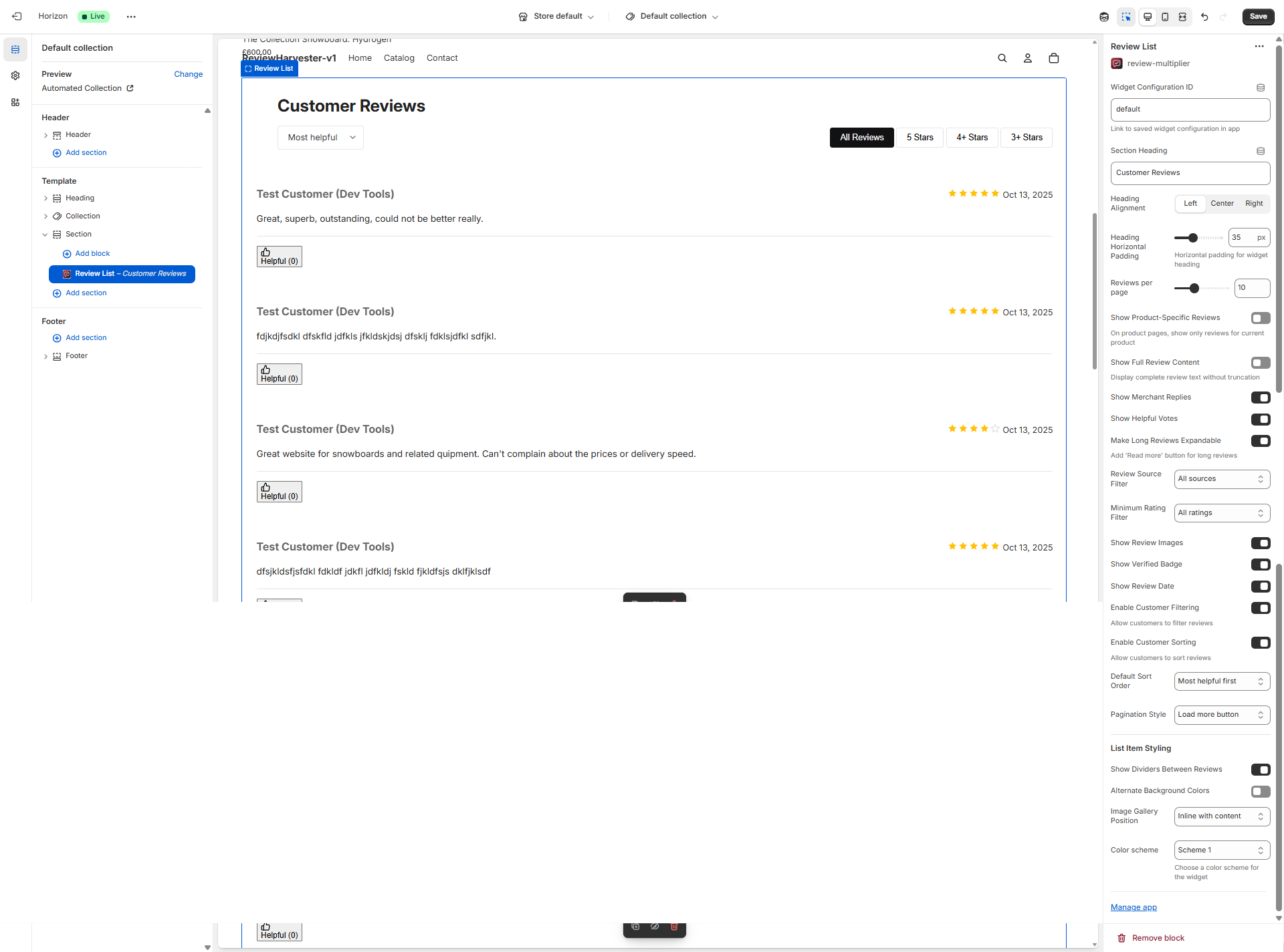
The List Widget settings panel in the Shopify theme editor, showing all available customization options for configuring your review list display.
Who Should Use the List Widget?
The List Widget is particularly well-suited for:
- Dedicated Reviews Pages: Creating standalone pages where reviews are the primary content
- High-Detail Product Pages: Products where customer experiences and detailed feedback drive purchasing decisions
- Service-Based Businesses: When reviews contain substantial narrative content about experiences
- B2B or High-Value Items: Products requiring thorough social proof and detailed customer perspectives
- Content-Rich Reviews: When your reviews frequently include detailed feedback, images, and merchant responses
Key Features
The List Widget offers several distinctive capabilities:
- Full-Width Layout: Reviews span the entire section width for maximum readability
- Expandable Content: Long reviews can be truncated with "Read more" functionality
- Merchant Replies: Display your responses to customer reviews inline
- Helpful Voting: Enable customers to vote on review helpfulness
- Flexible Pagination: Choose from page numbers, load more buttons, or infinite scroll
- Advanced Filtering & Sorting: Default-enabled filtering and sorting controls
- Image Gallery Options: Position review images inline, below content, or in a side panel
- Visual Dividers: Add dividers between reviews or alternate background colors
- Comprehensive Metadata: Show dates, verification badges, and source indicators
Section Heading
Setting Type: Text input
Default Value: Customer Reviews
Location: Second setting in the panel
What This Setting Does
The Section Heading appears at the top of your List Widget, providing context and drawing attention to the review content below. This is an important navigational and SEO element that helps customers understand what they're looking at and helps search engines index your review content appropriately.
How to Use This Setting
Simply enter the text you want to appear as the heading for this review section. The heading will be rendered as an H2 element in your page's HTML structure, which is semantically appropriate for a major page section.
Content Recommendations
Standard Headings:
- "Customer Reviews" (default - clear and universally understood)
- "What Our Customers Say"
- "Reviews from Real Customers"
- "Customer Feedback"
- "Product Reviews"
Engaging Headings:
- "See Why Customers Love [Product Name]"
- "Real Stories from Real Customers"
- "Hear From Our Community"
- "Trusted by Thousands of Happy Customers"
- "Don't Just Take Our Word For It"
Product-Specific Headings: When using the "Show Product-Specific Reviews" setting, consider headings like:
- "Reviews for [Product Name]" (using Liquid variables if your theme supports it)
- "Customer Experiences"
- "Verified Buyer Reviews"
Heading Length Considerations
- Short & Clear (2-3 words): Most scannable, works well on mobile, less engaging
- Medium (4-6 words): Good balance of clarity and personality
- Long (7+ words): More engaging, storytelling-focused, may wrap on mobile
When to Leave Blank
You can leave this field completely blank if:
- Your page design already has a heading above the widget
- You're embedding the widget in a section with its own heading
- You want a more minimal, design-forward layout
- The context is obvious from surrounding content
When blank, the widget will simply not display a heading, and the review content will start immediately.
Heading Alignment
Setting Type: Dropdown select Options: Left, Center, Right Default Value: Left Location: Third setting in the panel
What This Setting Does
This setting controls the horizontal alignment of your Section Heading text within the widget container. The alignment also affects the positioning of the filtering and sorting controls that appear below the heading.
Alignment Options Explained
Left Alignment (Default):
- Most common for body content
- Follows natural reading flow in left-to-right languages
- Works well with most theme designs
- Best for: Professional, clean layouts; themes with left-aligned body text; mobile-first designs
Center Alignment:
- Creates visual symmetry
- Draws more attention to the heading
- Common in editorial or magazine-style layouts
- Best for: Hero sections, landing pages, fashion/lifestyle brands, minimal designs
Right Alignment:
- Unusual but can create visual interest
- Works well in RTL (right-to-left) language contexts
- Can balance left-aligned content elsewhere on the page
- Best for: Artistic layouts, specific design requirements, RTL languages
Design Considerations
When choosing alignment, consider:
- Theme Consistency: Match the alignment style of other headings in your theme
- Page Context: Center alignment works better on dedicated reviews pages vs. product pages
- Width: Center alignment is more impactful with shorter headings
- Mobile Display: All alignments work on mobile, but center alignment can feel more natural on narrow screens
Interaction with Padding
The Heading Horizontal Padding setting (next) works differently based on alignment:
- Left: Padding adds space on the left side
- Center: Padding is not applied (heading stays centered)
- Right: Padding adds space on the right side
Heading Horizontal Padding
Setting Type: Range slider Range: 0-100 pixels Step: 5 pixels Default Value: 35px Location: Fourth setting in the panel
What This Setting Does
This setting adds horizontal padding (left or right depending on alignment) to your heading area, creating breathing room and visual alignment with other content on your page. This is particularly useful for aligning your widget heading with your theme's content column width or creating visual harmony with surrounding elements.
How the Padding Works
The padding behavior depends on your Heading Alignment setting:
With Left Alignment:
- Padding is applied to the left side only
- Pushes the heading away from the left edge
- Useful for aligning with your theme's content column
- Example: If your theme has 35px left padding on content, match it here
With Center Alignment:
- Padding is ignored (not applied)
- Heading remains perfectly centered
- This ensures symmetry is maintained
With Right Alignment:
- Padding is applied to the right side only
- Pushes the heading away from the right edge
- Useful for RTL layouts or specific design requirements
Choosing the Right Padding Value
0px - No Padding:
- Heading aligns flush with the widget container edge
- Use when: Widget is in a pre-padded container, you want edge-to-edge design
- Visual effect: Bold, modern, maximizes width
20-40px - Light Padding (includes 35px default):
- Subtle breathing room
- Aligns with most theme content columns
- Use when: Following standard theme padding conventions
- Visual effect: Professional, harmonious with theme
45-70px - Medium Padding:
- More pronounced inset
- Creates stronger visual alignment
- Use when: Matching wider theme containers or creating emphasis
- Visual effect: Deliberate, designed feel
75-100px - Heavy Padding:
- Significant inset from edge
- Creates narrow, focused heading area
- Use when: You have wide sections and want to create visual hierarchy
- Visual effect: Editorial, magazine-style layout
Testing Your Padding
The best approach is to:
- Set your heading alignment first
- Preview the widget on your actual storefront
- Adjust the padding slider while comparing to surrounding content
- Aim for visual alignment with other text elements on the page
Content & Display Settings
Reviews Per Page
Setting Type: Range slider Range: 5-20 reviews Step: 5 reviews Default Value: 10 reviews Location: Fifth setting in the panel
What This Setting Does
This setting determines how many review items are displayed on a single page before pagination controls appear. It's a crucial setting for balancing content richness with page performance and user experience.
The Tradeoff
Fewer Reviews (5-10):
- Faster initial page load
- Less scrolling required
- More frequent pagination interactions
- Better for: Mobile users, slower connections, longer reviews with images
More Reviews (15-20):
- More content visible without interaction
- Fewer pagination clicks needed
- Longer page load times
- More scrolling required
- Better for: Desktop users, fast connections, dedicated reviews pages
Recommended Values by Context
Product Pages with Mixed Content: 5-10 reviews
- Reviews are one element among many (product images, description, etc.)
- Customers often scan a few reviews then move on
- Shorter pages load faster and feel less overwhelming
Dedicated Reviews Pages: 10-15 reviews
- Reviews are the primary content
- Users came specifically to read reviews
- More content per page reduces friction
Reviews Landing Pages: 15-20 reviews
- Maximum content density
- Users expect comprehensive review information
- Often viewed on desktop with good connectivity
Interaction with Pagination Style
This setting works closely with your Pagination Style choice:
With "Page Numbers":
- Lower counts (5-10) create more pages but shorter pages
- Higher counts (15-20) create fewer pages but longer pages
- Page numbers give clear sense of total review volume
With "Load More Button":
- Initial count is what shows before any interaction
- Each "Load More" click adds this many more reviews
- Lower counts encourage more interactions but feel more responsive
- Higher counts mean fewer clicks to see all reviews
With "Infinite Scroll":
- This many reviews load automatically as user scrolls near bottom
- Lower counts mean more frequent loading moments (can feel janky)
- Higher counts mean smoother experience with less frequent loads
Performance Considerations
The List Widget renders full review content including:
- Complete review text (or truncated with expand option)
- Review images and galleries
- Merchant replies
- Helpful voting buttons
- Metadata (dates, ratings, verification badges)
Each review is content-rich, so the performance impact of 20 reviews is significantly higher than for a grid or masonry card. Monitor your page load speeds and adjust accordingly.
Performance Testing Approach:
- Set to default (10 reviews)
- Test page load speed on mobile and desktop
- If load time is acceptable, experiment with 15
- If load time is slow, try 5
- Find the sweet spot for your specific reviews and audience
Show Product-Specific Reviews
Setting Type: Checkbox (toggle) Default Value: Off (unchecked) Location: Sixth setting in the panel
What This Setting Does
When enabled on a product page, this setting filters the displayed reviews to show only reviews associated with the specific product being viewed. When disabled, the widget shows all reviews from your store regardless of which product they're associated with.
When This Setting Applies
📋 Free: plain text | Starter: HTML/plain/multipart | Pro: HTML/plain/multipart
This setting is context-aware and only affects the widget when:
- The widget is placed on a product page template in your Shopify theme
- The page being viewed is actually a product page (not home, collection, or custom page)
If the widget is on any other template type (home page, custom page, etc.), this setting has no effect, and all reviews are shown by default.
Use Cases
Keep This OFF When:
- You're building a general reviews page showing social proof from across your store
- You have limited reviews per product and want to show volume
- You sell similar/related products and want reviews to feel universal
- Your products are variations of the same thing (e.g., different colors of the same item)
- You want to maximize review visibility for SEO
Turn This ON When:
- You have product-specific reviews and want to show relevant feedback only
- Customers need to see feedback specific to their purchase decision
- Your products are distinct with different features and use cases
- You have enough product-specific reviews to fill the widget meaningfully
- Product accuracy is more important than review volume
Important Behavior Notes
Review Volume Impact: If you enable this setting but a product has few or no reviews, the widget will:
- Show only those few reviews (if any exist)
- Display the "No reviews" empty state if none exist
- Not fall back to showing other reviews
This can create sparse or empty widgets on less-reviewed products. Consider this when deciding whether to enable the setting globally or only on specific products.
Combined with Filtering: When enabled, product-specific filtering happens first, then other filters apply:
- Filter to current product's reviews only
- Then apply Review Type Filter (if set)
- Then apply Rating Filter (if set)
- Then apply customer-initiated filters (if enabled)
- Then apply sort order
This means you could end up with zero reviews displayed if the filters are too restrictive for a specific product.
Implementation Strategy
Strategy 1 - Product-Specific Only:
- Enable this setting for all product page widgets
- Create a separate general reviews page with the setting disabled
- Pro: Maximum relevance, clear separation
- Con: Some product pages may have few/no reviews
Strategy 2 - General Reviews Only:
- Keep this setting disabled everywhere
- Show store-wide social proof on all pages
- Pro: Consistent review visibility, volume appears higher
- Con: Less relevant, may confuse customers
Strategy 3 - Hybrid Approach:
- Use two different widget configurations
- Product pages: Enabled (show specific reviews when available)
- Other pages: Disabled (show all reviews for general social proof)
- Pro: Best of both approaches
- Con: More complex setup
Show Full Review Content
Setting Type: Checkbox (toggle) Default Value: Off (unchecked) Location: Seventh setting in the panel
What This Setting Does
This setting controls whether review content is displayed in full without truncation, or whether long reviews are shortened to a preview length. When disabled (default), reviews are shown at a reasonable preview length. This works in conjunction with the "Make Long Reviews Expandable" setting to create an optimal reading experience.
The Two Content Display Modes
Full Content Mode (Setting ON):
- Every review displays its complete text, regardless of length
- No truncation or "Read more" buttons
- Customers see everything immediately
- Best for: Detailed reviews, dedicated reviews pages, when most reviews are reasonably short
Preview Mode (Setting OFF - Default):
- Long reviews are truncated to a preview length (typically 3-4 lines)
- Works with "Make Long Reviews Expandable" setting
- If expandable setting is ON: Shows "Read more" button to expand
- If expandable setting is OFF: Content stays truncated
- Best for: Scanning multiple reviews quickly, mixed-length content, mobile experiences
Show Merchant Replies
Setting Type: Checkbox (toggle) Default Value: On (checked) Location: Eighth setting in the panel
What This Setting Does
When enabled, this setting displays merchant/owner replies to customer reviews directly inline with each review. This is a powerful feature for demonstrating customer service, addressing concerns, and building trust with potential customers.
Merchant replies appear directly below the associated customer review with distinct styling to differentiate from customer content.
Show Helpful Votes
Setting Type: Checkbox (toggle) Default Value: On (checked) Location: Ninth setting in the panel
What This Setting Does
This setting displays "Was this review helpful?" voting buttons on each review, allowing customers to indicate whether they found a particular review useful. This social feedback mechanism helps surface the most valuable reviews and provides engagement data.
When enabled, each review displays voting buttons and counts showing how many customers found the review helpful.
Make Long Reviews Expandable
Setting Type: Checkbox (toggle) Default Value: On (checked) Location: Tenth setting in the panel
What This Setting Does
When enabled, this setting automatically truncates long review content to a preview length and adds a "Read more" button that customers can click to expand and see the full review text. This creates a more scannable list while still providing access to complete review content.
Recommended Configuration: Show Full Content OFF + Expandable Content ON creates the optimal scanning experience with customer control over detail level.
Filtering & Sorting
Review Type Filter
Setting Type: Dropdown select Options: Both (product and store reviews), Product reviews only, Store reviews only Default Value: Smart default based on page context Location: Eleventh setting in the panel
What This Setting Does
The Review Type Filter determines which type of reviews are included in your widget display—whether they're linked to specific products or are general store/brand reviews.
Understanding Review Types
Product Reviews: Reviews that are linked to a specific product in your Shopify catalog. These are typically submitted through product pages or post-purchase emails where a specific product is identified.
Store Reviews: General reviews about your brand, service, or overall shopping experience. These include reviews collected without a specific product association, as well as reviews imported from platforms like Google Business Profile, Facebook, and Trustpilot.
Smart Defaults
The widget automatically selects an appropriate default based on where it's placed:
- Product pages: Defaults to "Product reviews only" — shows reviews specific to the product being viewed
- Homepage, collection pages, and other pages: Defaults to "Store reviews only" — shows general store/brand reviews
You can override these defaults by selecting a different option.
Option Details
Both (product and store reviews): Shows all reviews regardless of type. Best for dedicated review pages or maximum social proof.
Product reviews only: Only shows reviews linked to specific products. Best for product pages where customers want specific product feedback.
Store reviews only: Only shows store-level reviews and imported platform reviews. Best for homepage, about pages, and landing pages showcasing overall reputation.
Rating Filter
Setting Type: Dropdown select Options: All ratings, 3+ stars, 4+ stars, 5 stars only Default Value: All ratings Location: Twelfth setting in the panel
What This Setting Does
The Rating Filter allows you to set a minimum star rating threshold for reviews displayed in the widget. This is a pre-filter applied before reviews reach customers, letting you control the sentiment mix shown on your storefront.
All Ratings (Default - Recommended): Shows every review regardless of star rating for maximum transparency and authenticity.
Filtered Options: Choose 3+, 4+, or 5 stars only to show progressively more positive reviews, though this should be balanced against authenticity concerns.
Show Review Images
Setting Type: Checkbox (toggle) Default Value: On (checked) Location: Thirteenth setting in the panel
What This Setting Does
This setting controls whether customer-uploaded images attached to reviews are displayed within the widget. When enabled, review images appear as a gallery within or alongside each review (position controlled by the "Image Gallery Position" setting).
Customer images are powerful social proof that significantly increases trust and conversion rates compared to text-only reviews.
Show Verified Badge
Setting Type: Checkbox (toggle) Default Value: On (checked) Location: Fourteenth setting in the panel
What This Setting Does
When enabled, this setting displays a "Verified Purchase" or "Verified Buyer" badge on reviews from customers who actually purchased the product through your store. This badge provides an additional layer of trust and authenticity.
The verification badge helps customers distinguish between reviews from confirmed buyers versus general feedback, significantly increasing review credibility.
Show Review Date
Setting Type: Checkbox (toggle) Default Value: On (checked) Location: Fifteenth setting in the panel
What This Setting Does
This setting controls whether the review submission date is displayed on each review. Dates provide temporal context that helps customers assess review relevance and freshness.
Showing dates demonstrates transparency and helps customers understand if feedback is current or from earlier iterations of your product.
Enable Customer Filtering
Setting Type: Checkbox (toggle) Default Value: On (checked) Location: Sixteenth setting in the panel
What This Setting Does
When enabled, this setting displays interactive filter buttons above the review list that allow customers to filter reviews by star rating in real-time. Customers can click buttons like "All Reviews," "5 Stars," "4+ Stars," or "3+ Stars" to instantly filter the displayed reviews.
This is different from the "Rating Filter" setting (which pre-filters reviews merchant-side). Customer Filtering gives visitors control to explore reviews by rating on their own.
Default State: ON for List Widget (this widget is designed for exploration, unlike simpler widgets).
Enable Customer Sorting
Setting Type: Checkbox (toggle) Default Value: On (checked) Location: Seventeenth setting in the panel
What This Setting Does
When enabled, this setting displays a sort dropdown menu above the review list that allows customers to change the review sort order in real-time. Customers can choose from options like "Newest first," "Highest rating first," "Most helpful first," etc.
This is separate from the "Default Sort Order" setting (which sets the initial sort). Customer Sorting lets visitors reorder reviews dynamically.
Default State: ON for List Widget (exploration-focused widget).
Default Sort Order
Setting Type: Dropdown select Options: Newest first, Oldest first, Highest rating first, Lowest rating first, Most helpful first Default Value: Most helpful first Location: Eighteenth setting in the panel
What This Setting Does
This setting determines the initial order in which reviews are displayed when the widget first loads. If "Enable Customer Sorting" is ON, customers can change this order using the sort dropdown, but this setting controls what they see initially.
Most Helpful First (Default for List Widget): Shows reviews with the highest helpful vote counts first, surfacing the most valuable content immediately.
Pagination Style
Setting Type: Dropdown select Options: Page numbers, Load more button, Infinite scroll Default Value: Load more button Location: Nineteenth setting in the panel
What This Setting Does
This setting controls how customers navigate through multiple pages of reviews. Since the "Reviews Per Page" setting limits how many reviews appear at once, this setting determines the mechanism for accessing additional reviews beyond the initial set.
Page Numbers: Traditional pagination with numbered pages and prev/next buttons.
Load More Button (Default): Shows a button that loads additional reviews when clicked, appending them to the existing list.
Infinite Scroll: Automatically loads more reviews as the customer scrolls near the bottom of the review list, creating a seamless browsing experience.
List Item Styling
Show Dividers Between Reviews
Setting Type: Checkbox (toggle) Default Value: On (checked) Location: Twentieth setting in the panel
What This Setting Does
When enabled, this setting displays horizontal divider lines (borders) between individual review items in the list. These dividers create visual separation and make it easier to distinguish where one review ends and another begins.
Dividers are especially valuable in the List Widget because reviews can contain substantial content (text, images, replies, voting UI), making clear boundaries important for readability.
Alternate Background Colors
Setting Type: Checkbox (toggle) Default Value: Off (unchecked) Location: Twenty-first setting in the panel
What This Setting Does
When enabled, this setting applies alternating background colors to review items in the list, creating a "zebra striping" effect. Odd-numbered reviews get one background color, even-numbered reviews get another (typically a very subtle shade difference).
This is a classic UI pattern for improving scannability in long lists by providing visual rhythm and making it easier to track horizontal lines of text.
Image Gallery Position
Setting Type: Dropdown select Options: Inline with content, Below content, Side panel Default Value: Inline with content Location: Twenty-second setting in the panel
What This Setting Does
This setting controls where customer-uploaded review images appear relative to the review text content. Since List Widget reviews display full-width with substantial content, image positioning significantly impacts the layout and reading flow.
Inline with Content (Default): Images appear within the text flow, integrated with the review narrative.
Below Content: Images appear in a gallery section below the review text.
Side Panel: Images appear in a separate panel to the right side of the review text (desktop only).
Color Scheme
Setting Type: Dropdown select Options: Scheme 1, Scheme 2, Scheme 3 Default Value: Scheme 1 Location: Twenty-third setting in the panel
What This Setting Does
This setting applies one of three predefined color schemes to the widget, affecting text colors, background colors, borders, and other visual elements. The schemes are designed to complement different theme color palettes.
The schemes inherit and adapt to your Shopify theme's color settings, ensuring the widget integrates harmoniously with your store's design.
Best Practices
Optimal Configuration for Different Scenarios
Dedicated Reviews Landing Page:
- Reviews Per Page: 15-20 (maximize content)
- Show Full Content: OFF
- Expandable Content: ON
- Show Replies: ON
- Show Helpful Votes: ON
- Enable Filtering: ON
- Enable Sorting: ON
- Pagination Style: Load More or Infinite Scroll
Product Page Integration:
- Reviews Per Page: 5-10 (balanced with other product content)
- Show Product-Specific: ON
- Show Full Content: OFF
- Expandable Content: ON
- Show Replies: ON
- Pagination Style: Load More Button
Mobile-Optimized Setup:
- Reviews Per Page: 5-10 (shorter pages)
- Expandable Content: ON (critical for mobile)
- Image Position: Below Content (cleaner mobile flow)
- Pagination Style: Infinite Scroll (mobile-friendly)
Performance Optimization
The List Widget is content-rich, so performance considerations:
- Lower "Reviews Per Page" if page speed is slow (especially with images)
- Use "Load More" or "Infinite Scroll" instead of showing all reviews at once
- Enable "Expandable Content" to reduce initial DOM size
- Test mobile page load speeds and adjust accordingly
Engagement Maximization
To encourage customer interaction with reviews:
- Enable Helpful Voting to create engagement loops
- Enable Customer Filtering and Sorting for exploration
- Show Merchant Replies to demonstrate active community
- Use "Most Helpful" as default sort to surface best content first
SEO Best Practices
For maximum search engine value:
- Show All Ratings for content diversity
- Show Review Dates for temporal signals
- Show Verified Badges for trust signals
- Consider "Show Full Content" ON if SEO is priority over UX
- Use descriptive Section Headings with target keywords
Troubleshooting Common Issues
For comprehensive troubleshooting of widgets not displaying, see our detailed Troubleshooting Widgets Not Displaying guide.
Click to expand troubleshooting steps
No Reviews Appearing
Check:
- Widget Configuration ID is correct
- Filters aren't too restrictive (Rating Filter, Review Type Filter)
- You have published, approved reviews in your system
- Product-Specific setting isn't enabled on a product with no reviews
Pagination Not Showing
Pagination controls only appear when:
- Total reviews exceed "Reviews Per Page" count
- If you have 8 reviews and "Reviews Per Page" is 10, no pagination shows
Helpful Vote Counts Are All Zero
This is normal when:
- Widget is newly installed
- Traffic is low
- Give it time for customers to start voting
Images Not Displaying
Check:
- "Show Review Images" is enabled
- Reviews actually have customer-uploaded images
- Image URLs are accessible (not broken links)
Widget Feels Too Long/Busy
Try:
- Reducing "Reviews Per Page" count
- Enabling "Expandable Content" if not already
- Disabling "Show Dividers" for more compact feel
- Setting "Image Position" to "Below Content" or "Side Panel"
Summary
The List Widget is Review Multiplier's most comprehensive review display format, designed for maximum content depth and customer engagement. With 24 configurable settings, it offers unparalleled control over how reviews are presented, filtered, and navigated.
Key strengths include expandable content, merchant replies, helpful voting, flexible pagination, and advanced filtering capabilities. This makes it ideal for dedicated reviews pages, detailed product pages, and anywhere you want customers to deeply explore review content.
The default configuration (expandable content, helpful voting, filtering/sorting enabled, load more pagination) is optimized for engagement and usability, but you can customize every aspect to match your specific needs and customer behaviors.
For additional help with the Review Multiplier app, visit the full documentation site or contact support through the app admin.