Review Carousel Widget: Complete Settings Reference
Overview
The Review Carousel Widget is a dynamic, auto-rotating horizontal slider that displays customer reviews in an engaging, interactive format. Unlike static grid layouts, the carousel presents reviews one set at a time, creating a focused viewing experience that draws attention to individual testimonials while showcasing your full range of customer feedback through smooth transitions.
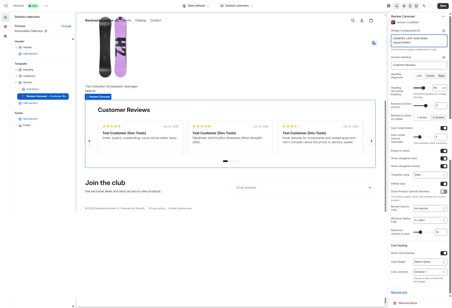
The Review Carousel Widget displayed in the Shopify theme editor with the complete settings panel visible on the right.
What Makes the Carousel Layout Special?
The carousel format offers unique advantages for displaying reviews:
- Focused Attention: Shows a limited set of reviews at once, eliminating overwhelm
- Automatic Rotation: Cycles through reviews without customer interaction
- Space Efficiency: Displays many reviews in a compact horizontal space
- Visual Movement: Animation catches the eye and maintains engagement
- Mobile-Friendly: Natural swipe gesture on touch devices
- Premium Feel: Carousels are associated with modern, polished interfaces
When to Use the Review Carousel Widget
The carousel is best suited for:
- Homepage hero sections: Create dynamic visual interest above the fold
- High-traffic landing pages: Automatic rotation showcases reviews to passive browsers
- Limited vertical space: When you need reviews but have height constraints
- Featured testimonials: Highlight your best reviews with focused presentation
- Mobile-first experiences: Swipeable carousels feel native on phones
Consider alternatives if:
- You want customers to scan many reviews quickly → Use Review Grid or Masonry instead
- You need comprehensive review browsing → Use Review List instead
- Customers need to filter or search reviews → Grid layouts work better
- Accessibility is paramount → Static layouts are more screen-reader friendly
Quick Start Configuration
Before diving into details, here's a quick checklist:
- Widget Configuration ID - Paste from Review Multiplier app (required)
- Section Heading - Add descriptive heading (e.g., "What Customers Love")
- Reviews to show - Set visible reviews (3 on desktop is standard)
- Auto-rotate - Enable for automatic slideshow effect
- Navigation controls - Enable arrows and dots for manual control
- Rating filter - Consider showing 4+ stars for best impression
Now let's explore each setting in detail.
Essential Settings
Widget Configuration ID
Type: Text input Required: Yes Default: "default"
This critical setting links the carousel to your widget configuration in the Review Multiplier app. Without the correct ID, reviews won't display properly.
How to Find Your ID
- Open Review Multiplier app in Shopify admin
- Navigate to Widgets
- Create new or select existing widget
- Copy the Widget Configuration ID from the installation page
- Paste into this field in the theme editor
Important: The ID is case-sensitive and typically looks like clxtk7m8q0001.... Copy it exactly with no extra spaces.
Troubleshooting
Click to expand troubleshooting steps
Reviews not showing?
- Verify complete ID was copied (no truncation)
- Check widget is "Active" status in the app
- Ensure you have reviews available for this configuration
- Try saving theme and hard-refreshing storefront
Content & Display Settings
Section Heading
Type: Text input Default: "Customer Reviews"
The text that appears above your carousel, providing context for the content.
Effective heading examples:
- "Hear from Happy Customers"
- "Real Reviews from Real People"
- "What Our Customers Say"
- "Verified Customer Feedback"
- "Loved by Thousands"
Tips:
- Keep under 40 characters for mobile
- Match your brand voice (formal vs casual)
- Consider your page context (homepage vs product page)
- Leave blank if your theme section already has a heading
Heading Alignment
Type: Dropdown select Options: Left, Center, Right Default: Left
Controls horizontal alignment of your section heading.
Left alignment: Traditional, editorial feel. Best for content-heavy pages.
Center alignment: Balanced, attention-grabbing. Best for homepage sections and symmetrical designs.
Right alignment: Unusual but can create visual interest. Use sparingly for artistic effect.
Design tip: Center-aligned headings work particularly well with carousels since the carousel itself is horizontally centered.
Heading Horizontal Padding
Type: Range slider Range: 0-100 pixels Step: 5 pixels Default: 35 pixels
Adds spacing to the left (for left-aligned) or right (for right-aligned) of your heading. No effect on center-aligned headings.
Recommended values:
- 0-15px: Minimal padding, heading near edge
- 20-40px: Standard padding, comfortable spacing (recommended)
- 45-70px: Generous padding, editorial feel
- 75-100px: Maximum padding for wide sections
Match this padding to other headings on your site for consistency.
Carousel Behavior Settings
Reviews to Show at Once
Type: Range slider Range: 1-4 reviews Default: 3 reviews
Determines how many review cards are visible simultaneously in the carousel viewport on desktop screens.
1 Review (Single-Slide)
Visual: One full-width review card fills the carousel
Best for:
- Maximum focus on individual testimonials
- Long-form detailed reviews
- Mobile-like experience on desktop
- Dramatic, bold presentation
- Featured customer stories
Consideration: Requires more clicks/rotations to see many reviews. Works best with auto-rotate enabled.
2 Reviews (Double-Slide)
Visual: Two review cards side-by-side
Best for:
- Balanced presentation
- Medium-length reviews
- Side-by-side comparison viewing
- Moderate desktop screen widths
- When you have pairs of complementary reviews
Consideration: Good compromise between focus and volume.
3 Reviews (Triple-Slide) - Default
Visual: Three review cards side-by-side
Best for:
- Standard carousel presentation
- Most use cases
- Optimal balance of visibility and quantity
- Wide desktop screens (1200px+)
- Brief to medium-length reviews
Consideration: The most common and expected configuration. Rarely the wrong choice.
4 Reviews (Quad-Slide)
Visual: Four review cards side-by-side
Best for:
- Very brief reviews (1-2 sentences)
- Ultra-wide screens (1400px+)
- Maximum content density
- "Social proof" style testimonials
- When you have many excellent short reviews
Consideration: Cards become narrow. Only use if reviews are consistently brief.
Responsive note: This setting only affects desktop. Mobile has its own setting (see below).
Reviews to Show on Mobile
Type: Dropdown select Options: 1 review or 2 reviews Default: 1 review
Controls visible review count on mobile devices (screens under 750px width).
1 Review (Recommended)
Why this is default:
- Mobile screens are narrow—one review fills space perfectly
- Maximum readability without squinting
- Natural swipe gestures for navigation
- Meets user expectations (carousels show one item on phones)
- Provides best user experience for 70-80% of e-commerce traffic
Use 1 review when:
- Reviews average more than 20 words (most cases)
- Your mobile traffic is 60%+ of total
- Readability is priority
- You want accessible design
2 Reviews
Visual: Two narrow cards side-by-side on phone
When to consider:
- Reviews are extremely brief (10-15 words max)
- You're showcasing ratings/stars more than text
- Your brand targets younger, mobile-first demographics
- You've specifically tested and confirmed better engagement
Consideration: Makes text small and hard to read. Only use if reviews are very short.
Pro tip: Keep this at 1 review for 95% of stores. Mobile readability is crucial.
Auto-Rotate Slides
Type: Toggle (checkbox) Default: ON (enabled)
Controls whether the carousel automatically advances through reviews without user interaction.
When Enabled (Recommended)
What happens:
- Carousel automatically transitions to next review(s) after set interval
- Creates slideshow effect that draws passive attention
- Cycles through all reviews without clicks
- Pauses when user hovers (if "Pause on hover" enabled)
Benefits:
- Captures attention: Movement draws the eye
- Passive engagement: Showcases reviews to browsers who don't interact
- Maximizes exposure: All reviews get viewed eventually
- Modern feel: Dynamic interfaces feel premium and polished
- Mobile advantage: Auto-advance reduces need for touch interaction
Best for:
- Homepage and landing pages (passive browsing)
- Hero sections (attention-grabbing)
- When customers aren't actively researching (browsing mode)
- Mobile-heavy traffic (reduces interaction requirement)
- Featured testimonials (let them play like a slideshow)
When Disabled
What happens:
- Carousel remains static until customer clicks arrows or dots
- Reviews only change when manually navigated
- No automatic movement
Benefits:
- Customer control: Users browse at their own pace
- Reading time: No pressure to read before slide changes
- Accessibility: Some users find auto-rotation disorienting
- Focus: No distraction from automatic movement
Best for:
- Product pages (active research mode)
- Detailed reviews that require reading time
- Older demographics (less comfortable with auto-advance)
- Accessibility-focused implementations
- When users are actively researching before purchase
Making the Choice
Enable auto-rotate if:
- Carousel is on homepage or above fold
- You want to grab attention with movement
- Reviews are brief enough to read quickly (2-3 sentences)
- Your traffic is mobile-heavy (auto-advance helps mobile users)
Disable auto-rotate if:
- Reviews are long and detailed (need reading time)
- Users are in active research mode (product pages)
- Accessibility is top priority
- You've received feedback about rotation being annoying
Pro tip: Enable auto-rotate with 5-6 second intervals on homepage. Disable on product pages for research-focused browsing.
Auto-Rotate Interval (Seconds)
Type: Range slider Range: 3-10 seconds Default: 5 seconds
When auto-rotate is enabled, this controls how long each slide is visible before automatically advancing.
3 Seconds (Fast)
Best for:
- Very brief reviews (one sentence)
- "Social proof" style quick testimonials
- High-energy, fast-paced brand personality
- When you have many reviews to showcase quickly
Consideration: May be too fast for customers to read longer reviews. Only use for very short content.
4-5 Seconds (Standard)
Best for:
- Most use cases (5 seconds is the default)
- Brief to medium reviews (2-4 sentences)
- Balanced pace—fast enough to maintain interest, slow enough to read
- Homepage carousel sections
Consideration: The sweet spot for most stores. Fast enough to feel dynamic, slow enough to read.
6-7 Seconds (Moderate)
Best for:
- Medium-length reviews (4-6 sentences)
- Detailed testimonials with substance
- Older demographics who read more slowly
- When showing multiple reviews per slide (2-3 reviews visible)
Consideration: Good for more detailed content without feeling sluggish.
8-10 Seconds (Slow)
Best for:
- Long, detailed reviews (6+ sentences)
- Reviews with customer photos (need time to view)
- Accessibility (more time for all users to read)
- When each review is highly valuable
Consideration: May feel too slow and lose attention. Use only when content justifies longer viewing time.
How to Choose
Calculate reading time:
- Average reading speed: ~250 words per minute = ~4 words per second
- Count words in typical review, divide by 4, add 1-2 seconds buffer
- Example: 20-word review = 5 seconds (20÷4) + 1 second = 6 seconds
General recommendations:
- Brief reviews (10-20 words): 4-5 seconds
- Medium reviews (20-40 words): 5-7 seconds
- Detailed reviews (40+ words): 7-10 seconds
- Multiple reviews per slide: Add 2 seconds
User testing tip: Watch people use your site. If they're still reading when slide changes, increase the interval.
Pause on Hover
Type: Toggle (checkbox) Default: ON (enabled)
When auto-rotate is enabled, this controls whether rotation pauses when a customer's mouse hovers over the carousel.
When Enabled (Recommended)
What happens:
- Customer hovers mouse over carousel → rotation pauses
- Customer moves mouse away → rotation resumes
- Provides control without disabling auto-rotate
Benefits:
- Best of both worlds: Auto-advance for passive viewers, control for engaged readers
- Reading time: Customers can pause to finish reading by hovering
- User-friendly: Intuitive interaction pattern
- Standard convention: Expected behavior on most carousels
- Accessibility improvement: Gives users control over timing
When to enable:
- Desktop traffic is significant (hover doesn't work on touch devices)
- You have auto-rotate enabled
- Reviews require reading time
- User control is valued
When Disabled
What happens:
- Carousel continues rotating even when hovered
- No way to pause except clicking navigation arrows
When to disable:
- You want unstoppable auto-advance (aggressive)
- Reviews are so brief that pausing isn't needed
- Your traffic is 90%+ mobile (hover doesn't apply)
Recommendation: Keep this enabled whenever auto-rotate is on. It's a user-friendly feature with no downside.
Show Navigation Dots
Type: Toggle (checkbox) Default: ON (enabled)
Controls whether dot indicators appear below the carousel, showing total slides and current position.
When Enabled (Recommended)
What you see:
- Small dots below carousel (e.g., ○ ○ ● ○ ○)
- Current slide dot is highlighted/filled
- Dots are clickable to jump to specific slides
- Number of dots = total number of slides
Benefits:
- Orientation: Customers know how many review sets exist
- Progress indicator: Shows position in the carousel
- Navigation: Click dots to jump to specific slides
- Standard convention: Expected carousel UI element
- Visual polish: Completes the carousel design
Best for:
- Most use cases (standard carousel feature)
- When you have 5-15 slides (readable number of dots)
- Desktop and mobile (dots work on both)
- Providing navigation options beyond arrows
When Disabled
What you see:
- No dots below carousel
- No visual indication of total slides or position
- Customers can't tell how many reviews exist
When to disable:
- Ultra-minimalist design aesthetic
- You have many slides (20+ dots looks cluttered)
- You only want arrow navigation
- Space is extremely limited below carousel
Consideration: Dots are small and unobtrusive. Most stores should keep them enabled for improved user experience.
Show Navigation Arrows
Type: Toggle (checkbox) Default: ON (enabled)
Controls whether left/right arrow buttons appear on the carousel sides for manual navigation.
When Enabled (Recommended)
What you see:
- Circular arrow buttons on left and right sides of carousel
- Left arrow (←): Navigate to previous reviews
- Right arrow (→): Navigate to next reviews
- Arrows typically appear on hover (desktop) or always visible (mobile)
Benefits:
- Manual control: Customers can navigate at their own pace
- Override auto-rotate: Take control even with auto-advance enabled
- Accessible navigation: Large click targets, keyboard accessible
- Expected pattern: Standard carousel interface
- Mobile-friendly: Large touch targets for swiping alternative
Best for:
- All carousels (standard feature)
- Customers who want control over browsing
- When auto-rotate is disabled (arrows become primary navigation)
- Accessibility (keyboard arrow keys work with arrows enabled)
When Disabled
What you see:
- No arrow buttons
- Navigation only via dots (if enabled) or auto-rotate
- Swipe gestures still work on mobile
When to disable:
- Extremely minimalist design (dots-only navigation)
- You want to force auto-rotate experience (no manual override)
- Design aesthetic requires clean, arrow-free layout
- You have infinite loop + auto-rotate (users never need to navigate back)
Recommendation: Keep arrows enabled for 95% of cases. They provide control without harming design when implemented well.
Transition Style
Type: Dropdown select Options: Slide, Fade, Cover Flow Default: Slide
Controls the animation effect when transitioning between review slides.
Slide (Default)
Animation: Reviews slide horizontally from right to left (or vice versa)
Visual effect:
- New reviews slide in from the side
- Old reviews slide out the opposite side
- Continuous horizontal motion
- Most common carousel animation
Personality:
- Standard: Expected, familiar pattern
- Dynamic: Clear sense of movement and progression
- Directional: Shows there are more reviews in that direction
Best for:
- Most use cases (recommended default)
- When showing multiple reviews per slide
- Horizontal-focused designs
- Long carousels with many reviews
Technical advantage: Best performance on most devices.
Fade
Animation: Current reviews fade out while next reviews fade in
Visual effect:
- Reviews crossfade/dissolve between slides
- No horizontal movement
- Smooth, ethereal transition
- Cards appear and disappear in place
Personality:
- Sophisticated: Elegant, refined feeling
- Calm: Gentle, no jarring movement
- Magical: Reviews appear/disappear smoothly
- Premium: Often associated with luxury brands
Best for:
- Luxury/premium brands
- Single review per slide (works best with 1 visible card)
- Slower auto-rotate speeds (6+ seconds)
- Editorial, magazine-like presentations
- When movement would be distracting
Consideration: Less obvious that it's a carousel (no directional movement). Ensure arrows/dots are visible.
Cover Flow
Animation: 3D perspective effect with center card prominent, side cards angled
Visual effect:
- Apple's famous Cover Flow/carousel effect
- Center review is full size and straight-on
- Side reviews are smaller and angled (perspective)
- Creates depth and 3D feeling
- Rotates/flips as it advances
Personality:
- Modern: Contemporary, tech-forward
- Dynamic: Most visually striking option
- Engaging: Eye-catching, novel effect
- Playful: Fun, interactive feeling
Best for:
- Modern, tech-forward brands
- Creating visual impact and differentiation
- Showing 3 reviews per slide (effect works best with 3)
- Desktop-focused experiences (effect most visible on larger screens)
- When you want carousel to be a focal point
Consideration:
- Most visually complex (slight performance impact on older devices)
- May not match all design aesthetics (works best with modern themes)
- Side reviews are partially obscured (center review is focus)
How to Choose
Use Slide if:
- You're unsure which to choose (safe default)
- You want standard, expected carousel behavior
- You're showing 2-4 reviews per slide
- Performance is critical (mobile-heavy traffic)
Use Fade if:
- Your brand is premium/luxury
- You want sophisticated, calm transitions
- You're showing 1 review per slide
- Your design is minimal and elegant
Use Cover Flow if:
- You want to create visual impact
- Your brand is modern and tech-forward
- You're showing exactly 3 reviews per slide
- You want the carousel to stand out
- Desktop traffic is significant
Infinite Loop
Type: Toggle (checkbox) Default: ON (enabled)
Controls whether the carousel loops back to the beginning after reaching the end, creating an endless cycle.
When Enabled (Recommended)
What happens:
- Carousel reaches last slide → next advance loops back to first slide
- Creates continuous, never-ending rotation
- No "end" to the carousel
- Works in both directions (can go backward from first to last)
Benefits:
- Seamless experience: No dead ends or "restart" needed
- Better with auto-rotate: Carousel continues indefinitely without stopping
- Exploration: Customers can browse indefinitely without hitting a wall
- Expectation: Most carousels work this way (standard behavior)
Best for:
- Auto-rotate enabled (carousel runs continuously)
- When you have 5+ slides (looping makes sense with more content)
- Homepage/landing pages (passive browsing)
- Creating smooth, uninterrupted experience
When Disabled
What happens:
- Carousel reaches last slide → next arrow is disabled
- Must navigate backward to return to beginning
- Carousel has distinct beginning and end
- Linear progression only
When to disable:
- You want customers to browse linearly (start to finish)
- You have few slides (3-4) where looping feels repetitive
- You want customers to sense they've "completed" viewing reviews
- Creating a narrative or story progression
Recommendation: Keep infinite loop enabled for most cases, especially with auto-rotate. It creates the smoothest user experience.
Filtering & Content Control
Show Product-Specific Reviews
Type: Toggle (checkbox) Default: OFF
When enabled on product pages, displays only reviews for the current product being viewed instead of all reviews.
Enable when:
- You collect product-specific reviews
- Carousel is on product page template
- Customers need to see feedback specific to their purchase consideration
- You have many different products with separate review sets
Leave disabled when:
- You collect store/company reviews (not product-specific)
- Carousel is on homepage/collection pages
- You want to show overall store reputation
- You have few products
Important: This setting only has effect on product pages. On other pages, it shows reviews based on your widget configuration.
Review Type Filter
Type: Dropdown select Options: Both (product and store reviews), Product reviews only, Store reviews only Default: Smart default based on page context
Filter which reviews display based on review type—whether they're linked to specific products or are general store/brand reviews.
Understanding Review Types
Product Reviews: Reviews that are linked to a specific product in your Shopify catalog. These are typically submitted through product pages or post-purchase emails where a specific product is identified. Best for product pages where customers want to see feedback about that specific item.
Store Reviews: General reviews about your brand, service, or overall shopping experience. These include reviews collected without a specific product association, as well as reviews imported from platforms like Google Business Profile, Facebook, and Trustpilot. Best for homepage, about pages, and landing pages where you want to showcase overall reputation.
Smart Defaults
The widget automatically selects an appropriate default based on where it's placed:
- Product pages: Defaults to "Product reviews only" — shows reviews specific to the product being viewed
- Homepage, collection pages, and other pages: Defaults to "Store reviews only" — shows general store/brand reviews
You can override these defaults by selecting a different option.
Option Details
Both (product and store reviews): Shows all reviews regardless of type. Maximizes review volume and comprehensive social proof.
Product reviews only: Only shows reviews linked to specific products. Best for product pages to help customers make informed purchasing decisions about that specific item.
Store reviews only: Only shows store-level reviews and imported platform reviews. Best for building general brand trust and showcasing overall customer satisfaction.
Strategic Use
- Product pages: Product reviews only (relevant product feedback)
- Homepage: Store reviews only (general reputation and trust)
- Collection pages: Store reviews only or Both (depends on your strategy)
- Landing pages: Store reviews only (brand credibility)
- About page: Store reviews only (overall customer satisfaction)
Minimum Rating Filter
Type: Dropdown select Options: All ratings, 4+ stars, 5 stars only Default: 4+ stars
Filter which reviews display based on star rating.
All ratings: Shows every review regardless of rating. Most transparent and trustworthy.
4+ stars (Default): Shows only 4 and 5-star reviews. Creates positive impression while maintaining authenticity.
5 stars only: Shows only perfect reviews. Maximum positive impression but may reduce trust if too perfect.
Carousel-Specific Consideration
Unlike grids where customers can scan many reviews, carousels show limited reviews at once. The ratings you choose have magnified impact:
- 4+ stars recommended: Carousels benefit from consistently positive reviews since customers see fewer total reviews
- All ratings use carefully: Ensure you have enough positive reviews that a 2-star review in rotation won't hurt conversion
- 5 stars only: More acceptable in carousels than grids (curated "best of" makes sense with featured presentation)
Pro tip for carousels: "4+ stars" strikes the best balance—shows excellent feedback while maintaining authenticity.
Maximum Reviews to Load
Type: Range slider Range: 5-20 reviews Step: 5 (options: 5, 10, 15, 20) Default: 10 reviews
Controls the total number of reviews loaded into the carousel.
How This Setting Works
Example with "Reviews to show: 3" and "Maximum reviews: 10":
- Carousel loads 10 reviews from database
- Displays 3 reviews at a time in viewport
- Has approximately 3-4 slides total (10 reviews ÷ 3 per slide)
- Customers can cycle through ~4 slides to see all 10 reviews
Important: This is TOTAL reviews loaded, not reviews per slide.
5 Reviews (Minimal)
Results in: ~2-5 slides depending on reviews per slide setting
Best for:
- Curated "best of" selections
- Very limited review collection
- Fastest loading performance
- Featured testimonials only
Consideration: Limited variety. Only use if you're showcasing your absolute best reviews or have few total reviews.
10 Reviews (Standard)
Results in: ~3-10 slides depending on reviews per slide setting
Best for:
- Most carousels (recommended)
- Balanced variety without overloading
- Good performance while showing range
- Standard use cases
Consideration: Sweet spot for most stores. Enough variety without overwhelming.
15 Reviews
Results in: ~5-15 slides depending on reviews per slide setting
Best for:
- Stores with many excellent reviews
- Homepage feature sections
- When you want to showcase variety
- Engaged customer base that browses thoroughly
Consideration: More content to load. Ensure you have 15 excellent reviews worth featuring.
20 Reviews (Maximum)
Results in: ~7-20 slides depending on reviews per slide setting
Best for:
- Comprehensive review showcases
- Stores with hundreds of reviews
- When carousel is primary review display method
- Desktop-heavy, patient audiences
Consideration: Longest load time. Most customers won't see all 20. Only use if you have many excellent reviews.
How to Choose
Consider your total reviews:
- Under 20 total reviews: Load 5-10 (show your best)
- 20-50 total reviews: Load 10-15 (good variety)
- 50+ total reviews: Load 15-20 (comprehensive showcase)
Consider page context:
- Homepage: 10-15 (variety without overwhelming)
- Product pages: 5-10 (focused on relevant reviews)
- Dedicated review page: 20 (or use grid layout instead)
Performance consideration: Each review loads text, images, and data. Mobile users on slower connections most affected. Prefer 10-15 for best balance.
Card Styling Settings
Show Card Shadow
Type: Toggle (checkbox) Default: ON (enabled)
Adds subtle drop shadow around each review card for depth and visual separation.
When enabled:
- Cards appear elevated above background
- Creates 3D depth effect
- Helps cards stand out
- Professional, modern look
When disabled:
- Flat cards with no shadow
- Ultra-minimalist aesthetic
- Better for dark backgrounds (shadows less visible anyway)
Recommendation: Keep enabled for light backgrounds. Disable for dark backgrounds or extremely minimal designs.
Card Height
Type: Dropdown select Options: Auto (fit content), Fixed height, Match tallest Default: Match tallest (uniform)
Controls how review card heights are managed in the carousel.
Auto (Fit Content)
How it works:
- Each card's height adjusts to fit its content
- Short reviews = shorter cards
- Long reviews = taller cards
- Card heights vary slide-to-slide
Visual effect:
- Dynamic, organic appearance
- Carousel height changes as slides change
- Can feel "jumpy" if heights vary significantly
Best for:
- Reviews with widely varying lengths
- When content authenticity is paramount
- Single review per slide (one card height at a time)
- Minimal/organic design aesthetic
Consideration: May cause layout shift as carousel advances. Users might need to readjust viewing position.
Fixed Height
How it works:
- All cards set to specific pixel height
- Content taller than height is truncated or scrolls
- Consistent card height across all slides
Visual effect:
- Uniform, stable appearance
- No layout shift between slides
- May cut off long reviews or show empty space in short reviews
Best for:
- Highly consistent review lengths
- When stability is more important than showing full content
- Grid-like, structured aesthetic
Consideration: Long reviews may be cut off. Ensure reviews fit within the fixed height or provide "Read more" functionality.
Match Tallest (Uniform) - Default
How it works:
- Carousel calculates tallest review
- Sets all cards to match that height
- Shorter reviews have extra whitespace at bottom
- Maintains consistent height across all slides
Visual effect:
- Stable, no height changes between slides
- Uniform appearance like a grid
- Some cards may have bottom padding/whitespace
Best for:
- Multiple reviews per slide (2-4 cards side-by-side)
- Professional, polished appearance
- Preventing layout shift
- Most use cases (recommended default)
Benefit: Best of both worlds—shows full content while maintaining visual stability.
How to Choose
Use Auto if:
- Showing 1 review per slide (no side-by-side comparison)
- Content authenticity matters most
- You have organic, conversational brand voice
Use Fixed if:
- You need absolute height consistency
- Reviews are consistently similar length
- You have scrollable cards or truncation handling
Use Match tallest if: ✅ RECOMMENDED
- Showing 2+ reviews per slide (side-by-side)
- You want professional, stable appearance
- You don't want layout jumping between slides
- Covering most standard use cases
Color Scheme
Type: Dropdown select Options: Scheme 1, Scheme 2, Scheme 3 Default: Scheme 1
Selects from your theme's pre-defined color palettes for the carousel.
Scheme 1 (Default): Usually your theme's primary/neutral palette. Clean, professional standard.
Scheme 2: Usually secondary/accent colors. Adds visual interest and differentiation.
Scheme 3: Usually contrast/alternative colors (often dark background). Bold, attention-grabbing.
How to choose:
Test all three schemes in the theme editor and select the one that:
- Has best readability (sufficient text contrast)
- Matches surrounding sections appropriately
- Fits your brand aesthetic
- Makes star ratings clearly visible
Strategic use:
- Same scheme as surrounding sections: Carousel blends in (supporting content)
- Different scheme: Carousel stands out (featured content)
Accessibility reminder: Ensure chosen scheme has adequate contrast (WCAG AA: 4.5:1 minimum for text).
Best Practices & Recommendations
Optimal Configuration by Page Type
Homepage Hero Section:
- Reviews to show: 3
- Auto-rotate: ON (5-6 seconds)
- Transition: Slide or Cover Flow
- Rating filter: 4+ stars
- Maximum reviews: 10-15
- Card height: Match tallest
Product Pages:
- Reviews to show: 2-3
- Auto-rotate: OFF (let customers control)
- Show product-specific: ON
- Transition: Slide
- Rating filter: All ratings or 4+
- Maximum reviews: 10
Landing Pages (Ads):
- Reviews to show: 1 (focus)
- Auto-rotate: ON (4-5 seconds, fast engagement)
- Transition: Fade (elegant)
- Rating filter: 5 stars only or 4+ (maximize positive impression)
- Maximum reviews: 5-10 (curated best)
Mobile Optimization
Critical for carousel success (70%+ of traffic is mobile):
- Always set "Reviews to show on mobile" to 1
- Keep auto-rotate interval at 5+ seconds (mobile users read slower)
- Enable both arrows and dots (multiple navigation options)
- Test swipe gestures (should work smoothly)
- Ensure text is large enough to read on small screens
Performance Optimization
Keep carousels fast:
- Maximum reviews: 10-15 (not 20) for best loading speed
- Enable image optimization in Review Multiplier settings
- Consider disabling auto-rotate on product pages (one less script running)
- Test on 3G connection speed (not just fast WiFi)
Accessibility Considerations
Make carousels accessible to all users:
- Keep auto-rotate OFF or enable "Pause on hover"
- Enable navigation arrows (keyboard accessible)
- Ensure sufficient color contrast in chosen scheme
- Don't rely solely on color to convey information
- Test with screen readers (announce slide changes)
Auto-rotate accessibility: Some users find auto-advancing content disorienting. Consider disabling on pages where users are actively reading/researching.
A/B Testing Recommendations
Test these variables to optimize:
- Auto-rotate ON vs OFF - Measure time on page and engagement
- Rating filter: All vs 4+ stars - Measure conversion rate
- Reviews to show: 1 vs 3 - Measure clicks and interaction
- Transition style: Slide vs Fade - Measure perception (survey)
What to measure:
- Conversion rate
- Time on carousel section
- Navigation clicks (arrow/dot usage)
- Review read rate (how many customers actually browse)
Troubleshooting Common Issues
For comprehensive troubleshooting of widgets not displaying, see our detailed Troubleshooting Widgets Not Displaying guide.
Click to expand troubleshooting steps
Carousel Not Appearing
Check:
- Widget Configuration ID is correct and complete
- Widget is "Active" status in Review Multiplier app
- You have reviews available with selected filters
- No JavaScript errors in browser console (F12 → Console)
Auto-Rotate Not Working
Check:
- "Auto-rotate slides" toggle is ON
- No JavaScript errors blocking carousel script
- Browser allows scripts (some ad blockers interfere)
- Hover state isn't active (if "Pause on hover" enabled)
Navigation Arrows Not Showing
Check:
- "Show navigation arrows" toggle is ON
- Theme CSS isn't hiding arrows (check with theme developer)
- Arrows may appear only on hover (desktop behavior)
- Sufficient reviews loaded (arrows disabled if only 1 slide exists)
Cards Different Heights (When You Want Uniform)
Solution:
- Change "Card Height" to "Match tallest" instead of "Auto"
- Save theme and refresh
- Ensures all cards match tallest card's height
Carousel Too Slow/Fast
Solution:
- Adjust "Auto-rotate interval" setting
- Faster: 3-4 seconds for brief reviews
- Slower: 6-10 seconds for detailed reviews
- Calculate based on average words per review
Performance Issues (Slow Loading)
Solution:
- Reduce "Maximum reviews to load" to 10
- Ensure Review Multiplier image optimization is enabled
- Check if reviews have many large customer photos
- Consider reducing reviews per slide (fewer cards = faster render)
Related Documentation
- Widget Installation Guide: Adding the carousel to your theme
- Review Collection: Gathering customer feedback
- Review Grid Widget: Alternative static grid layout
- Review Masonry Widget: Alternative Pinterest-style layout
- Carousel Best Practices: Advanced carousel optimization techniques
Summary
The Review Carousel Widget offers a dynamic, engaging way to showcase customer reviews through auto-rotating slides and smooth transitions. By thoughtfully configuring settings like auto-rotation, visible reviews, transition styles, and navigation controls, you can create a carousel that captures attention, builds trust, and seamlessly integrates with your brand aesthetic.
Key Takeaways:
- Auto-rotate works best on homepage: Passive engagement for browsers
- Disable auto-rotate on product pages: Let researchers control their pace
- Mobile: always 1 review per slide: Readability is critical on small screens
- 4+ stars default for carousels: Curated positive impression is expected in this format
- 10-15 reviews maximum: Sweet spot for variety without overload
- Match tallest card height: Prevents jarring layout shifts
- Enable arrows and dots: Multiple navigation options improve UX
For additional help or customization needs, contact Review Multiplier support through the app dashboard.