Masonry Grid Widget: Complete Settings Reference
Overview
The Masonry Grid Widget (also known as Review Masonry) is a Pinterest-style review display widget that creates a dynamic, cascading layout of customer reviews on your Shopify storefront. Unlike traditional grid layouts where all cards are the same height, the masonry layout allows review cards of varying heights to flow naturally, creating an engaging, modern visual experience that makes the most efficient use of screen space.
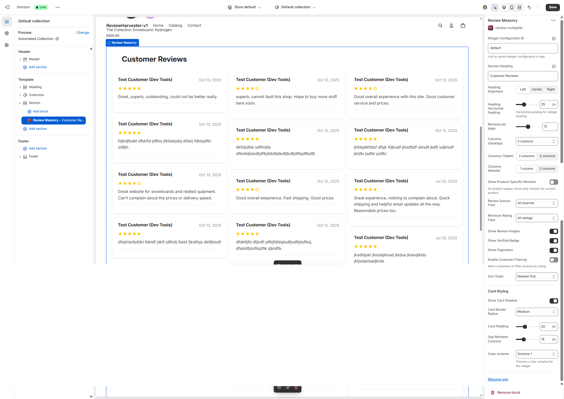
The Masonry Grid Widget displayed in the Shopify theme editor with the complete settings panel visible on the right.
What Makes the Masonry Layout Special?
The masonry layout is ideal for displaying reviews of varying lengths. Since customer reviews naturally vary in content length—some customers write brief comments while others provide detailed testimonials—the masonry layout ensures that:
- Space is optimized: No awkward white space in cards with shorter content
- Visual interest is maximized: The staggered heights create a dynamic, magazine-like appearance
- Readability is maintained: Each review gets exactly the space it needs
- Mobile responsiveness works beautifully: Cards reflow naturally across different screen sizes
When to Use the Masonry Grid Widget
The Masonry Grid Widget is best suited for:
- Homepage review sections: Create visual impact with a diverse collection of reviews
- Dedicated review pages: Display your full review collection in an engaging layout
- Mixed review lengths: When you have reviews ranging from brief comments to detailed testimonials
- Visual-heavy reviews: Reviews that include customer photos benefit from variable card heights
- Modern, editorial designs: The Pinterest-style layout fits contemporary, magazine-inspired themes
Consider alternatives if:
- You need uniform, structured appearance → Use the Review Grid Widget instead
- You want horizontal scrolling → Use the Review Carousel Widget instead
- You need vertical scrolling lists → Use the Review List Widget instead
Quick Start Configuration Checklist
Before diving into detailed settings, here's a quick checklist to get your Masonry Grid Widget up and running:
- Paste your Widget Configuration ID (required - get this from the Review Multiplier app)
- Set your section heading (e.g., "What Our Customers Say")
- Choose column counts for desktop, tablet, and mobile
- Select review source (all sources, or filter to specific platforms)
- Configure card styling to match your brand
- Test on multiple devices to ensure responsive layout works correctly
Now let's explore each setting in detail.
Essential Settings
Widget Configuration ID
Location: Top of settings panel Type: Text input field Required: Yes Default: "default"
What It Does
The Widget Configuration ID is the critical link between this theme block and your review widget configuration in the Review Multiplier app. This ID tells the block which set of reviews to display, which filtering rules to apply, and which styling preferences to use.
How to Find Your Widget Configuration ID
- Open the Review Multiplier app from your Shopify admin
- Navigate to Widgets in the app
- Either create a new widget or select an existing one
- On the widget details or installation page, you'll see the Widget Configuration ID displayed prominently
- Copy this ID (it typically looks like:
clxtk7m8q0001...or similar) - Paste it into this field in the theme editor
Important Notes
- Without this ID, the widget will attempt to display using default settings, which may not show your reviews correctly
- Each widget can have a unique ID, allowing you to display different review sets on different pages
- The ID is case-sensitive, so copy and paste it exactly as shown
- You can reuse the same ID on multiple pages if you want the same review configuration everywhere
Troubleshooting
Click to expand troubleshooting steps
If your reviews aren't displaying:
- Verify you've copied the complete Widget Configuration ID (no extra spaces)
- Ensure the widget is set to "Active" status in the Review Multiplier app
- Check that you have reviews available for the selected configuration
- Try saving the theme and refreshing your storefront
Content & Display Settings
Section Heading
Location: Near top of settings panel Type: Text input field Default: "Customer Reviews"
What It Does
This setting controls the text that appears as a heading above your masonry grid of reviews. It introduces the review section to your customers and provides context for the content below.
Configuration Options
- Leave blank: No heading will be displayed (useful if your theme section already has a heading)
- Enter custom text: Any text you enter will appear as an H2 heading above the reviews
- Use emojis: You can include emojis in the heading (e.g., "⭐ Customer Reviews" or "What Our Customers Say 💬")
Best Practices
Effective heading examples:
- "What Our Customers Say"
- "Real Reviews from Real Customers"
- "Customer Experiences"
- "Hear from Happy Customers"
- "Verified Customer Feedback"
- "Reviews That Matter"
Tips:
- Keep it under 40 characters for mobile readability
- Use action-oriented language when possible
- Match your brand voice (formal, casual, playful, etc.)
- Consider your page context (product page vs homepage may use different headings)
- Test readability across different screen sizes
Examples by Use Case
| Page Type | Suggested Heading |
|---|---|
| Homepage | "What Our Customers Are Saying" |
| Product Page | "Product Reviews" or "Customer Feedback" |
| Dedicated Review Page | "All Customer Reviews" or "Review Gallery" |
| About Us Page | "Trusted by Thousands" or "Customer Stories" |
Heading Alignment
Location: Below Section Heading Type: Three-button selector Options: Left, Center, Right Default: Left
What It Does
This setting controls the horizontal alignment of your section heading text. The alignment you choose affects the visual hierarchy and flow of your review section.
Available Options
Left Alignment ← (Default)
- Text aligns to the left edge of the section
- Most common for body text in Western languages
- Creates a traditional, editorial feel
- Best for: Content-heavy pages, blog-style layouts, professional/corporate brands
Center Alignment
- Text centers in the middle of the section width
- Creates symmetry and balance
- More attention-grabbing than left alignment
- Best for: Homepage hero sections, minimal designs, lifestyle brands, promotional sections
Right Alignment →
- Text aligns to the right edge of the section
- Uncommon but can be striking when used intentionally
- Creates visual tension and interest
- Best for: Artistic/creative brands, RTL language support, asymmetric designs
Design Considerations
Matching Your Theme: Choose alignment that complements your overall theme design. If most of your headings are centered, keep this centered for consistency.
Horizontal Padding: Note that heading alignment works in conjunction with the "Heading Horizontal Padding" setting (see below). Left-aligned headings will have padding on the left, while right-aligned headings will have padding on the right.
Mobile Impact: Centered headings work particularly well on mobile devices where screen width is limited, as they create a focal point without requiring eye scanning from edge to edge.
Heading Horizontal Padding
Location: Below Heading Alignment Type: Range slider Range: 0-100 pixels Step: 5 pixels Default: 35 pixels Unit: px (pixels)
What It Does
This setting adds horizontal spacing (left or right padding, depending on alignment) to your section heading. Padding creates breathing room between your heading and the edge of the widget, improving readability and visual polish.
How It Works
- Left alignment: Padding is applied to the LEFT side of the heading
- Right alignment: Padding is applied to the RIGHT side of the heading
- Center alignment: No padding is applied (heading remains centered regardless)
Setting Recommendations
| Padding Value | Effect | Best For |
|---|---|---|
| 0-15px | Minimal padding, heading near edge | Narrow sections, mobile-first designs |
| 20-40px | Moderate padding, comfortable spacing | Most use cases, standard layouts |
| 45-70px | Generous padding, editorial feel | Wide sections, premium designs |
| 75-100px | Maximum padding, dramatic inset | Full-width sections, hero areas |
Visual Examples
Padding: 0px
[Customer Reviews]
[Reviews start here...]

Padding: 35px (default)
     [Customer Reviews]
[Reviews start here...]

Padding: 70px
              [Customer Reviews]
[Reviews start here...]
Tips
- Match your theme spacing: Use padding that aligns with other headings on your site
- Consider your column gap: If you have wide gaps between review columns, use more heading padding for balance
- Test on mobile: High padding values (60px+) may cause headings to feel cramped on small screens
- Coordinate with review card padding: Visual harmony is achieved when padding proportions feel consistent
Reviews per Page
Location: Middle of settings panel Type: Range slider Range: 6-18 reviews Step: 3 reviews (6, 9, 12, 15, 18) Default: 12 reviews
What It Does
This setting determines how many review cards are displayed on each page of your masonry grid before pagination kicks in. It directly impacts page load time, visual density, and how much scrolling customers need to do.
Available Options
6 reviews - Minimal
- Fastest loading: Ideal for slower hosting or image-heavy reviews
- Less scrolling: Customers see content quickly
- Best for: Product pages, mobile-heavy traffic, simple implementations
- Consideration: May require frequent page navigation to see many reviews
9 reviews - Light
- Quick loading: Good balance of speed and content
- Moderate scrolling: Comfortable viewing experience
- Best for: Product pages, collection pages, stores with 20-50 total reviews
12 reviews - Standard (Default)
- Balanced approach: Good mix of performance and content density
- Standard scrolling: Typical web page length
- Best for: Most use cases, homepage sections, stores with 50+ reviews
- Sweet spot: Recommended starting point for most merchants
15 reviews - Dense
- Richer content: More reviews visible before pagination
- More scrolling: Longer page length
- Best for: Dedicated review pages, stores with hundreds of reviews, desktop-heavy traffic
18 reviews - Maximum
- Most content: Comprehensive review display per page
- Slower loading: More images and content to load
- Most scrolling: Long page, may lose viewer attention
- Best for: Review archive pages, stores with strong hosting, minimal images per review
Performance Considerations
Loading Speed Impact:
- Each review card loads text, star ratings, customer names, dates, and potentially images
- Reviews with customer photos have the biggest impact on load time
- On slow connections, 18 reviews can take 3-5 seconds longer to load than 6 reviews
Recommendations by Traffic Source:
- 70%+ mobile traffic: Use 9 or 12 reviews (mobile users scroll less)
- Desktop-heavy traffic: Can use 15 or 18 reviews
- Fast hosting + CDN: 12-18 reviews are fine
- Slower hosting: Stick to 6-9 reviews
User Experience Considerations
Pros of More Reviews Per Page:
- Fewer clicks to see all reviews
- Better for SEO (more content per page)
- Customers can compare many reviews at once
- Reduced "paginated content" user frustration
Cons of More Reviews Per Page:
- Longer page load times
- More scrolling required
- Can feel overwhelming
- Reduced performance scores (Core Web Vitals)
Pagination vs Infinite Scroll: Note that this widget uses traditional pagination (page numbers/next buttons) rather than infinite scroll. Consider your customer's expectations—pagination feels more controlled and allows bookmarking specific review pages.
Responsive Column Configuration
The Masonry Grid Widget offers independent column control for three device sizes: desktop, tablet, and mobile. This responsive design ensures your reviews look great on every screen size.
Columns (Desktop)
Location: Column settings group Type: Dropdown select Options: 2, 3, 4, or 5 columns Default: 3 columns
What It Does
Controls how many vertical columns of reviews display side-by-side on desktop screens (typically 990px width and above).
Available Options
2 Columns - Wide cards
- Best for: Long-form reviews, review content with large images, minimalist designs
- Card width: ~45-48% of container width each
- Reading experience: Easy to read, less eye movement
- Consideration: Shows fewer reviews at once, requires more scrolling
3 Columns - Balanced (Default)
- Best for: Most use cases, standard e-commerce layouts
- Card width: ~30-32% of container width each
- Reading experience: Comfortable scanning, good content density
- Consideration: The most common and expected layout
4 Columns - Dense
- Best for: Short reviews, stores with many reviews, modern/busy designs
- Card width: ~22-24% of container width each
- Reading experience: Requires focus, more visual scanning
- Consideration: Long review text may feel cramped, great for brief testimonials
5 Columns - Maximum density
- Best for: Very short reviews, "testimonial walls," ultra-wide screens (1440px+)
- Card width: ~18-19% of container width each
- Reading experience: Small card width, best for quick scanning
- Consideration: Only use if most reviews are brief (1-2 sentences)
Design Guidelines
Screen Width Considerations:
- 1200px width: 3-4 columns work well
- 1400px+ width: 4-5 columns are comfortable
- Under 1200px: Stick to 2-3 columns
Content Length Matching:
- Average review 20-50 words: 3-4 columns ideal
- Average review 50-100+ words: 2-3 columns ideal
- Brief testimonials (10-20 words): 4-5 columns work well
With Review Images:
- If 30%+ of your reviews have photos: use fewer columns (2-3) so images are visible
- If few reviews have photos: more columns (4-5) are acceptable
Columns (Tablet)
Location: Column settings group Type: Dropdown select Options: 2 or 3 columns Default: 2 columns
What It Does
Controls the column count on tablet devices, typically screens between 750px and 989px width. This includes landscape iPads, larger Android tablets, and some laptop screens.
Available Options
2 Columns - Comfortable (Default)
- Best for: Most tablet views, portrait orientation tablets
- Card width: ~47-48% of screen width each
- Reading experience: Easy to read, comfortable card size
- Consideration: Standard choice, works for nearly all use cases
3 Columns - Dense
- Best for: Landscape tablets, desktop-like tablet experiences
- Card width: ~30-32% of screen width each
- Reading experience: More compact, requires closer attention
- Consideration: Only use if desktop is also set to 3+ columns for consistency
Tablet-Specific Considerations
Orientation Matters:
- Portrait tablets (vertical): 2 columns is almost always best
- Landscape tablets (horizontal): 3 columns can work well
Touch Target Size:
- Tablet users tap with fingers, so ensure cards aren't too small
- 2 columns provides better touch targets for clickable elements
Viewing Distance:
- Tablets are held 12-18 inches from eyes (closer than desktop, farther than phone)
- 2 columns hits the sweet spot for comfortable reading at this distance
Columns (Mobile)
Location: Column settings group Type: Dropdown select Options: 1 or 2 columns Default: 1 column
What It Does
Controls the column layout on mobile phone screens, typically under 750px width. This is often your most important responsive setting, as 60-80% of e-commerce traffic comes from mobile devices.
Available Options
1 Column - Full-width (Default)
- Best for: Most mobile use cases, optimal readability
- Card width: 100% of screen width (minus padding)
- Reading experience: Maximum readability, no squinting required
- Consideration: Standard mobile pattern, meets user expectations
- Vertical scrolling: Natural mobile behavior
2 Columns - Compact
- Best for: Very brief reviews, "social proof" badges, modern minimalist designs
- Card width: ~47-48% of screen width each
- Reading experience: Small text, requires zooming for longer reviews
- Consideration: Only use if reviews are very short (1-2 sentences)
- Horizontal scanning: Less natural on mobile
Mobile Best Practices
When to Use 1 Column (Recommended for 95% of stores):
- Reviews average more than 20 words
- Your customers are age 35+
- Reviews contain important product details
- Accessibility is a priority
- Your mobile traffic is 60%+ of total traffic
When to Consider 2 Columns:
- Reviews are consistently brief (10-20 words max)
- You're displaying review count/social proof over content
- Your brand targets mobile-first, younger demographics (18-30)
- You have a very modern, minimalist design aesthetic
- You've tested and confirmed higher engagement with 2 columns
Accessibility Note: Mobile users with visual impairments or reading difficulties need larger text. Single-column layouts are significantly more accessible.
Responsive Configuration Examples
Here are proven column configurations for different business types:
| Business Type | Desktop | Tablet | Mobile | Reasoning |
|---|---|---|---|---|
| Standard Store | 3 | 2 | 1 | Balanced, works for 90% of merchants |
| Detailed Reviews | 2 | 2 | 1 | Gives long reviews breathing room |
| High Volume | 4 | 3 | 1 | Shows many reviews quickly on desktop |
| Minimalist Design | 3 | 2 | 2 | Compact, modern aesthetic |
| Photography-Heavy | 2 | 2 | 1 | Large images need space |
| Testimonials | 5 | 3 | 2 | Brief quotes can be denser |
Filtering & Content Control
Show Product-Specific Reviews
Location: Middle of settings panel Type: Toggle switch (checkbox) Default: OFF (disabled)
What It Does
When enabled, this setting automatically filters the displayed reviews based on the current product page being viewed. This is a powerful feature for stores with multiple products, allowing you to show relevant, product-specific reviews to customers browsing individual product pages.
How It Works
When ENABLED (toggle ON):
- On product pages: Only shows reviews specifically for the product being viewed
- On non-product pages (homepage, collections, etc.): Shows reviews from all products
- Reviews are matched by Shopify product ID
- Customers see feedback directly relevant to their purchase decision
When DISABLED (toggle OFF):
- Shows reviews based on your widget configuration settings
- Same reviews appear regardless of which page or product is viewed
- Useful for showing general store reputation across all pages
Use Cases
Enable this setting when:
- You have a catalog with many different products
- Product reviews are collected separately for each item
- You want customers to see feedback specific to what they're considering buying
- You're placing the widget on product page templates
- You want to improve conversion by showing relevant social proof
Leave this disabled when:
- You primarily collect store/company reviews rather than product reviews
- You want to show overall store reputation everywhere
- You have very few products
- You're using the widget only on homepage/collection pages
- You want consistent review display across all pages
Product Review vs Store Review Context
Important distinction:
This setting is specifically for product reviews (reviews about individual items). If your Review Multiplier configuration collects:
- Product reviews: Enable this setting on product pages
- Store reviews: Leave this disabled (store reviews aren't product-specific)
- Both types: Consider creating two separate widget configurations
Setup Requirements
For this feature to work correctly:
- Your reviews must be associated with specific Shopify products
- Products must have reviews collected through Review Multiplier
- The widget must be placed on a product page template
- Products must be identified by their Shopify product ID
Best Practices
Recommended Setup:
- Product pages: Enable product-specific reviews
- Homepage: Disable (show diverse reviews from across your catalog)
- Collection pages: Disable (show variety)
- Dedicated review page: Disable (show everything)
Fallback Behavior: If a product has no reviews yet, the widget will display an appropriate "no reviews" message encouraging customers to be the first to leave feedback.
Review Type Filter
Location: Middle of settings panel Type: Dropdown select Options: Both (product and store reviews), Product reviews only, Store reviews only Default: Smart default based on page context
What It Does
This setting allows you to filter which reviews are displayed based on review type—whether they're linked to specific products or are general store/brand reviews.
Understanding Review Types
Product Reviews: Reviews that are linked to a specific product in your Shopify catalog. These are typically submitted through product pages or post-purchase emails where a specific product is identified.
Store Reviews: General reviews about your brand, service, or overall shopping experience. These include reviews collected without a specific product association, as well as reviews imported from platforms like Google Business Profile, Facebook, and Trustpilot.
Smart Defaults
The widget automatically selects an appropriate default based on where it's placed:
- Product pages: Defaults to "Product reviews only" — shows reviews specific to the product being viewed
- Homepage, collection pages, and other pages: Defaults to "Store reviews only" — shows general store/brand reviews
You can override these defaults by selecting a different option.
Available Filter Options
Both (product and store reviews)
- Shows: All reviews regardless of type
- Best for: Dedicated review pages, comprehensive social proof
- Benefit: Maximizes review volume and displays full customer sentiment
- Consideration: Mixed review types may require clear context for visitors
Product reviews only
- Shows: Only reviews linked to specific products
- Best for: Product pages where customers want specific product feedback
- Benefit: Highly relevant content for purchase decisions
- Consideration: May show fewer reviews for products with limited feedback
Store reviews only
- Shows: Store-level reviews and imported platform reviews (Google, Facebook, Trustpilot)
- Best for: Homepage, about pages, landing pages showcasing overall reputation
- Benefit: Builds general brand trust and credibility
- Consideration: Less relevant for specific product purchase decisions
Strategic Type Filtering
Why filter by review type?
-
Page Context: Different pages benefit from different review types
- Product pages: Product reviews for specific feedback
- Homepage: Store reviews for overall reputation
- About page: Store reviews for brand credibility
-
Customer Journey Stage: Match review type to visitor intent
- Browsing stage: Store reviews build general trust
- Product consideration: Product reviews aid purchase decisions
- Post-purchase: Both types reinforce purchase satisfaction
-
Content Relevance: Show the most relevant reviews for each context
- Product pages benefit from specific product feedback
- Landing pages need overall brand social proof
Multi-Widget Strategy
Pro tip: Create multiple widget configurations with different type filters:
Widget A: Product reviews only → Product pages Widget B: Store reviews only → Homepage Widget C: Both → Dedicated review page
This allows you to optimize review display for each page's purpose.
Configuration Examples by Page Type
| Page Type | Recommended Filter | Reasoning |
|---|---|---|
| Product Page | Product reviews only | Specific product feedback for purchase decisions |
| Homepage | Store reviews only | Overall brand reputation and trust |
| Collection Page | Store reviews only | General brand credibility |
| About Page | Store reviews only | Company reputation and service quality |
| Reviews Page | Both | Comprehensive customer feedback display |
Minimum Rating Filter
Location: Below Review Type Filter Type: Dropdown select Options: All ratings, 3+ stars, 4+ stars, 5 stars only Default: All ratings
What It Does
This filter controls which reviews are displayed based on their star rating. It allows you to set a minimum rating threshold, hiding reviews below that rating from this widget display.
Available Filter Options
All ratings (Default)
- Shows: Every review regardless of star rating (1-star through 5-star)
- Best for: Transparency, building trust through authenticity
- Benefit: Shows honest, complete picture of customer sentiment
- Consideration: Negative reviews are visible (which can actually increase trust)
3+ stars
- Shows: Only reviews rated 3, 4, or 5 stars
- Filters out: 1-star and 2-star reviews
- Best for: Showing generally positive sentiment while maintaining variety
- Benefit: Reduces very negative feedback visibility
- Consideration: Customers may notice absence of lower ratings
4+ stars
- Shows: Only reviews rated 4 or 5 stars
- Filters out: 1, 2, and 3-star reviews
- Best for: Highlighting strong positive feedback
- Benefit: Creates strongly positive impression
- Consideration: May appear curated or filtered to savvy customers
5 stars only
- Shows: Only perfect 5-star reviews
- Filters out: Everything rated 4 stars or below
- Best for: "Best of" showcases, exceptional testimonials
- Benefit: Maximum positive impression
- Consideration: May reduce trustworthiness (appears too perfect), significantly reduces review count
The Trust Paradox: Why Showing All Ratings Often Works Best
Research shows that displaying a mix of ratings (including some 3-4 star reviews) can actually increase conversion rates compared to showing only 5-star reviews. Here's why:
- Authenticity Signal: All 5-star reviews look suspicious—customers assume they're fake or cherry-picked
- Realistic Expectations: A few 4-star reviews show customers what to realistically expect
- Decision Confidence: Seeing varied ratings helps customers feel informed
- Lower Returns: Customers who read mixed reviews are less likely to return products
When to Use Each Filter
All ratings ✅ RECOMMENDED FOR MOST STORES
- You have good overall rating (4.0+ average)
- You want maximum trustworthiness
- Your negative reviews are balanced by many positives
- You're confident in your product/service quality
- You value transparency as a brand principle
3+ stars
- You have some 1-2 star reviews you're addressing
- You're in a highly competitive category where perception matters
- Your average rating is 3.5-4.0 (good but not great)
- You want to filter obvious outliers without appearing dishonest
4+ stars
- You're running a specific campaign emphasizing quality
- You have exceptionally high standards as a brand promise
- You're showcasing products with overwhelmingly positive feedback
- Used temporarily while addressing systemic issues creating low ratings
5 stars only ⚠️ USE SPARINGLY
- Creating a "Customer Favorites" or "Hall of Fame" section
- Limited use on specific landing pages for premium products
- You have hundreds of reviews so filtering still leaves many visible
- Combined with clear labeling ("Our Best Reviews" not "Our Reviews")
Legal and Ethical Considerations
Important: Different jurisdictions have different rules about displaying reviews:
- United States (FTC): You must display representative reviews, not just positive ones
- European Union (Consumer Rights Directive): Reviews must reflect the full range of feedback
- United Kingdom (CMA): Filtering reviews may require disclosure
Best practice: Always use "All ratings" unless you have a specific, justified business reason and clearly disclose any filtering (e.g., "Showing reviews rated 4 stars and above").
Impact on Review Count
Be aware that filtering reduces the total number of reviews displayed:
| Original Count | All Ratings | 4+ Stars Only | 5 Stars Only |
|---|---|---|---|
| 100 reviews | 100 shown | ~60-70 shown | ~30-40 shown |
| 50 reviews | 50 shown | ~30-35 shown | ~15-20 shown |
| 20 reviews | 20 shown | ~12-14 shown | ~6-8 shown |
If you have few reviews, filtering can make your section look sparse.
Visual Elements & Display Options
Show Review Images
Location: Visual settings group Type: Toggle switch (checkbox) Default: ON (enabled)
What It Does
This setting controls whether customer-uploaded photos are displayed within review cards. When enabled, reviews that include images will show those photos below the review text, providing visual social proof of your products in real-world use.
When Enabled (Default)
What customers see:
- Review cards with customer photos display thumbnail images
- Images are clickable to view full-size versions
- Multiple images per review are shown as a gallery
- Reviews without images display normally (text only)
Benefits:
- Higher conversion rates: Visual proof significantly increases trust
- Product context: Shows how products look in real life, not just staged photos
- Engagement: Reviews with photos get 3-4x more views than text-only
- Reduced returns: Customers have realistic expectations from real photos
- SEO value: Images can appear in Google Image Search
When Disabled
What customers see:
- All review cards show text only, regardless of whether images were submitted
- Cleaner, more uniform card appearance
- Faster loading times
- More predictable card heights
When to disable:
- Your brand aesthetic requires minimal, text-focused design
- You have limited reviews with photos (looks inconsistent)
- Page load speed is critical (images slow loading)
- Your product doesn't photograph well in casual settings
- You're concerned about image quality or appropriateness
Review Images: Quality and Management
What types of images do customers upload?
- Unboxing photos
- Products in use
- "Before and after" shots
- Size comparisons
- Color/style variations in real lighting
- Packaging and presentation
Image moderation: Review Multiplier includes moderation tools allowing you to:
- Approve or reject submitted images before they go live
- Remove inappropriate or off-brand photos
- Highlight particularly good customer photos
- Request better images from customers who left text-only reviews
Performance Considerations
Impact on load time:
- Each review image adds ~50-200KB to page load
- 12 reviews with images ≈ 600KB-2.4MB additional data
- Images are optimized and lazy-loaded by default
- Mobile users on slower connections most affected
Optimization tips:
- Review Multiplier automatically compresses uploaded images
- Images load only when scrolled into view (lazy loading)
- Thumbnails are used in the grid, full-size only on click
- Consider disabling on mobile-only with custom CSS if needed
Design Impact on Masonry Layout
With images enabled:
- Card heights vary MORE dramatically (some cards have images, others don't)
- Creates more dynamic, visually interesting masonry layout
- Images draw eye attention, break up text blocks
- Reviews with photos may appear more credible
With images disabled:
- Card heights vary only based on text length
- More uniform, cleaner appearance
- Faster visual scanning of text content
- Puts focus entirely on written feedback
Strategic Recommendations
📋 Free: 1 per review 50/mo total | Starter: 3 per review Unlimited | Pro: 5 per review Unlimited
Enable review images if:
- Your products are visual (apparel, home decor, beauty)
- You actively encourage photo reviews (incentives, prompts)
- You have strong image moderation in place
- Your hosting/CDN handles images well
- Visual social proof is important in your category
Consider disabling if:
- Your products aren't visual (software, services, B2B)
- You receive few photo reviews (creates inconsistency)
- Page speed is critical for your SEO strategy
- Your brand requires tightly controlled visual presentation
- You serve primarily markets with slower internet speeds
Show Verified Badge
Location: Visual settings group Type: Toggle switch (checkbox) Default: ON (enabled)
What It Does
This setting controls whether a "Verified Purchase" or "Verified Buyer" badge appears on reviews from customers who genuinely purchased the product from your store. This badge provides an important trust signal that the review is from a real customer, not a fake or incentivized review.
The Verified Badge Explained
What qualifies as "verified"?
- Customer made an actual purchase in your Shopify store
- Review is linked to a completed, paid order
- Customer's email matches the order email address
- Order was not refunded or cancelled
What the badge looks like:
- Small icon or label (typically a checkmark ✓ or badge icon)
- Text label: "Verified Purchase," "Verified Buyer," or similar
- Usually appears near customer name or at top of review card
- Distinct visual styling to stand out from review text
When Enabled (Default - Recommended)
Benefits:
- Dramatically increases trust: Studies show verified badges increase purchase confidence by 35-40%
- Distinguishes authentic reviews: Separates real customers from potential fake reviews
- Compliance: Meets FTC and international guidelines for review transparency
- Competitive advantage: Shows you follow best practices
- Filters out incentivized reviews: Customers see these are genuine purchasers
What customers see:
- Reviews from verified purchasers display the badge
- Reviews from other sources (imported, unverified) do not show badge
- Clear visual distinction between verified and unverified
When Disabled
What customers see:
- All reviews appear the same, regardless of verification status
- No indication of whether reviewer actually purchased
- Cleaner visual design without badge clutter
When to disable:
- You primarily show imported reviews from third-party platforms (already verified there)
- Your brand aesthetic is extremely minimal and badges feel cluttered
- All your reviews are verified (badge becomes redundant)
- You're displaying non-product reviews (company/service reviews)
Trust and Conversion Impact
Consumer behavior research shows:
| Scenario | Purchase Likelihood | Trust Score |
|---|---|---|
| Reviews without verification | Baseline (1.0x) | 62% trust |
| Reviews with verified badges | +35% higher | 89% trust |
| Mix of verified + unverified | +25% higher | 78% trust |
| All 5-star without verification | -10% lower | 45% trust (suspicious) |
Key insight: Verified badges make your reviews more believable, even if they're not all perfect 5-star ratings.
Legal and Platform Compliance
FTC Requirements (United States):
- Reviews must disclose material connections (purchases)
- Verified badges help meet this requirement
- Distinguishing verified from unverified is considered best practice
Amazon's Influence:
- Amazon popularized "Verified Purchase" badges
- Customers now expect this on e-commerce sites
- Missing badges may reduce trust (customers assume reviews are fake)
Platform Requirements:
- Google Shopping requires product reviews to be verified for star rating display
- Facebook and other platforms favor verified review content
- Having verification enables better integration with review platforms
Verified vs Unverified: Managing Mixed Sources
If you import reviews from multiple sources:
- Google reviews: Not "verified purchase" in your store, but verified by Google
- Trustpilot: Has own verification, but not your store's purchase
- Native reviews: Verified if linked to your orders
Best practice: Enable the badge. It will:
- Show verification for native reviews
- Not show badge for imported reviews (appropriate—they're verified elsewhere)
- Create a helpful distinction customers understand
Alternative: Use review source filtering to show only verified native reviews in some widgets, imported reviews in others.
Design Considerations
Badge placement matters: The badge typically appears:
- Near the customer's name (most common)
- Below the star rating
- As a small banner across the card corner
- Within the review metadata (date, location)
Visual weight:
- Badge should be noticeable but not overwhelming
- Common colors: Green (trust), blue (verified), gold (premium)
- Icon + text is clearer than icon alone
- Mobile: Badge may be abbreviated ("Verified" vs "Verified Purchase")
Recommendation
✅ LEAVE THIS ENABLED for 95% of stores.
The verified badge is one of the highest-value trust signals you can display. Only disable if you have a very specific reason (pure third-party review display, extreme minimalist brand, etc.).
Show Pagination
Location: Visual settings group Type: Toggle switch (checkbox) Default: ON (enabled)
What It Does
This setting controls whether pagination controls (Previous/Next buttons and page numbers) appear at the bottom of the review masonry grid, allowing customers to navigate through multiple pages of reviews.
When Enabled (Default)
What customers see:
- Navigation buttons at bottom of reviews: "Previous" and "Next"
- Page numbers between buttons (e.g., "1 2 3 ... 10")
- Current page highlighted
- Disabled "Previous" button on first page
- Disabled "Next" button on last page
Functionality:
- Clicking "Next" loads the next set of reviews (based on "Reviews per page" setting)
- Page numbers allow jumping directly to specific pages
- Browser back button returns to previous page
- URL may update to reflect current page (supports bookmarking)
Benefits:
- Customers can browse through all your reviews systematically
- Performance-friendly: Only loads reviews for current page
- Traditional, familiar navigation pattern
- Supports deep linking to specific review pages
- Better for SEO (search engines can crawl paginated content)
When Disabled
What customers see:
- Only the reviews from the first page (based on "Reviews per page" setting)
- No way to see additional reviews beyond the initial set
- Cleaner design without navigation elements
When to disable:
- You have very few reviews (fewer than "Reviews per page" setting)
- You're using the widget as a preview/teaser (full reviews elsewhere)
- You prefer infinite scroll (would require custom development)
- You want minimal, distraction-free design
- You're showcasing only "best reviews" with low review count
Pagination vs Infinite Scroll
Why Review Multiplier uses pagination:
| Pagination (Default) | Infinite Scroll (Not Available) |
|---|---|
| ✅ Clear endpoint (customers know when they've seen all) | ❌ Unclear endpoint (scroll forever?) |
| ✅ Better performance (loads in chunks) | ❌ Can slow down as page grows |
| ✅ SEO-friendly (search engines can index pages) | ❌ Poor SEO (content loaded dynamically) |
| ✅ Accessibility-compliant (screen readers) | ❌ Accessibility challenges |
| ✅ Supports bookmarking | ❌ Hard to bookmark specific reviews |
| ❌ Requires clicks to see more | ✅ Seamless scrolling experience |
User experience research: While infinite scroll feels modern, pagination actually has higher review consumption rates because customers know how much content exists and can navigate intentionally.
Pagination with "Reviews per Page" Setting
These two settings work together:
Example scenarios:
| Total Reviews | Reviews per Page | Pagination Needed? |
|---|---|---|
| 15 reviews | 12 per page | ✅ Yes (2 pages) |
| 10 reviews | 12 per page | ❌ No (all fit on 1 page) |
| 50 reviews | 6 per page | ✅ Yes (9 pages) |
| 100 reviews | 18 per page | ✅ Yes (6 pages) |
If pagination is disabled but you have more reviews than the per-page setting, customers will only see the first page and won't know more reviews exist.
Pagination Design and User Experience
Navigation elements:
-
Previous Button
- Icon: Left arrow ←
- Text: "Previous" or "Prev"
- Disabled (grayed out) on page 1
- Accessible keyboard navigation (left arrow key)
-
Page Numbers
- Current page highlighted (bold, different color, or background)
- Clickable numbers to jump to specific pages
- Ellipsis (...) for many pages (e.g., "1 2 3 ... 8 9 10")
- Shows context (usually 2 pages on each side of current)
-
Next Button
- Icon: Right arrow →
- Text: "Next"
- Disabled (grayed out) on last page
- Accessible keyboard navigation (right arrow key)
Accessibility Considerations
Why pagination is accessibility-friendly:
- Screen readers: Can announce page numbers and navigation
- Keyboard navigation: Tab to buttons, enter to activate
- Focus management: Focus moves to reviews when page changes
- ARIA labels: Buttons labeled for assistive technology
- Predictable: Matches standard web pagination patterns
If you disable pagination: Ensure you're not hiding reviews from users who need them. If you have many reviews, pagination should stay enabled for accessibility.
SEO Impact
With pagination enabled:
- Search engines can discover and index multiple pages of reviews
- Each page is a unique URL (or URL parameter)
- Review content contributes to page relevance
- More indexable content improves site comprehensiveness
With pagination disabled:
- Only first page of reviews indexed
- Reduced review content for SEO
- Less keyword diversity from review text
Performance and Analytics
Loading performance:
- Pagination prevents loading hundreds of reviews at once
- Each page loads quickly (~0.5-1 second)
- Mobile users benefit from faster initial load
- Bandwidth savings on cellular connections
Analytics tracking:
- Track which pages customers view most (usually page 1, rarely beyond page 3)
- Monitor pagination click-through rates
- Identify drop-off points (when customers stop browsing reviews)
User behavior insights:
- 70-80% of customers never go past page 1
- If customers frequently go to page 2-3, consider increasing "Reviews per page"
- If few customers paginate, you may have reviews per page set correctly
Recommendations
Enable pagination if:
- You have more reviews than fit on one page
- You want customers to explore all your reviews
- SEO and accessibility are priorities
- You're following e-commerce best practices
Disable pagination if:
- You have very few reviews (< reviews per page setting)
- You're creating a curated "featured reviews" section
- You're combining with a "View all reviews" link elsewhere
- You want the absolute simplest possible design
Pro tip: Keep pagination enabled and adjust the "Reviews per page" setting to find the right balance of content density and load time for your store.
Enable Customer Filtering
Location: Visual settings group Type: Toggle switch (checkbox) Default: OFF (disabled)
What It Does
When enabled, this setting adds interactive filter buttons above the review grid, allowing customers to filter the displayed reviews by star rating in real-time without page reload. This gives customers control to focus on the review ratings most relevant to their research.
When Enabled
What customers see:
- Filter buttons appear below the section heading:
- "All Reviews" - Shows all reviews (default active state)
- "5 Stars" - Shows only 5-star reviews
- "4+ Stars" - Shows reviews rated 4 or 5 stars
- "3+ Stars" - Shows reviews rated 3, 4, or 5 stars
- Currently active filter is visually highlighted (different color/style)
- Review grid instantly updates when a filter is clicked
- Review count may update to show filtered total
User interaction:
- Click a filter button to apply that rating filter
- Grid animates/updates to show only matching reviews
- Pagination resets to page 1 when filter changes
- Click "All Reviews" to remove filter and see all ratings again
Benefits:
- Customer control: Shoppers can focus on reviews relevant to them
- Transparency: Shows you're not hiding negative reviews (customers can choose to see them)
- Research behavior: Savvy customers often filter to 3-4 star reviews (more honest/detailed)
- Engagement: Interactive elements increase time on page
- Doubt resolution: Customers with concerns can specifically view lower-rated reviews
When Disabled (Default)
What customers see:
- No filter buttons displayed
- All reviews shown based on your "Minimum Rating Filter" setting
- Simpler, cleaner interface
- Reviews display without interactive controls
When to keep disabled:
- You want complete control over which reviews display (use "Minimum Rating Filter" instead)
- You prefer minimal, distraction-free design
- You have very few reviews (filtering would leave too few in each category)
- Your customers are less tech-savvy (avoid confusion)
- You're already filtering to 4+ stars and don't want to advertise it
Customer Filtering vs Minimum Rating Filter
Important distinction:
| Setting | What It Does | Control |
|---|---|---|
| Minimum Rating Filter | Admin sets one filter applied to all customers | You control |
| Enable Customer Filtering | Customers can choose their own filter | Customers control |
Can you use both?
- Technically yes, but not recommended
- If you set "Minimum Rating Filter: 4+ stars" AND enable customer filtering, customers can only filter within 4-5 star reviews
- This limits the utility of customer filtering
- Best practice: Use one OR the other, not both
Recommended approach:
- Use Minimum Rating Filter: When you want control (filtering out very negative reviews)
- Use Customer Filtering: When you want transparency (let customers decide)
- Most trustworthy: Enable customer filtering with no minimum rating filter
The Psychology of Customer Filtering
Why would customers filter reviews?
To 5 stars only:
- Looking for enthusiastic testimonials
- Want to see "best case scenarios"
- Researching product highlights and best features
- Confirming their purchase decision (seeking validation)
To 3-4 stars:
- Looking for honest, balanced feedback
- Want to understand realistic pros/cons
- Researching potential drawbacks
- These reviews often have most useful detail
To "All Reviews":
- Want complete picture
- Researching thoroughly before purchase
- Comparing volume of positive vs negative
- Building accurate expectations
Research insight: Customers who read a mix of ratings have lower return rates than those who read only 5-star reviews. Giving them filtering tools helps them make informed decisions.
Design and Placement
Filter buttons typically appear:
- Directly below the section heading
- Above the review grid
- Horizontally aligned in a row
- Visually distinct from regular buttons (pills, tabs, or toggles)
Visual states:
- Active filter: Highlighted (filled background, bold text, different color)
- Inactive filters: Subtle (outline only, regular weight, muted color)
- Hover state: Slight color change or animation
- Mobile: Buttons may stack or scroll horizontally
Impact on Layout and Performance
Layout considerations:
- Filter buttons add ~50-80px of vertical height
- Ensure adequate spacing between filters and reviews
- Mobile: Buttons may wrap to multiple rows or require horizontal scroll
- Coordinate button styling with your theme's button design
Performance:
- Filtering happens client-side (in browser), no server request needed
- Fast, instant response when clicking filters
- If you have hundreds of reviews, filtering through them may have slight delay
- Negligible performance impact for most stores
Analytics and Insights
If you enable customer filtering, track:
- Which filters are clicked most often
- Do customers use filters or mostly view "All Reviews"?
- Correlation between filter usage and conversion
- Time on page for filtered vs unfiltered views
Insights this reveals:
- If "4+ Stars" is popular: Customers are cautious, want positive but realistic feedback
- If "3+ Stars" is popular: Customers value honesty and detail over pure enthusiasm
- If filters rarely used: May not be worth the UI complexity
Use Cases and Recommendations
Enable customer filtering when:
- You have 30+ reviews across a range of ratings (2.5-5 stars average)
- You value transparency and customer empowerment
- Your market/customers are tech-savvy and appreciate interactive features
- You have a 4.0-4.5 average rating (mix of good and great)
- You're confident in your products and okay with customers viewing all ratings
Keep filtering disabled when:
- You have fewer than 20-30 total reviews
- Most reviews are the same rating (e.g., 95% are 5 stars)
- Your brand aesthetic is minimal and you avoid interactive elements
- Your customers are less tech-savvy (older demographics, B2B)
- You're using "Minimum Rating Filter" to show only 4+ stars already
Pro tip: The most transparent, trustworthy configuration is:
- Minimum Rating Filter: All ratings
- Enable Customer Filtering: ON
- This says: "We have nothing to hide. Decide for yourself what you want to see."
Sort Order
Location: Below filtering options Type: Dropdown select Options: Newest first, Oldest first, Highest rating first, Lowest rating first, Most helpful first Default: Newest first
What It Does
This setting determines the order in which reviews are displayed in the masonry grid. Sort order significantly impacts which reviews customers see first and can influence their perception of your products.
Available Sort Options
Newest First (Default - Recommended)
What it does:
- Reviews are ordered by submission date, most recent at the top
- Newest reviews appear in the first positions (top-left in grid)
- Older reviews appear later in the grid or on subsequent pages
Why this is the default:
- Relevance: Recent reviews reflect current product quality and fulfillment
- Freshness: Shows your store is actively getting new customers
- Timeliness: Captures recent product improvements or changes
- Customer expectation: Most review platforms (Amazon, Google) default to newest
- Product evolution: If you've improved based on feedback, recent reviews show that
Best for:
- Most standard use cases
- Products that evolve or improve over time
- Showing active, current customer engagement
- Products with seasonal relevance
- When you've recently improved service/quality
Consideration:
- If you have a few recent negative reviews, they'll appear first
- Older glowing reviews may be buried
Oldest First
What it does:
- Reviews ordered by submission date, oldest at the top
- Your very first customer reviews appear first
- Most recent reviews buried on last pages
When to use:
- Historical narrative: Showing your journey from beginning
- Legacy products: Established products with long review history
- Anniversary/milestone pages: Celebrating early customer support
- "Since day one" messaging: Emphasizing long-term reliability
Best for:
- Rare/specific use cases only
- Dedicated "customer story" or timeline pages
- When you have consistently good reviews across all time periods
- Nostalgic or storytelling marketing campaigns
Consideration:
- Not recommended for standard use
- Old reviews may mention outdated product versions
- Old reviews may reference outdated fulfillment/service
- Doesn't show current customer sentiment
- Can make your store seem stagnant
Highest Rating First
What it does:
- Reviews sorted by star rating, 5-star reviews appear first
- Within same rating, typically sorted by date (newest first)
- Lower-rated reviews pushed to later pages
When to use:
- Maximum positive impression: Leading with your best reviews
- Conversion-focused pages: Landing pages, ads, high-intent product pages
- New customer onboarding: First impression matters
- Limited reviews: When you have few reviews and want to highlight the best
Best for:
- High-intent sales pages
- Products with competitive categories
- When most reviews are 4-5 stars (creates positive cascade)
- A/B testing for conversion optimization
- Featured product showcases
Consideration:
- May appear curated or biased
- Lower ratings still visible, just requires pagination
- Reduces perceived authenticity if too perfect
- Not as transparent as date-based sorting
Lowest Rating First
What it does:
- Reviews sorted by star rating, lowest ratings appear first
- 1-2 star reviews at the top, 5-star reviews at the bottom
- Counter-intuitive ordering
When to use:
- Transparency campaigns: "We have nothing to hide"
- After controversy: Rebuilding trust by showing you acknowledge issues
- Confidence signal: If you have very few low ratings, showing them first proves authenticity
- Problem resolution showcase: If negative reviews have merchant responses showing resolution
Best for:
- Rarely used, very specific scenarios
- Reputation management after issues
- Brands with exceptional quality (few negative reviews to worry about)
- "Unfiltered reviews" marketing messages
Consideration:
- High risk: Leading with negative reviews can tank conversion
- Only use if you have very few low-rated reviews OR excellent responses to them
- Requires strong merchant responses to be effective
- Can backfire if negative reviews raise legitimate concerns
Most Helpful First
What it does:
- Reviews sorted by "helpful" votes from other customers
- Reviews with most "Was this helpful? Yes/No" positive votes appear first
- Creates community-curated review order
When to use:
- If you have review helpfulness voting enabled
- After sufficient time for customers to vote on reviews
- When you have detailed, substantive reviews (worthy of voting)
- Community-driven brands
Best for:
- Large review counts (100+ reviews) where voting makes sense
- Detailed product reviews (not brief testimonials)
- Tech products, complex items where detailed reviews matter
- Engaged customer communities
- Amazon-style browsing experiences
Consideration:
- Requires helpfulness feature: Customers must be able to vote reviews as helpful
- Takes time to accumulate votes (new reviews start with 0 votes)
- Newer reviews disadvantaged (haven't had time to get votes)
- May need minimum vote threshold to be meaningful
Strategic Sort Order Selection
Conversion optimization approach:
| Page Type | Recommended Sort | Reasoning |
|---|---|---|
| Homepage | Newest first | Shows current activity, fresh sentiment |
| Product pages | Newest first OR Highest rating | Newest = authentic, Highest = conversion-focused |
| Landing pages (ads) | Highest rating | Maximize conversion from paid traffic |
| Collection pages | Newest first | General browsing, want current feedback |
| Review archive page | Most helpful | Deep research page, best reviews float up |
| Trust/About page | Oldest first | Show long-term customer relationships |
Sort Order and Customer Journey Stage
Top of funnel (awareness):
- Newest first - shows active, growing business
Middle of funnel (consideration):
- Most helpful - helps research and comparison
Bottom of funnel (decision):
- Highest rating first - provides final confirmation
Post-purchase (advocacy):
- Newest first - shows continued customer satisfaction
A/B Testing Sort Orders
Consider testing:
- Newest first vs Highest rating first
- Measure: Conversion rate, time on page, reviews read per session
- Hypothesis: Highest rating may increase conversions but reduce trust
- Test duration: 2-4 weeks minimum for statistical significance
Common findings:
- "Highest rating" often increases conversion by 5-15%
- "Newest first" often increases time on page and review engagement
- "Most helpful" increases average order value (better-informed customers)
Combining Sort Order with Other Settings
Effective combinations:
Maximum positive impression:
- Sort Order: Highest rating first
- Minimum Rating Filter: 4+ stars
- Show Verified Badge: ON
- Result: Premium, highly curated feel
Maximum transparency:
- Sort Order: Newest first
- Minimum Rating Filter: All ratings
- Enable Customer Filtering: ON
- Result: Honest, trustworthy, unbiased feel
Community-driven:
- Sort Order: Most helpful first
- Enable Customer Filtering: ON
- Show Pagination: ON
- Result: Amazon-like research experience
Recommendation
✅ KEEP DEFAULT "NEWEST FIRST" for most stores.
It balances authenticity, relevance, and customer expectations. Only change if you have a specific strategic reason or are actively A/B testing for optimization.
Card Styling Settings
The Card Styling section allows you to customize the visual appearance of individual review cards in the masonry grid, affecting shadow, borders, padding, spacing, and color schemes.
Show Card Shadow
Location: Card Styling section Type: Toggle switch (checkbox) Default: ON (enabled)
What It Does
This setting adds a subtle drop shadow around each review card, creating depth and visual separation between cards and the background. Shadows are a core design principle that help create hierarchy and make cards appear to "float" above the page.
When Enabled (Default)
What customers see:
- Each review card has a soft shadow (typically
0 2px 8px rgba(0,0,0,0.08)) - Cards appear to float slightly above the page background
- Creates depth and 3D effect
- Shadows are subtle, not harsh or distracting
Visual effect:
- Depth perception: Cards appear layered above background
- Focus: Shadows help individual cards stand out
- Separation: Clear boundaries between cards
- Modern aesthetic: Shadows are a material design principle
- Readability: Shadows help define card edges, especially on white backgrounds
Best for:
- Modern, card-based designs
- Light backgrounds (white, light gray)
- Creating visual hierarchy
- Standard e-commerce aesthetics
- Most use cases (recommended default)
When Disabled
What customers see:
- Review cards are flat, no shadow effect
- Cards defined only by background color and border (if any)
- Flush, flat design aesthetic
Visual effect:
- Minimalist: Extremely clean, flat design
- Print-like: Resembles printed page more than digital interface
- Retro: Calls back to pre-2010 web design
- Subtle: Less visual "noise" without shadows
Best for:
- Ultra-minimalist brand aesthetics
- Dark backgrounds (shadows less visible anyway)
- High-contrast designs (cards already stand out)
- Retro or vintage brand styles
- Print-inspired layouts
Design Principles: Shadows in UI
Why shadows matter in interface design:
- Visual hierarchy: Shadows indicate what's "above" what
- Affordance: Shadowed elements look clickable/interactive
- Focus: Shadows draw attention to important elements
- Spatial relationships: Shadows show what's grouped together
- Brand perception: Shadows feel more modern and premium
Shadow depth psychology:
- Subtle shadows (like this widget uses): Professional, modern, not distracting
- Deep shadows: Dramatic, aggressive, can feel heavy
- No shadows: Minimalist, flat, calm, can feel dated
Technical Implementation
Default shadow values:
box-shadow: 0 2px 8px rgba(0, 0, 0, 0.08);
What this means:
0: No horizontal offset (shadow directly below)2px: 2 pixels downward offset (subtle elevation)8px: 8 pixel blur radius (soft, diffused shadow)rgba(0,0,0,0.08): Black at 8% opacity (very subtle)
Result: A soft, professional shadow that adds depth without distraction.
Shadows and Page Performance
Impact on rendering:
- CSS box-shadows have minimal performance impact
- Modern browsers hardware-accelerate shadows
- No meaningful difference in load time
- Negligible impact on FPS or scrolling performance
Verdict: Feel free to use shadows without performance concerns.
Combining Shadows with Other Styling
Shadows work best with:
- Slight border radius (8-12px): Softens cards, makes shadows more visible
- White or light card backgrounds: Shadows show up clearly
- Adequate card padding: Prevents content from touching shadowed edges
- Column gaps: Shadows need breathing room to be visible
Shadows may not work well with:
- No border radius (0px): Harsh corners + shadows can look strange
- Dark backgrounds: Shadows barely visible
- Very tight column gaps: Overlapping shadows create muddy appearance
- Colorful backgrounds: Shadows may not provide enough contrast
Accessibility Considerations
Shadows and accessibility:
- Shadows do NOT convey information (purely decorative)
- Cards must be identifiable without shadows (use borders/backgrounds)
- High contrast mode ignores shadows (ensure cards still distinguishable)
- Shadows should not be the only way cards are defined
Best practice: Use shadows + card background color + border (even if subtle) for maximum accessibility.
Recommendations by Background Color
| Background | Shadow Recommended? | Reasoning |
|---|---|---|
| White | ✅ Yes | Maximum shadow visibility, creates depth |
| Light gray | ✅ Yes | Shadows visible and effective |
| Medium gray | ⚠️ Optional | Shadows less visible, border may work better |
| Dark gray/black | ❌ No | Shadows invisible, use borders instead |
| Color (blue, green, etc.) | ⚠️ Optional | Test visibility, may need adjusted shadow color |
Quick Decision Guide
Enable shadows if:
- You're unsure (it's the safe default)
- You have a light background
- You want a modern, polished look
- Your brand isn't aggressively minimalist
- Your theme uses shadows elsewhere (consistency)
Disable shadows if:
- You have a dark background
- Your brand is ultra-minimalist
- You're using strong borders instead
- You want a flat, retro aesthetic
- Your theme never uses shadows (consistency)
Card Border Radius
Location: Card Styling section Type: Dropdown select Options: None (0px), Small (4px), Medium (8px), Large (12px) Default: Medium (8px)
What It Does
Border radius controls how rounded the corners of your review cards appear. This is one of the most impactful visual styling choices, as corner rounding significantly affects the overall feel and personality of your review section.
Available Options
None (0px) - Sharp Corners
Visual appearance:
- Perfectly square, 90-degree corners
- Straight, hard edges
- Angular, geometric look
Design personality:
- Strict: Formal, serious, corporate
- Modern: Industrial, technical, architectural
- Retro: Early web design aesthetic
- Precise: Engineering, data-driven brands
Best for:
- Tech/SaaS products
- B2B/enterprise brands
- Minimal, Brutalist designs
- When matching an angular theme
- Desktop/monitor product stores
Consideration:
- Can feel harsh or cold
- Less friendly/approachable
- Harder to distinguish from background if no shadow
- May not match rounded theme elements
Small (4px) - Subtle Rounding
Visual appearance:
- Barely noticeable rounding
- Corners just slightly softer than square
- Subtle, refined curvature
Design personality:
- Understated: Quietly sophisticated
- Professional: Business-appropriate but not cold
- Contemporary: Modern without being trendy
- Restrained: Elegant, minimalist
Best for:
- Professional services
- Financial/legal brands
- Subtle, sophisticated aesthetics
- When you want softness without calling attention to it
- Luxury brands
Consideration:
- So subtle it may not be noticeable
- May feel indecisive (not quite rounded, not quite square)
- Less visual impact than larger radius
Medium (8px) - Balanced Rounding (Default)
Visual appearance:
- Clearly rounded corners, but not pill-shaped
- Comfortable, approachable curve
- The "Goldilocks" option - not too square, not too round
Design personality:
- Friendly: Approachable, welcoming
- Modern: Contemporary without being extreme
- Versatile: Works for most brands and themes
- Standard: Matches most e-commerce conventions
Best for:
- Most stores (recommended default)
- Retail/consumer products
- Lifestyle brands
- When unsure which radius to choose
- Matching typical theme conventions
Consideration:
- May feel generic (it's the most common choice)
- Safe but not distinctive
Large (12px) - Pronounced Rounding
Visual appearance:
- Noticeably curved corners
- Soft, friendly, bubbly aesthetic
- Approaching pill/capsule shape (but not quite)
Design personality:
- Friendly: Very welcoming, warm
- Playful: Fun, casual, approachable
- Modern: iOS/mobile-inspired design
- Soft: Gentle, nurturing, comfortable
Best for:
- Consumer-friendly brands
- Kids/family products
- Health/wellness products
- Beauty/cosmetics
- Mobile-first designs
- Friendly, approachable brands
Consideration:
- Can feel too casual for professional contexts
- May not match angular themes
- Can look too "bubbly" for serious products
Border Radius Design Theory
Why rounded corners matter:
Psychological impact:
- Sharp corners: Attention-grabbing, tension, energy
- Rounded corners: Comfort, safety, approachability
- Research finding: Rounded shapes are processed faster by the brain and feel more pleasant
Historical context:
- Pre-2005: Sharp corners only (CSS limitation)
- 2007-2010: Rounded corners became possible, used heavily
- 2010-2015: Very round corners popular (Web 2.0 aesthetic)
- 2015-2020: Medium rounding (4-8px) standard
- 2020-present: Mix of styles, often 8-12px, some return to sharp
Platform conventions:
- iOS (Apple): Heavy use of rounded corners (10-12px+)
- Android (Material Design): Medium rounding (4-8px)
- Windows: Traditionally square, now moving to rounded
- Web standard: 8px has become default
Combining Border Radius with Other Settings
Border radius + shadows:
- Rounded + shadow: Modern, friendly, dimensional
- Sharp + shadow: Angular, architectural, industrial
- Rounded + no shadow: Flat, minimalist, soft
- Sharp + no shadow: Brutalist, stark, technical
Border radius + padding:
- Large radius + generous padding: Spacious, comfortable, luxury
- Small radius + tight padding: Compact, efficient, data-dense
- Mismatched (large radius + no padding): Content may touch rounded corners (bad UX)
Border radius + card shadow + color scheme:
- This trio creates your card's overall personality
- Test combinations to find your brand's perfect match
Accessibility and Border Radius
Important: Border radius is purely decorative and doesn't affect accessibility.
However:
- Rounded corners can make cards easier to visually parse (brain finds them pleasant)
- Very sharp corners can feel harsh to users with sensory sensitivities
- Rounded corners reduce "visual noise" and create calmer interfaces
No accessibility requirement for specific border radius.
Recommendations by Brand Type
| Brand Type | Recommended Radius | Reasoning |
|---|---|---|
| Consumer Retail | Medium (8px) | Friendly, standard, versatile |
| B2B/SaaS | None or Small | Professional, serious |
| Kids/Family | Large (12px) | Playful, soft, approachable |
| Luxury | Small (4px) | Sophisticated, refined |
| Tech Products | None or Medium | Sharp or balanced modern |
| Health/Wellness | Large (12px) | Comforting, nurturing |
| Fashion/Beauty | Medium to Large | Stylish, soft, contemporary |
Matching Your Theme
Important: Your review cards should match your overall theme's border radius:
- Check your theme buttons: What border radius do they use?
- Check product cards: How rounded are they?
- Check your site's overall design: Angular or rounded?
- Match the radius: Consistency creates cohesion
Examples:
- If your theme buttons are sharply squared → Use None or Small
- If your product cards have generous rounding → Use Medium or Large
- If your site uses mixed radii → Medium (8px) is the safe middle ground
Quick Decision Guide
Use None (0px) if:
- Your brand is technical, industrial, or data-focused
- Your theme is angular and geometric
- You want a Brutalist or minimal aesthetic
- You're in B2B enterprise space
Use Small (4px) if:
- You want subtlety and sophistication
- Your brand is professional but approachable
- You like "quiet luxury" aesthetics
- You're in finance, legal, or professional services
Use Medium (8px) if: ✅ RECOMMENDED DEFAULT
- You're unsure which to choose
- You want a safe, versatile option
- Your brand is consumer-facing retail
- You want to match common e-commerce conventions
Use Large (12px) if:
- Your brand is friendly, playful, or casual
- You're in kids, family, health, or beauty categories
- Your theme already uses large rounding elsewhere
- You have a mobile-first customer base
Card Padding
Location: Card Styling section Type: Range slider Range: 12-32 pixels Step: 4 pixels (12, 16, 20, 24, 28, 32) Default: 20 pixels Unit: px (pixels)
What It Does
Card padding controls the internal spacing between the edge of each review card and the content inside (text, stars, images). Padding creates "breathing room" and significantly impacts readability, visual comfort, and perceived quality.
Understanding Padding Values
Visual representation:
Padding: 12px (Minimal)
┌─────────────────┐
│★★★★★ John Doe  │ ← 12px space from edge
│Great product!   │
│                 │
└─────────────────┘

Padding: 20px (Default)
┌─────────────────┐
│                 │
│  ★★★★★ John Doe│ ← 20px space from edge
│  Great product! │
│                 │
└─────────────────┘

Padding: 32px (Maximum)
┌─────────────────┐
│                 │
│                 │
│   ★★★★★ John   │ ← 32px space from edge
│   Great product!│
│                 │
│                 │
└─────────────────┘
Padding Value Recommendations
12px - Minimal Padding
Visual effect:
- Content very close to card edges
- Compact, dense appearance
- Maximum content visible in limited space
Design personality:
- Efficient: Information-dense, "no wasted space"
- Compact: Fits more content in less space
- Urgent: Busy, active, packed
- Budget: Can feel cheap if not styled carefully
Best for:
- Mobile-only designs (screen space is precious)
- Short reviews (1-2 sentences)
- High column counts (5 columns on desktop)
- Data-dense interfaces
- When you need to fit many reviews in limited vertical space
Consideration:
- Can feel cramped or claustrophobic
- Reduces readability, especially on mobile
- May look cheap without other premium design elements
- Content may feel "squished"
16px - Light Padding
Visual effect:
- Modest breathing room
- Still compact but not cramped
- Readable without excess space
Design personality:
- Practical: Functional without frills
- Modern: Clean, efficient
- Accessible: Readable but space-conscious
Best for:
- Mobile-first designs
- Stores with many short reviews
- Balanced density without feeling tight
- When card space is at a premium
Consideration:
- Better than 12px for readability
- Still somewhat compact feeling
- Good middle ground between minimal and comfortable
20px - Standard Padding (Default)
Visual effect:
- Comfortable breathing room
- Content clearly separated from edges
- Balanced, neither cramped nor excessive
Design personality:
- Professional: Standard, expected spacing
- Balanced: Not too tight, not too loose
- Versatile: Works for most use cases
- Trust: Feels established and reliable
Best for:
- Most stores (recommended default)
- Standard review lengths (2-5 sentences)
- Desktop and mobile (responsive balance)
- When unsure which padding to choose
Consideration:
- Safe, perhaps not distinctive
- Middle-ground choice (not maximizing density or luxury)
24px - Generous Padding
Visual effect:
- Spacious, airy feel
- Content well-separated from edges
- Comfortable, easy to read
Design personality:
- Premium: Quality, considered design
- Comfortable: Easy on the eyes
- Thoughtful: Intentional use of space
- Modern: Contemporary e-commerce aesthetic
Best for:
- Desktop-focused experiences
- Longer reviews (5+ sentences)
- Premium/luxury brands
- When readability is priority
- Lower column counts (2-3 on desktop)
Consideration:
- Takes up more vertical space
- Fewer reviews visible at once
- May feel "empty" if reviews are very brief
28px - Very Generous Padding
Visual effect:
- Extremely spacious
- Content floating within large card area
- Luxurious, editorial feel
Design personality:
- Luxury: High-end, premium positioning
- Editorial: Magazine-like, curated
- Artistic: Intentional whitespace as design element
- Calm: Serene, uncluttered
Best for:
- Luxury brands
- Editorial/storytelling focused sites
- Very detailed, long-form reviews
- Desktop-only experiences
- Hero sections or featured review showcases
Consideration:
- Significant vertical space consumption
- Can feel excessive if reviews are brief
- May reduce number of reviews visible
32px - Maximum Padding
Visual effect:
- Extreme spaciousness
- Content centered in large whitespace
- Ultra-premium, gallery-like presentation
Design personality:
- Ultra-luxury: Highest-end positioning
- Artistic: Gallery, museum-like curation
- Exclusive: "We have space to spare" messaging
- Dramatic: Bold use of whitespace
Best for:
- Highest-end luxury brands
- Art/gallery/design focused sites
- Feature reviews as primary content (not supplementary)
- Very long, detailed testimonials
- Single-column or 2-column layouts only
Consideration:
- Very few reviews visible at once
- Can feel wasteful or empty with brief reviews
- Requires large screens to work well
- May hurt conversion if customers can't see enough reviews
Padding and Reading Experience
How padding affects readability:
Tight padding (12-16px):
- Eye scanning must stay within narrow band
- Text butts against edges, feels confined
- Faster fatigue, harder to focus
Comfortable padding (20-24px):
- Eyes have natural landing zones on all sides
- Content feels framed and focused
- Easier sustained reading
Generous padding (28-32px):
- Maximum reading comfort
- Content "floats" in space
- Very easy to focus on individual reviews
Research finding: Optimal padding for sustained reading is roughly 16-24px for most screen sizes. Below or above this range, reading becomes less comfortable.
Padding and Perceived Quality
Psychological impact of spacing:
Tight padding = Lower perceived value
- Bargain, discount positioning
- "Cramming it all in"
- Fast-paced, urgent feeling
Generous padding = Higher perceived value
- Luxury, premium positioning
- "We have room to breathe"
- Calm, considered feeling
This affects purchase decisions: Studies show consumers perceive identical products as higher quality when surrounded by more whitespace.
Combining Padding with Other Settings
Padding + border radius:
- Large padding + large radius = Very soft, friendly, spacious
- Small padding + sharp corners = Compact, efficient, technical
- Mismatch alert: Small padding + large radius can make content touch rounded corners (awkward)
Padding + column count:
- More columns → Use less padding (cards are already narrow)
- Fewer columns → Can use more padding (cards are wider)
- 5 columns + 32px padding = Cards feel empty
- 2 columns + 12px padding = Cards feel cramped
Padding + review length:
- Short reviews (1-2 sentences) → Less padding needed
- Long reviews (5+ sentences) → More padding improves readability
- Consistent review lengths → Any padding works
- Highly variable lengths → Medium padding (20px) adapts best
Responsive Padding Considerations
Important: The padding value applies to ALL screen sizes (desktop, tablet, mobile).
Mobile impact:
- 32px padding on mobile = Significant screen real estate loss
- 12px padding on mobile = Maximum content visibility
- 20px (default) = Good mobile compromise
If your traffic is 70%+ mobile, consider:
- Using 16-20px padding (not 24-32px)
- Testing mobile experience carefully
- Prioritizing content density over spaciousness
If your traffic is desktop-heavy, you can:
- Use 24-32px padding for luxury feel
- Prioritize comfort and quality perception
- Worry less about density
Recommendations by Brand Type
| Brand Type | Recommended Padding | Reasoning |
|---|---|---|
| Budget/Discount | 12-16px | Maximize density, cost-conscious feel |
| Standard Retail | 20px | Balanced, professional, versatile |
| Premium | 24-28px | Comfortable, quality-focused |
| Luxury | 28-32px | Maximum spaciousness, exclusivity |
| Mobile App/Tech | 16-20px | Space-efficient for small screens |
| Editorial/Media | 24-32px | Magazine-like, reader-focused |
Quick Decision Guide
Use 12-16px if:
- Your mobile traffic is 80%+
- You have many brief reviews
- You need to maximize visible reviews
- Your brand is budget/value-focused
- You have high column counts
Use 20px if: ✅ RECOMMENDED DEFAULT
- You're unsure which to choose
- You want versatility across devices
- You have mixed review lengths
- You want professional appearance
- Your brand is mainstream consumer
Use 24-28px if:
- Your brand is premium or luxury
- Desktop is your primary traffic source
- You have detailed, long reviews
- Readability is top priority
- You have low column counts (2-3)
Use 32px if:
- You're a high-end luxury brand
- You're featuring reviews as primary content
- You want dramatic, editorial presentation
- You have very long, detailed testimonials
- Your customers expect spacious, premium experiences
Gap Between Columns
Location: Card Styling section Type: Range slider Range: 8-32 pixels Step: 4 pixels (8, 12, 16, 20, 24, 28, 32) Default: 16 pixels Unit: px (pixels)
What It Does
This setting controls the horizontal spacing between columns in the masonry grid. It's the "gutter" space that separates side-by-side review cards, creating visual breathing room between columns.
Understanding Column Gap
Visual representation:
Gap: 8px (Tight)
┌────┐┌────┐┌────┐
│Card││Card││Card│
│    ││    ││    │
└────┘└────┘└────┘
 ↑ 8px gap

Gap: 16px (Default)
┌────┐  ┌────┐  ┌────┐
│Card│  │Card│  │Card│
│    │  │    │  │    │
└────┘  └────┘  └────┘
  ↑ 16px gap

Gap: 32px (Wide)
┌────┐      ┌────┐      ┌────┐
│Card│      │Card│      │Card│
│    │      │    │      │    │
└────┘      └────┘      └────┘
   ↑ 32px gap
Gap Value Recommendations
8px - Minimal Gap
Visual effect:
- Columns very close together
- Cards nearly touching
- Unified, connected appearance
- Maximum card width
Design personality:
- Dense: Information-packed, busy
- Unified: Grid feels like one cohesive unit
- Compact: Space-efficient
- Mobile-like: Resembles mobile app layouts
Best for:
- High column counts (5 columns on desktop)
- Mobile-first designs (narrow screens)
- When card width is more important than separation
- Minimalist designs with clean card edges
- Short reviews that benefit from compact presentation
Consideration:
- Can feel cramped or claustrophobic
- Shadows from adjacent cards may overlap (visual muddiness)
- Harder to focus on individual cards
- May feel cluttered if cards have busy content
12px - Light Gap
Visual effect:
- Modest separation between columns
- Cards clearly distinct but close
- Still space-efficient
Design personality:
- Efficient: Good use of space
- Connected: Cards feel related
- Modern: Clean without excess whitespace
Best for:
- 4-5 columns on desktop
- Mobile and tablet layouts
- When screen width is limited
- Balanced density
Consideration:
- Better breathing room than 8px
- Still relatively compact
- Good compromise between density and separation
16px - Standard Gap (Default)
Visual effect:
- Comfortable separation between columns
- Clear visual distinction between cards
- Balanced spacing
Design personality:
- Professional: Standard, expected spacing
- Balanced: Neither tight nor loose
- Versatile: Works for most scenarios
- Trust: Feels established and reliable
Best for:
- 3-4 columns on desktop
- Most use cases (recommended default)
- When unsure which gap to choose
- Standard e-commerce layouts
Consideration:
- Safe, middle-ground choice
- Works across various column counts
- Rarely the "wrong" choice
20px - Generous Gap
Visual effect:
- Clear, spacious separation
- Each card feels independent
- Airy, open layout
Design personality:
- Spacious: Room to breathe
- Individual: Each review stands alone
- Comfortable: Easy scanning between cards
- Modern: Contemporary spacing conventions
Best for:
- 2-3 columns on desktop
- Desktop-focused experiences
- When individual card focus is important
- Cards with shadows (shadows need room to be visible)
Consideration:
- Reduces card width (more space = narrower cards)
- Takes up more horizontal space
- May make high column counts feel too separated
24px - Wide Gap
Visual effect:
- Significant separation between columns
- Cards clearly independent entities
- Open, editorial layout
Design personality:
- Editorial: Magazine-like presentation
- Premium: Generous use of space signals quality
- Curated: Each review feels individually featured
- Calm: Uncluttered, serene
Best for:
- 2-3 columns maximum
- Premium/luxury brands
- Desktop-only or desktop-primary audiences
- When emphasizing individual review quality over quantity
- Cards with large shadows (room for shadows to breathe)
Consideration:
- Significantly reduces card width
- Not suitable for 4+ columns (cards become too narrow)
- Can feel excessive in compact layouts
28px - Very Wide Gap
Visual effect:
- Dramatic separation between columns
- Each card in its own distinct "zone"
- Ultra-spacious, gallery-like presentation
Design personality:
- Luxury: High-end, premium spacing
- Artistic: Intentional whitespace as design element
- Exclusive: "We have space to spare" messaging
- Dramatic: Bold, confident layout
Best for:
- 2 columns only (maybe 3 on very wide screens)
- Luxury brands
- Featured/hero review sections
- Desktop-only experiences
- When reviews are the primary page content
Consideration:
- Very narrow cards in multi-column layouts
- Can feel wasteful or empty
- Requires large screens to work well
32px - Maximum Gap
Visual effect:
- Extreme separation between columns
- Cards isolated in their own spaces
- Gallery, museum-like curation
Design personality:
- Ultra-luxury: Highest-end positioning
- Gallery: Art-like presentation
- Architectural: Bold use of space
- Exclusive: Premium, high-touch feeling
Best for:
- 2 columns maximum
- Highest-end luxury brands
- Hero sections featuring select reviews
- Desktop-only, wide-screen experiences
- When each review is a curated "feature"
Consideration:
- Cards become very narrow in multi-column layouts
- Can feel like wasted space if not intentional
- Only appropriate for specific brand positions
- May reduce conversion if customers can't see enough reviews
Column Gap and Masonry Layout
Important: The masonry layout is particularly sensitive to column gap because cards of varying heights create complex visual relationships.
Tight gaps (8-12px):
- Cards feel unified into a single visual block
- Good for high information density
- Shadows may overlap (muddy appearance)
- Works well when cards have minimal shadows
Medium gaps (16-20px):
- Masonry effect is most visible
- Cards clearly individual but related
- Shadows have room to be effective
- Sweet spot for most masonry layouts
Wide gaps (24-32px):
- Masonry effect less pronounced
- Cards feel independent
- Emphasizes irregular heights
- Can look intentionally artistic or accidentally sparse
Combining Column Gap with Other Settings
Column gap + columns:
- More columns → Use smaller gaps (8-12px)
- Fewer columns → Can use larger gaps (20-32px)
- 5 columns + 32px gap = Cards too narrow
- 2 columns + 8px gap = Unnecessary density
Column gap + card padding:
- Both create whitespace, but in different places
- Large gap + large padding = Very spacious, airy (luxury)
- Small gap + small padding = Dense, compact (budget/mobile)
- Large gap + small padding = Individual cards but efficient (modern)
- Small gap + large padding = Unified grid with comfortable cards (professional)
Column gap + card shadow:
- Shadows need gap space to be visible
- Small gaps (8-12px) = Shadows may overlap
- Medium gaps (16-20px) = Shadows work well
- Large gaps (24-32px) = Shadows fully visible
Rule of thumb: If card shadow is enabled, use gap of at least 16px.
Responsive Considerations
Important: Column gap applies to ALL screen sizes, but visual impact varies:
On desktop (wide screens):
- Large gaps (24-32px) create intentional, spacious design
- Small gaps (8-12px) maximize card width
- Gap is less "expensive" (plenty of horizontal space)
On tablet (medium screens):
- Medium gaps (16-20px) work best
- Large gaps start reducing card width noticeably
- Gap becomes more significant relative to screen width
On mobile (narrow screens):
- Small gaps (8-16px) recommended
- Large gaps (24-32px) can make cards too narrow
- Gap is "expensive" (limited horizontal space)
Responsive strategy: If your mobile traffic is 70%+, use gaps of 8-16px to preserve card width on small screens.
Recommendations by Column Count
| Desktop Columns | Recommended Gap | Reasoning |
|---|---|---|
| 5 columns | 8-12px | Many narrow cards need space efficiency |
| 4 columns | 12-16px | Balance between density and separation |
| 3 columns | 16-20px | Standard spacing works well |
| 2 columns | 20-28px | Wider cards can handle more gap |
Recommendations by Brand Type
| Brand Type | Recommended Gap | Reasoning |
|---|---|---|
| Budget/Value | 8-12px | Maximize density, efficient use of space |
| Standard Retail | 16px | Professional, balanced, versatile |
| Premium | 20-24px | Comfortable, spacious, quality-focused |
| Luxury | 24-32px | Maximum breathing room, exclusivity |
| Mobile-First | 8-16px | Preserve card width on narrow screens |
| Editorial | 20-32px | Magazine-like, curated presentation |
Quick Decision Guide
Use 8-12px if:
- You have 4-5 columns on desktop
- Mobile is 70%+ of your traffic
- You want maximum card width
- Your brand is value/efficiency-focused
- You have cards without shadows
Use 16px if: ✅ RECOMMENDED DEFAULT
- You're unsure which to choose
- You have 3-4 columns on desktop
- You want versatile, professional spacing
- You have card shadows enabled
- You want to match e-commerce conventions
Use 20-24px if:
- You have 2-3 columns on desktop
- Your brand is premium or luxury
- You want individual card focus
- You have strong shadows that need space
- Your desktop traffic is dominant
Use 28-32px if:
- You have 2 columns maximum
- You're a luxury brand
- You want dramatic, editorial presentation
- You feature reviews as primary content
- Your customers expect spacious, premium experiences
Color Scheme
Location: Bottom of Card Styling section Type: Dropdown select Options: Scheme 1, Scheme 2, Scheme 3 Default: Scheme 1
What It Does
This setting allows you to select from three pre-defined color schemes that control the overall color palette of your review widget, including card backgrounds, text colors, star colors, and other visual elements. Color schemes ensure your review section matches your overall theme design.
How Color Schemes Work
Color schemes are theme-dependent:
- The exact colors for Scheme 1, 2, and 3 are defined by your Shopify theme
- Different themes may have different color palettes for each scheme
- This ensures the review widget automatically matches your theme's aesthetic
- You don't need to manually pick colors—your theme designer has done this
Typical color scheme structure:
- Scheme 1: Usually your theme's primary/default color palette
- Scheme 2: Usually a secondary or accent color palette
- Scheme 3: Usually a contrasting or alternative color palette
Common Color Scheme Patterns
While specific colors vary by theme, here are typical patterns:
Scheme 1 (Default) - Primary/Neutral
- Background: White or very light gray
- Text: Dark gray or black
- Stars: Gold or yellow
- Accents: Your brand's primary color
- Usage: Main site content, most common
- Personality: Clean, professional, standard
Scheme 2 - Secondary/Accent
- Background: Light colored (light blue, cream, light green)
- Text: Dark text for contrast
- Stars: Gold, or accent color
- Accents: Secondary brand color
- Usage: Highlighted sections, alternating sections
- Personality: Subtle differentiation, visual interest
Scheme 3 - Contrast/Alternative
- Background: Dark (dark gray, navy, black) or bold color
- Text: White or very light text
- Stars: Gold or white
- Accents: High-contrast accent color
- Usage: Hero sections, footers, dramatic sections
- Personality: Bold, attention-grabbing, premium
Choosing the Right Color Scheme
Consider page context:
Homepage:
- If hero section is Scheme 1: Use Scheme 2 for reviews (differentiation)
- If hero section is dark/Scheme 3: Use Scheme 1 for reviews (contrast)
- Alternate schemes between sections for visual rhythm
Product Pages:
- Match product section color scheme for consistency
- If product photos are light: Use Scheme 1 or 2
- If product photos are dark: Use Scheme 3 for cohesion
Dedicated Review Page:
- Scheme 1 (primary) is typically best for content-heavy pages
- Clean, readable, doesn't distract from reviews themselves
Visual Hierarchy and Color Schemes
Using color schemes for emphasis:
Reviews as supporting content: Use same scheme as surrounding sections (blends in)
Reviews as featured content: Use contrasting scheme (stands out)
Example page structure:
[Header - Scheme 1]
[Hero - Scheme 3 (dark)]
[Features - Scheme 1]
[Reviews - Scheme 2] ← Different scheme draws attention
[CTA - Scheme 3]
[Footer - Scheme 3]
Testing Color Schemes
How to test:
- Select Scheme 1, save, and preview on storefront
- Select Scheme 2, save, and preview on storefront
- Select Scheme 3, save, and preview on storefront
- Compare readability, aesthetics, and how reviews stand out
Evaluation criteria:
- Readability: Can you easily read review text?
- Star visibility: Are star ratings clearly visible?
- Contrast: Does text have sufficient contrast with background?
- Brand match: Does it feel consistent with your brand?
- Page flow: Does it work with surrounding sections?
Accessibility and Color Schemes
Important: All color schemes should meet accessibility standards:
- WCAG AA contrast ratio: 4.5:1 for normal text
- WCAG AAA contrast ratio: 7:1 for optimal readability
Your theme should ensure all schemes are accessible, but always check:
- Test with contrast checker tools
- Verify readability in different lighting conditions
- Check on multiple devices (colors appear differently)
If a scheme has poor contrast, choose a different one. User experience and accessibility come first.
Color Scheme and Brand Identity
Reinforcing brand through color:
Consistent brand experience:
- If your brand is vibrant and colorful: Scheme 2 or 3 may better reflect this
- If your brand is minimal and neutral: Scheme 1 likely best
- If your brand is bold and dramatic: Scheme 3 (dark) may be appropriate
Color psychology:
- Light backgrounds (Scheme 1, 2): Open, friendly, approachable, clean
- Dark backgrounds (Scheme 3): Premium, sophisticated, modern, dramatic
- Colored backgrounds (varies): Energetic, playful, brand-specific
Common Color Scheme Issues
Issue: Reviews hard to read Solution: Try a different scheme with higher contrast
Issue: Stars not visible Solution: Switch to scheme with gold/yellow stars
Issue: Reviews don't stand out Solution: Use contrasting scheme from surrounding sections
Issue: Reviews look out of place Solution: Match scheme to surrounding section
Recommendations by Page Layout
| Page Layout | Recommended Scheme | Reasoning |
|---|---|---|
| Light page overall | Scheme 1 or 2 | Matches light aesthetic |
| Dark page overall | Scheme 3 | Maintains dark theme |
| Mixed light/dark | Opposite of surrounding | Creates visual interest |
| Colorful/vibrant | Scheme 2 | Adds color without overwhelming |
| Minimal/clean | Scheme 1 | Maintains simplicity |
Quick Decision Guide
Use Scheme 1 if: ✅ RECOMMENDED DEFAULT
- You're unsure which to choose
- You want clean, professional appearance
- Your site is primarily light-colored
- You want reviews to blend seamlessly
- You prioritize readability and accessibility
Use Scheme 2 if:
- You want reviews to stand out slightly
- You're alternating schemes between sections
- You want subtle visual interest
- Your brand uses accent colors
- You want differentiation without drama
Use Scheme 3 if:
- Your page has dark sections
- You want bold, attention-grabbing reviews
- Your brand is premium/luxury
- You want dramatic visual impact
- Your site theme is predominantly dark
Best Practices & Tips
Layout Configuration Best Practices
Column Configuration for Optimal Experience:
- Desktop: Start with 3 columns (default) and adjust based on card width
- Tablet: 2 columns works for 90% of cases
- Mobile: Always use 1 column unless reviews are extremely brief
Reviews Per Page Sweet Spot:
- Mobile-heavy traffic: 9-12 reviews
- Desktop-heavy traffic: 12-15 reviews
- Slow hosting: 6-9 reviews
- Fast hosting + CDN: 12-18 reviews
Performance Optimization
Image-heavy reviews:
- Reviews with many customer photos load slower
- Consider "Reviews per page: 6-9" if 50%+ have images
- Ensure Review Multiplier's image optimization is working
- Images lazy-load by default (only load when scrolled into view)
Mobile performance:
- Fewer reviews per page = faster mobile load
- Single column layout reduces rendering complexity
- Test on 3G connection speeds (not just fast WiFi)
Visual Design Tips
Creating cohesive design:
-
Match your theme's border radius
- Check button corners, product card corners
- Use same or similar radius for review cards
- Consistency creates professional appearance
-
Coordinate padding and gaps
- Large padding + large gaps = Luxury, spacious
- Small padding + small gaps = Compact, efficient
- Large padding + small gaps = Individual focus
- Small padding + large gaps = Separated but efficient
-
Shadow usage
- Light backgrounds: Enable shadows
- Dark backgrounds: Disable shadows, use borders instead
- High contrast designs: Shadows less necessary
Accessibility Best Practices
Ensure reviews are accessible to all:
- Use "Show Verified Badge": Helps all users identify authentic reviews
- Enable pagination: Better for screen readers than infinite scroll
- Don't rely solely on color: Use icons and text labels, not just color
- Test keyboard navigation: Can users tab through reviews and pagination?
- Check contrast: Text must be readable against background
Mobile-Specific Recommendations
Optimize for mobile dominance (70%+ of e-commerce traffic):
- Columns (Mobile): 1 column (not 2)
- Reviews per Page: 9-12 (not 15-18)
- Card Padding: 16-20px (not 24-32px)
- Column Gap: 12-16px (not 20-32px)
- Heading Horizontal Padding: 15-25px (not 50+px)
Why: Mobile screens are precious real estate. Optimize for content visibility and loading speed.
Filter and Sort Strategy
Transparency builds trust:
-
Most trustworthy configuration:
- Minimum Rating Filter: All ratings
- Enable Customer Filtering: ON
- Sort Order: Newest first
-
Conversion-focused configuration:
- Minimum Rating Filter: 4+ stars
- Enable Customer Filtering: OFF
- Sort Order: Highest rating first
-
Research-friendly configuration:
- Minimum Rating Filter: All ratings
- Enable Customer Filtering: ON
- Sort Order: Most helpful first
Choose based on your goals: Trust-building vs conversion optimization vs research enablement.
Testing and Optimization
A/B test these settings:
- Sort order: Newest vs Highest rating (track conversion rate)
- Reviews per page: 6 vs 12 (track page load time and engagement)
- Enable customer filtering: ON vs OFF (track time on page)
- Card styling: Shadows ON vs OFF (track perceived quality)
What to measure:
- Conversion rate
- Time on page
- Reviews read per session
- Page load time (Core Web Vitals)
- Bounce rate
Common Configuration Mistakes
Avoid these pitfalls:
-
Too many columns for content length
- 5 columns + long reviews = Cramped, unreadable
- Solution: Use fewer columns or filter to shorter reviews
-
Tight spacing + no shadows
- Cards blend together, hard to distinguish
- Solution: Add shadows OR increase gaps OR increase padding
-
Large radius + small padding
- Content touches rounded corners (awkward)
- Solution: Increase padding to at least 16px with large radius
-
Filtering to 5 stars only
- Appears fake or suspicious
- Solution: Show 4+ stars or all ratings for authenticity
-
Extreme settings on mobile
- 32px padding + 32px gap + 2 columns = Tiny cards
- Solution: Test on real mobile devices, optimize for mobile-first
Pro Tips from E-commerce Experts
Increase conversion with reviews:
- Feature reviews above the fold: Place widget high on product pages
- Show review count prominently: Large numbers build trust
- Mix ratings: A few 4-star reviews among 5-stars increase trust by 35%
- Enable images: Visual proof increases conversion by 10-25%
- Use verified badges: Increases trust perception by 40%
Reduce returns with reviews:
- Show recent reviews: Reflect current product quality
- Don't hide 3-4 star reviews: They set realistic expectations
- Show reviews with photos: Customers see real-world appearance
- Enable customer filtering: Let shoppers research thoroughly
- Feature detailed reviews: Help customers make informed decisions
Troubleshooting Common Issues
For comprehensive troubleshooting of widgets not displaying, see our detailed Troubleshooting Widgets Not Displaying guide.
Click to expand troubleshooting steps
Reviews Not Displaying
Symptom: Widget appears but shows "No reviews" or loading spinner indefinitely
Possible causes and solutions:
-
Widget Configuration ID incorrect or missing
- Verify ID is copied exactly from Review Multiplier app
- Check for extra spaces or partial copy
- Ensure widget status is "Active" in app
-
No reviews in database
- Verify you have reviews collected
- Check review source filter (may be filtering out all reviews)
- Check minimum rating filter (may be excluding all reviews)
-
Product-specific filter enabled but product has no reviews
- Disable "Show Product-Specific Reviews" for testing
- Or add reviews for the specific product
-
JavaScript errors on page
- Check browser console for errors (F12 → Console tab)
- Conflicts with other apps may block script execution
- Try disabling other apps temporarily to isolate issue
Layout Issues
Symptom: Cards overlapping, spacing wrong, or masonry not working
Possible causes and solutions:
-
Theme CSS conflicts
- Your theme may have CSS overriding widget styles
- Check with theme developer about app block compatibility
- Try on a default Shopify theme to isolate issue
-
Browser cache
- Clear browser cache and hard refresh (Ctrl+F5 or Cmd+Shift+R)
- CSS changes may be cached
-
Multiple instances of widget
- Don't add the same widget block multiple times on one page
- Creates JavaScript conflicts
-
Column count too high for screen size
- 5 columns on narrow screen causes layout issues
- Check responsive breakpoints are working
Performance Issues
Symptom: Slow page load, reviews take long to appear, scrolling laggy
Possible causes and solutions:
-
Too many reviews per page
- Reduce "Reviews per page" to 6-9
- Especially important if reviews have many images
-
Large customer images
- Review Multiplier should auto-compress images
- If not, check app settings for image optimization
- Consider disabling "Show Review Images" temporarily
-
Other slow elements on page
- Problem may not be reviews—check full page load time
- Use Google PageSpeed Insights to identify bottlenecks
-
Slow hosting
- Your Shopify plan affects hosting speed
- Consider upgrading Shopify plan if consistently slow
- Use a CDN (Review Multiplier should handle this)
Styling Problems
Symptom: Colors wrong, fonts incorrect, shadows missing
Possible causes and solutions:
-
Color scheme not matching theme
- Try different color schemes (1, 2, or 3)
- Your theme controls color scheme values
- Check with theme developer if all schemes look wrong
-
Shadows not visible
- Dark backgrounds: Shadows invisible (disable them)
- Check "Show Card Shadow" is toggled ON
- Increase column gap (shadows need space)
-
Fonts don't match site
- Widget inherits fonts from your theme automatically
- If wrong, your theme may have CSS specificity issues
- Check with theme developer
Mobile Display Issues
Symptom: Reviews look wrong on mobile, cards too narrow, spacing weird
Possible causes and solutions:
-
Mobile columns set to 2
- Change "Columns (Mobile)" to 1
- 2 columns makes cards too narrow on phones
-
Padding too large on mobile
- 32px padding consumes significant mobile screen width
- Use 16-20px padding for mobile-friendly experience
-
Mobile theme editor preview
- Theme editor mobile preview may not be accurate
- Always test on real mobile device or browser dev tools
- iOS and Android may render differently
Getting Help
If you can't resolve issues:
-
Review Multiplier Support
- Contact through app dashboard
- Provide: Store URL, screenshot, browser/device info
- Describe what you've already tried
-
Shopify Theme Support
- Layout/styling issues may be theme-related
- Contact your theme developer
- Mention you're using "Review Multiplier app blocks"
-
Shopify Experts
- Hire Shopify Expert for custom integration help
- Search Shopify Experts marketplace
- Look for experts experienced with app integrations
Related Documentation
Additional Review Multiplier Resources
- Widget Installation Guide: How to add the Review Masonry widget to your theme
- Review Collection Setup: How to collect reviews from customers
- Review Moderation: How to manage and moderate submitted reviews
- Multi-Platform Reviews: Importing reviews from Google, Facebook, Trustpilot
- Review Grid Widget Settings: Settings for the standard grid layout
- Review Carousel Widget Settings: Settings for the horizontal scrolling layout
- Review List Widget Settings: Settings for the vertical list layout
Shopify Theme Documentation
- Shopify Theme Editor Guide: Official Shopify documentation for theme customization
- App Blocks Overview: Understanding how app blocks integrate with themes
- Responsive Design in Shopify: Best practices for mobile optimization
Design and UX Resources
- E-commerce Review Best Practices: Industry guidelines for displaying customer reviews
- Social Proof and Conversion: How reviews impact purchase decisions
- Accessibility Guidelines (WCAG): Ensuring your reviews are accessible to all users
Summary
The Masonry Grid Widget offers extensive customization options to display customer reviews in a modern, Pinterest-style layout that adapts beautifully to any screen size. By understanding and thoughtfully configuring each setting—from column counts and filtering to card styling and color schemes—you can create a review section that builds trust, increases conversion, and perfectly matches your brand aesthetic.
Key Takeaways:
- Start with defaults: The default settings work well for 90% of stores
- Test on mobile: 70%+ of traffic is mobile—optimize accordingly
- Prioritize readability: Reviews must be easy to read to be effective
- Show authenticity: Mixed ratings with verified badges build maximum trust
- Match your brand: Use styling settings to align with your overall design
- Measure results: A/B test settings to optimize for your specific customers
For additional help or specific customization needs, contact Review Multiplier support through the app dashboard.